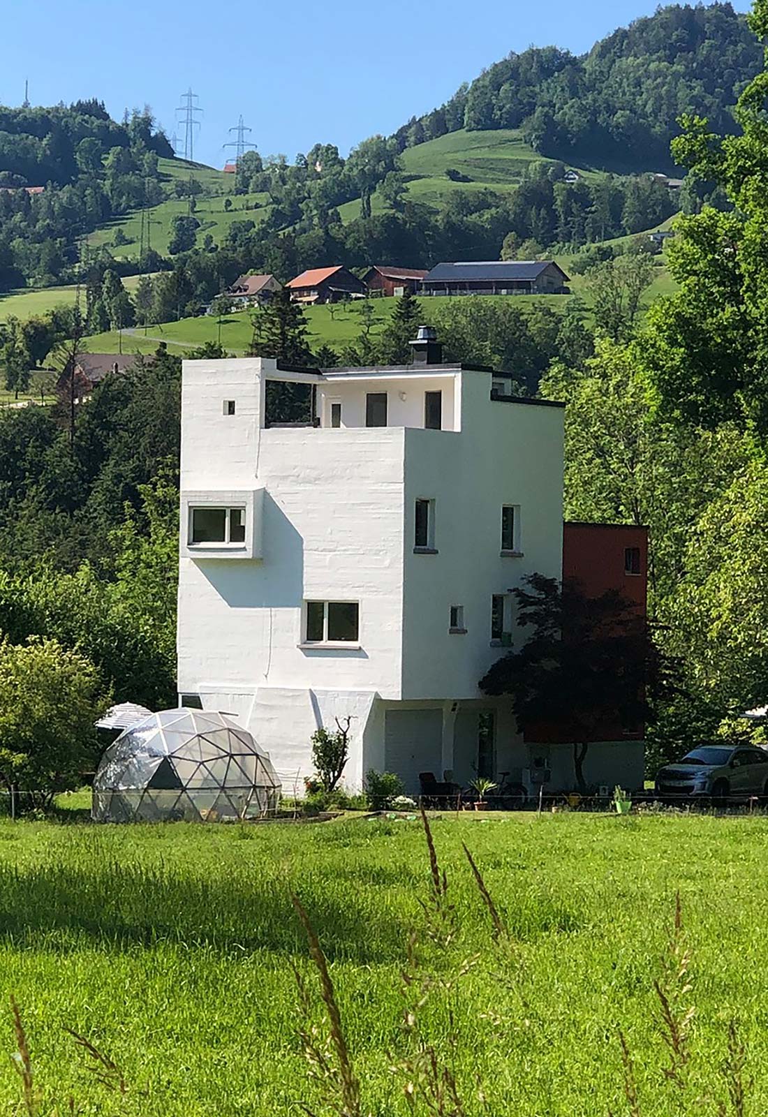
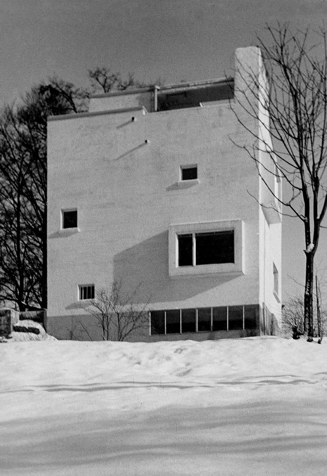
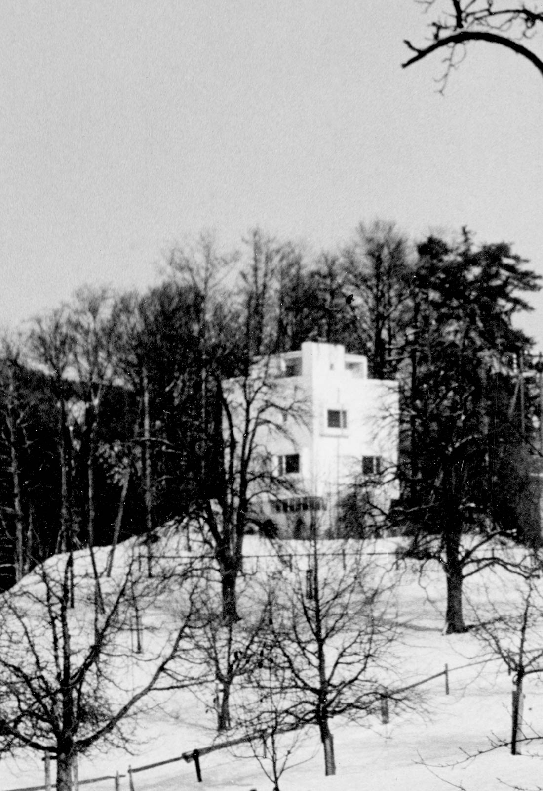
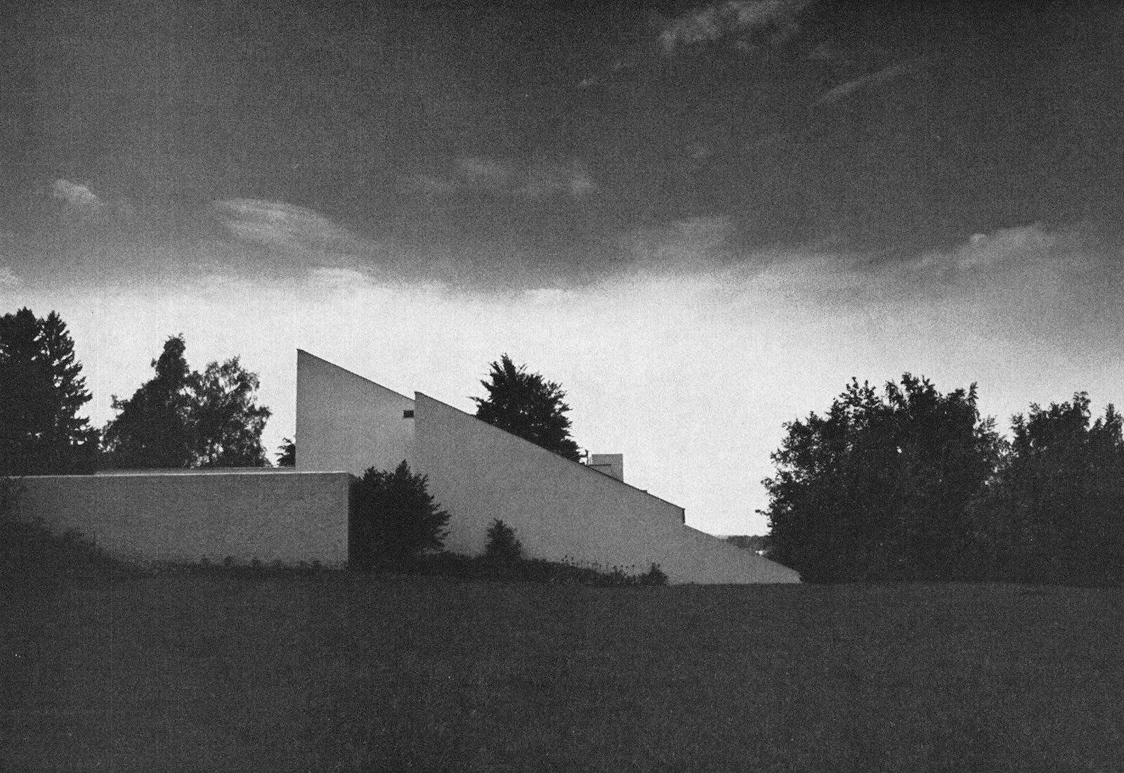
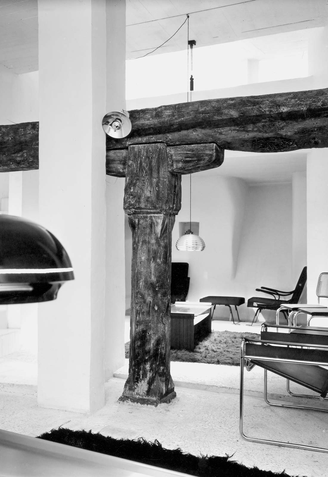
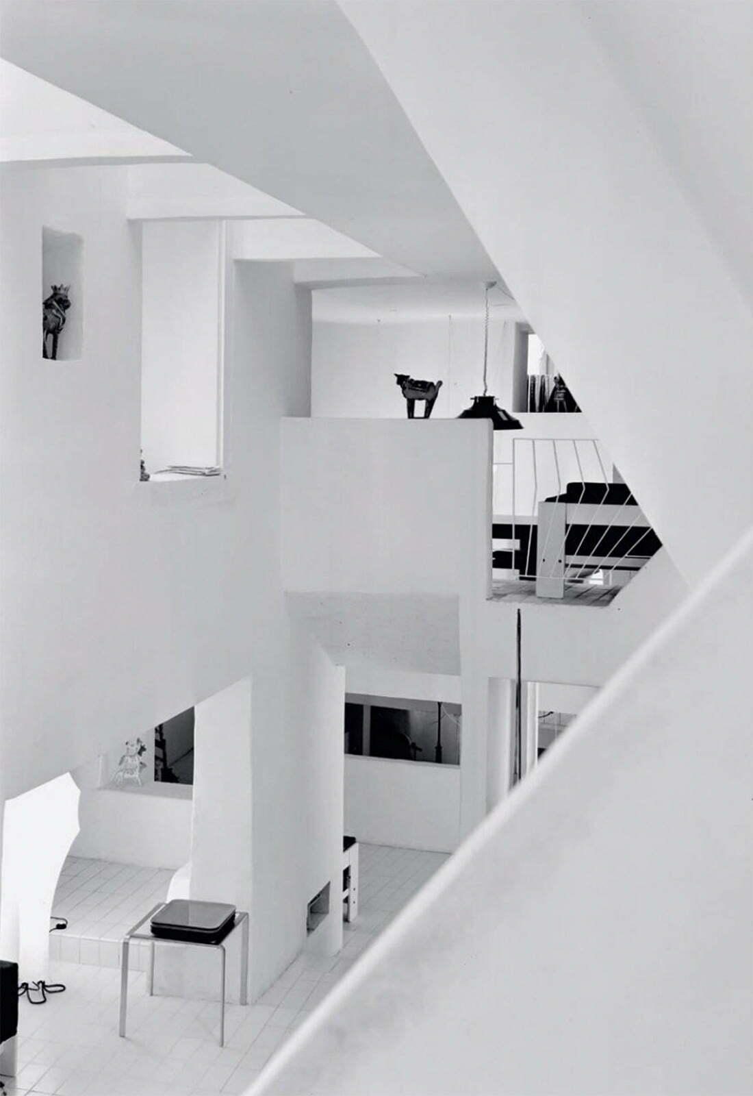
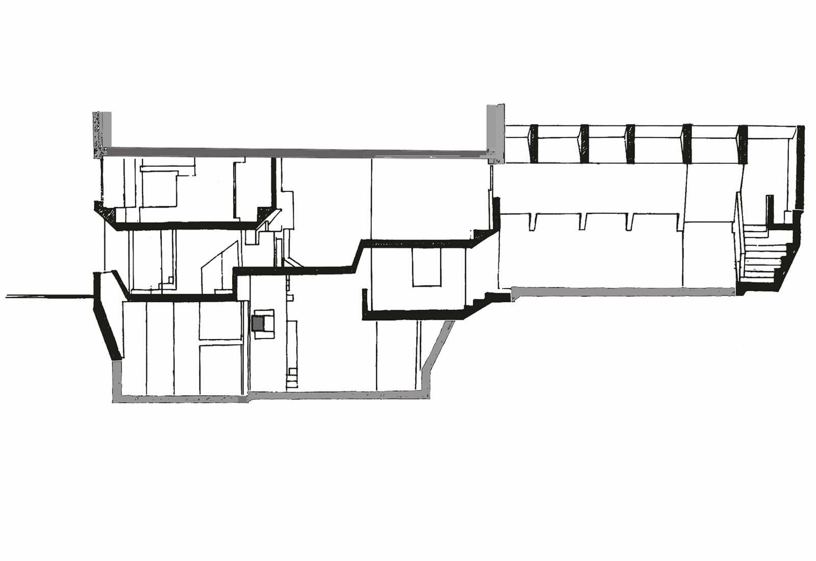
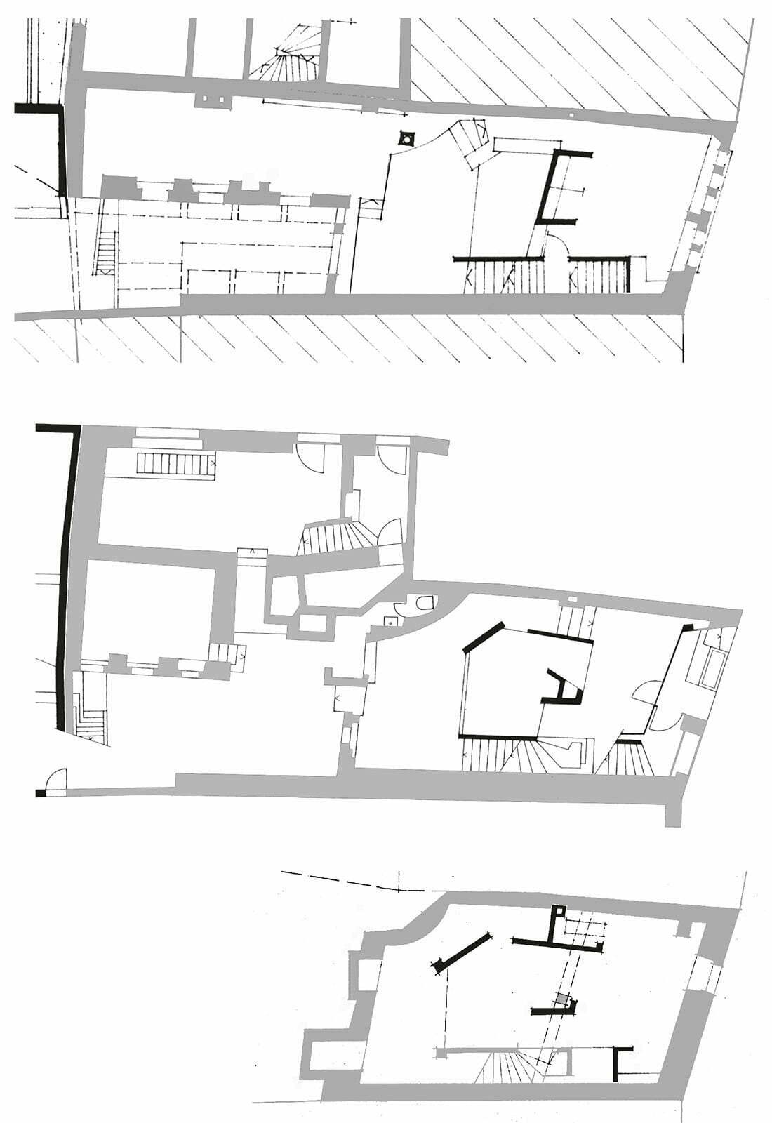
Transformation gravel silo, 1963
Wald (Zurich)
The most unique commission of my career was the conversion of an obsolete gravel silo into a vacation home. The closed concrete cube of 7.25 x 7.25 m in plan and 8.5 m height consisted of four square chambers. The client – a farmer – asked me for the locations of windows and doors and then blasted the openings out of the concrete walls himself with dynamite. Any resulting irregularities were accepted.
Fritz Baumann House, 1971
Langenthal (Berne)
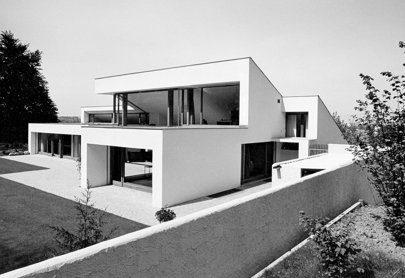
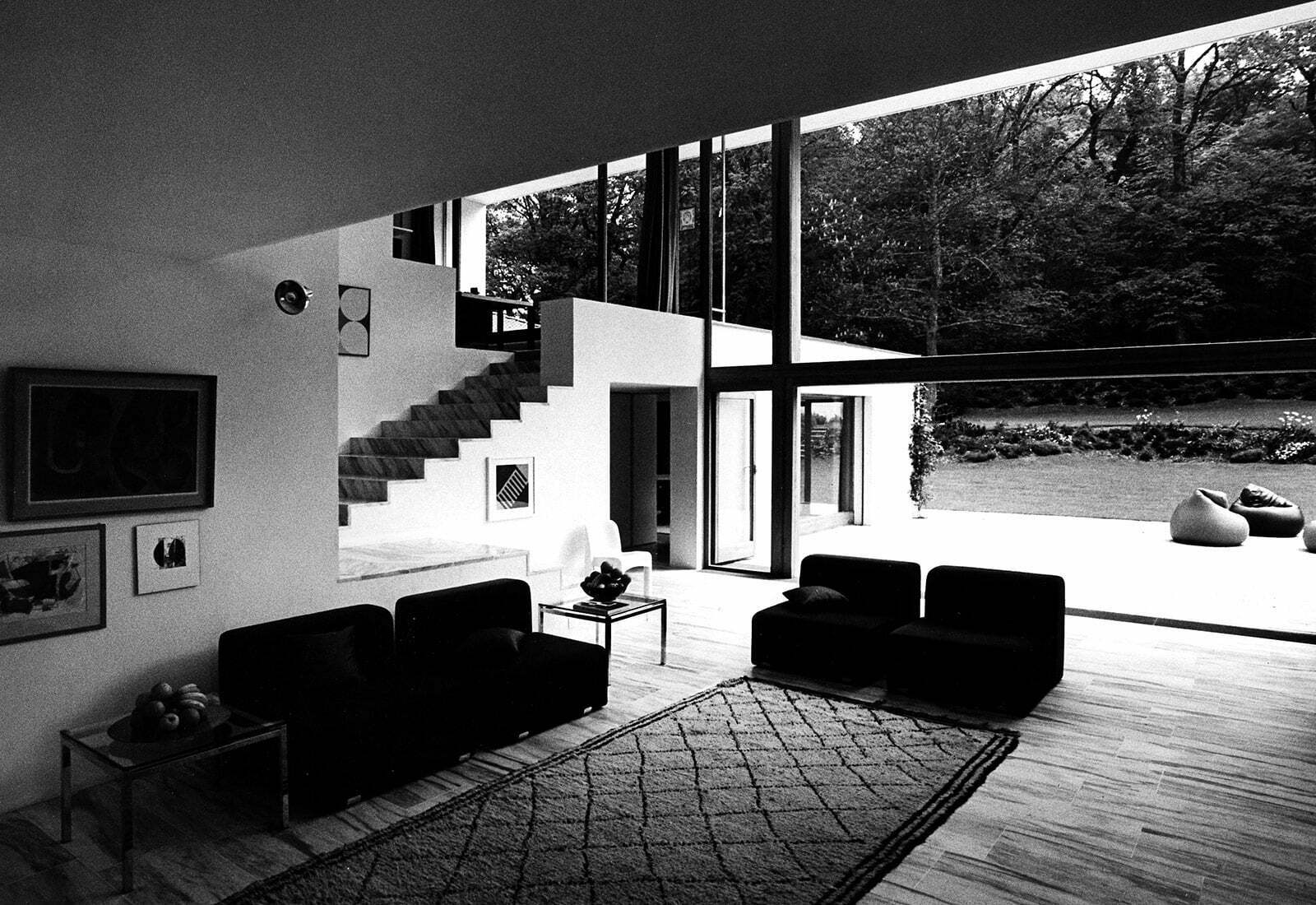
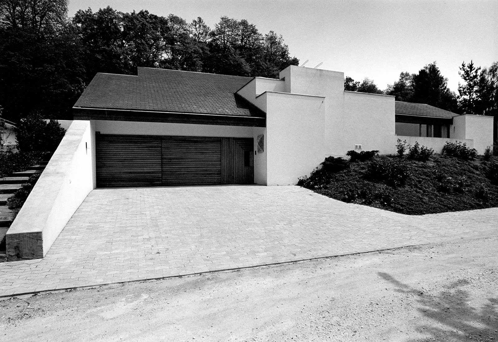
The house for a elderly couple bordering the forest stands in dialogue with a group of aged oak trees. It opens completely towards the east while turning a closed facade towards the sprawling community in the west. The large picture window in the living room can be sunken into the basement.
Reckinger House, 1976
Luxembourg
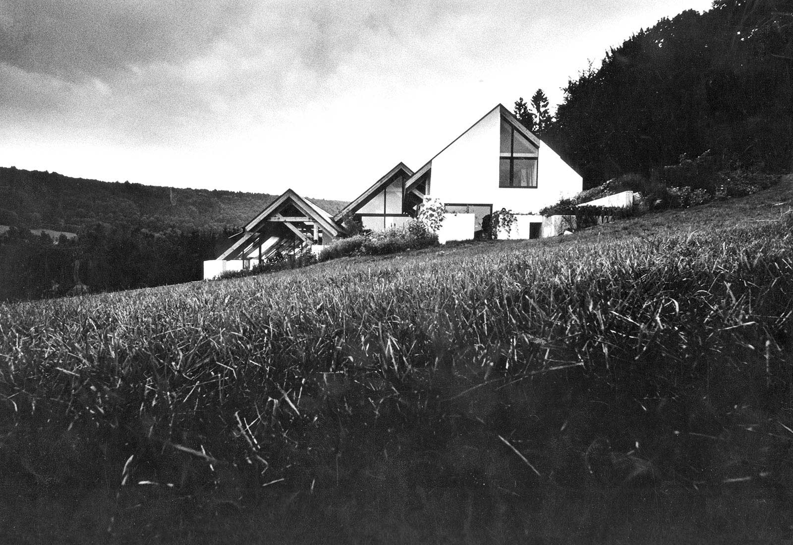
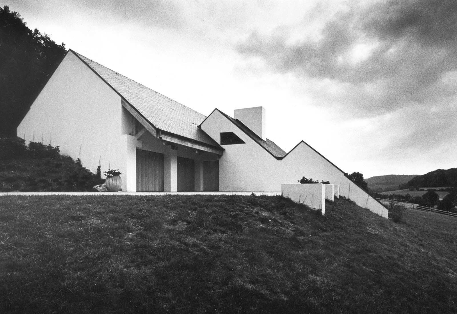
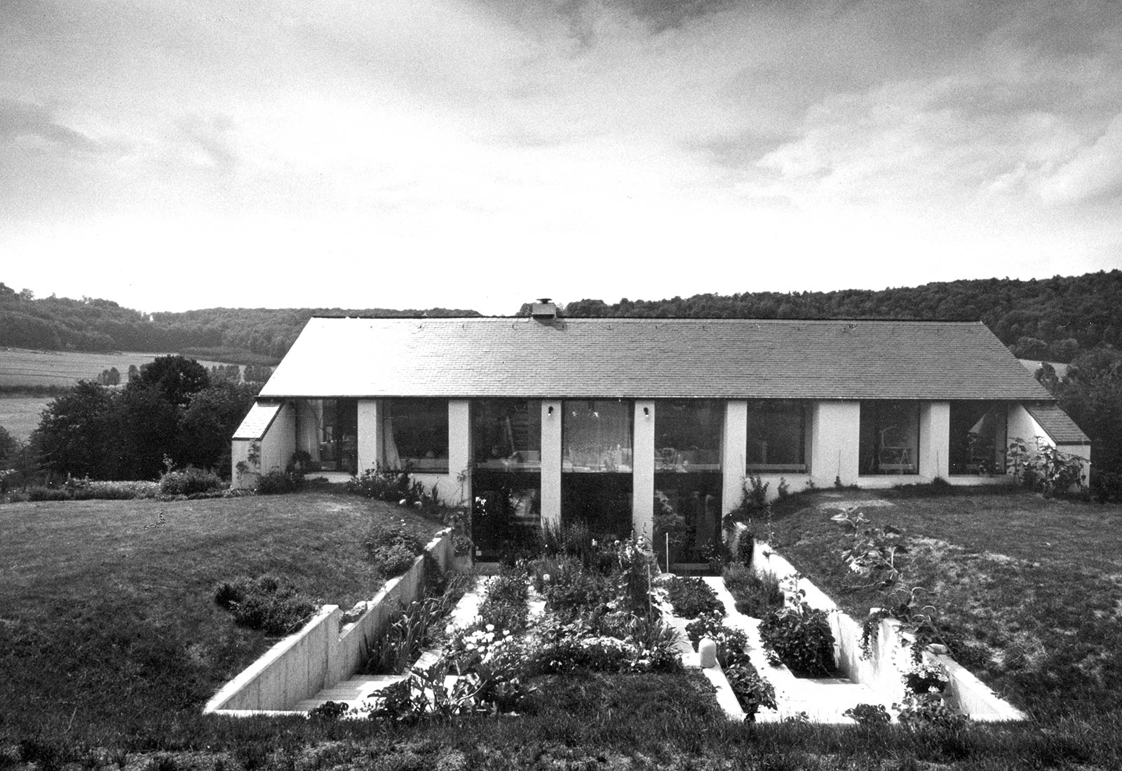
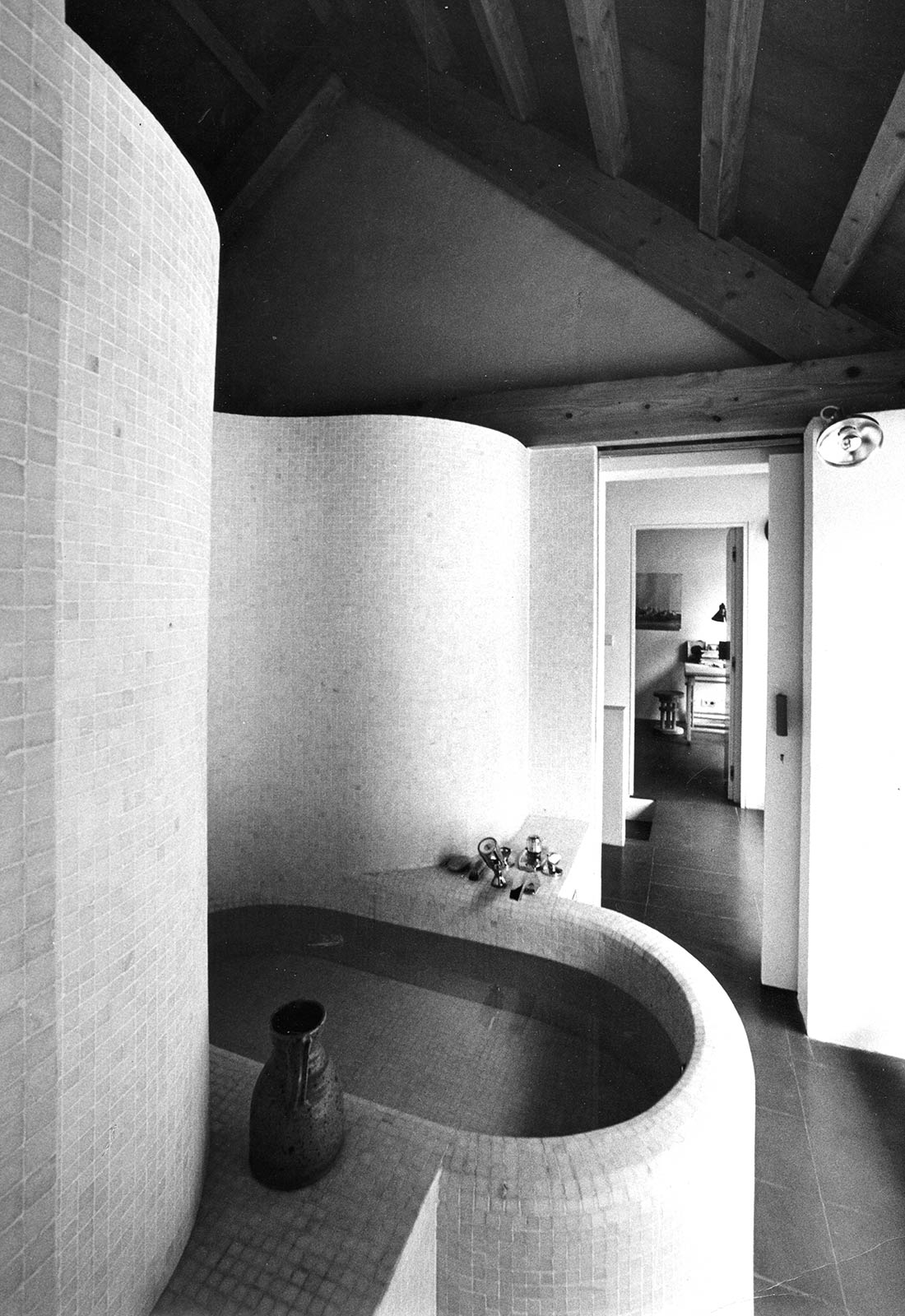
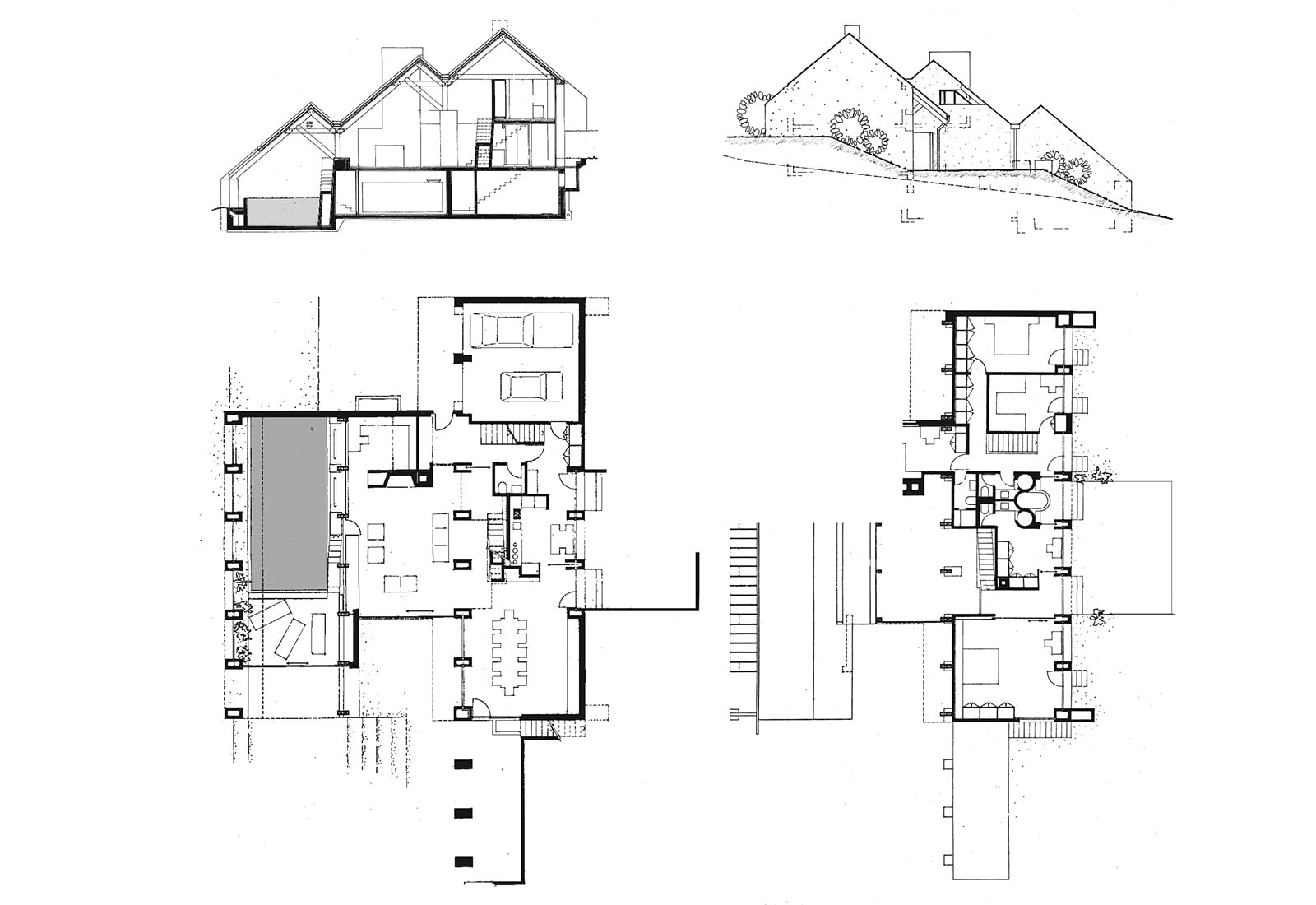
The house is located on the western slope of a thinly populated valley a few kilometers north of Luxembourg. The staggered roofs refer to the slope, the four rows of columns emphasize the long axis of the north-south valley while leading into the landscape. An indoor pool lies in the lowest part of the ground plan and reflects the evening light into the living room. On the east side, the large kitchen extends into an enclosed herb garden with a fountain, which contrasts with the surrounding landscape.The underside of the roofs consist of red Tuscan tiles attached to wooden beams while the floors are likewise covered with the same material.
Schudel House, 1988
Horgen (Zurich)
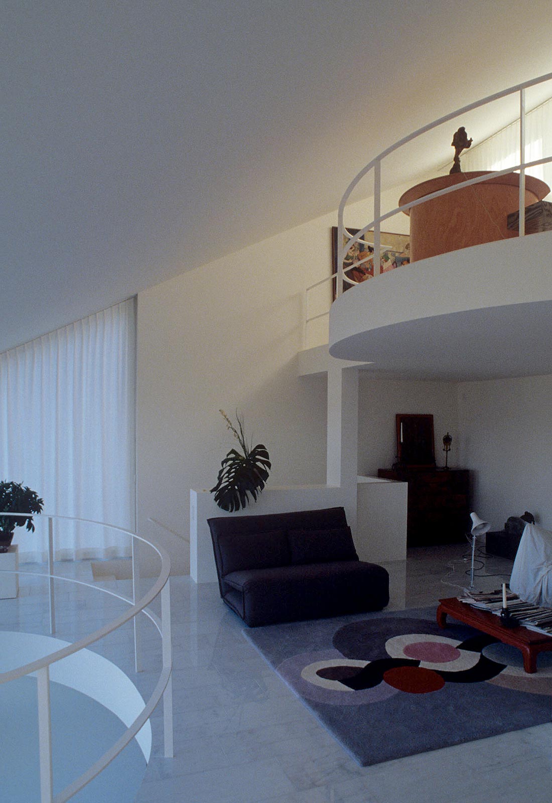
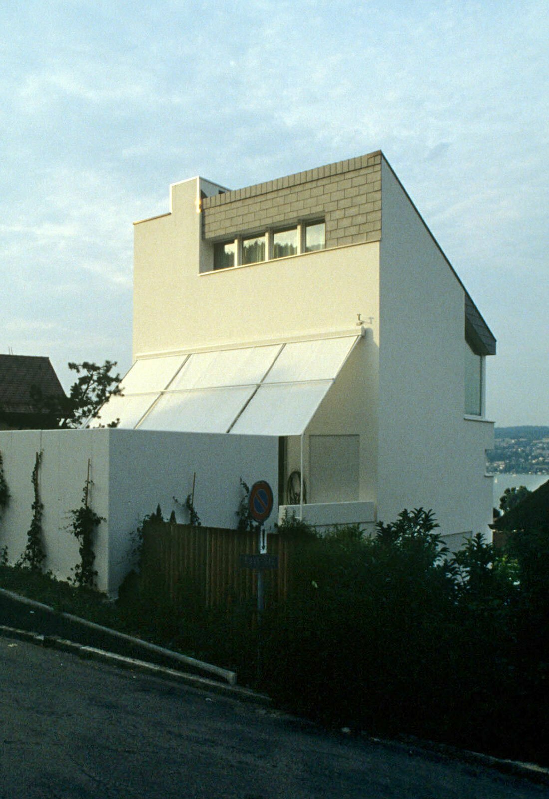
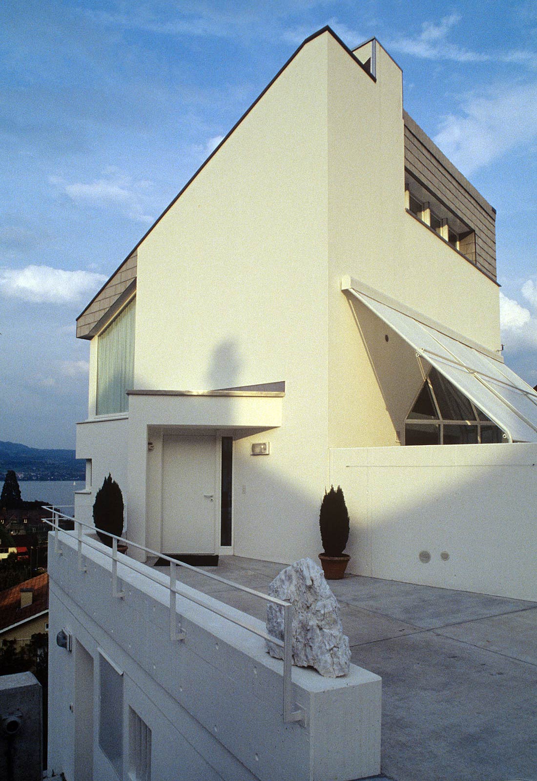
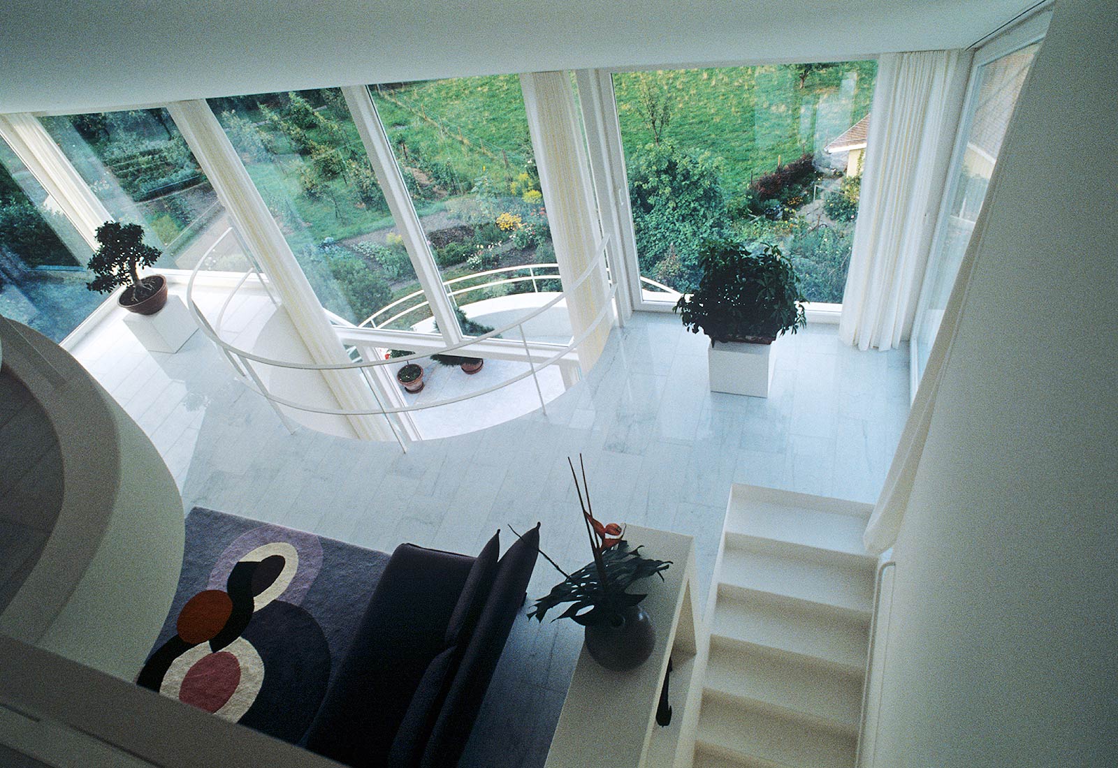
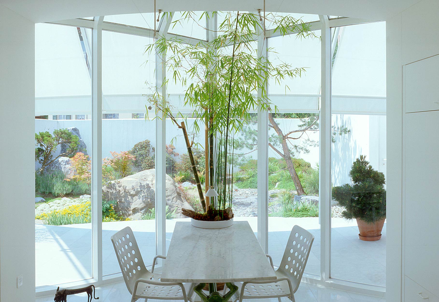
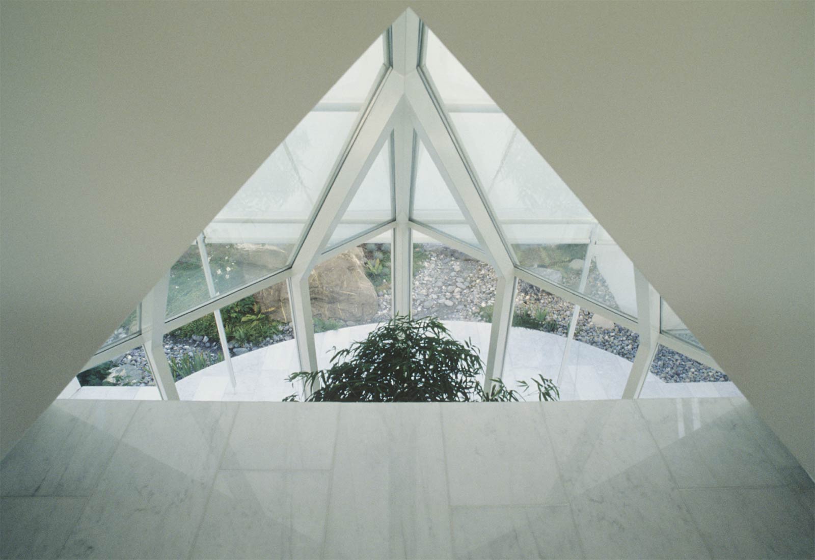
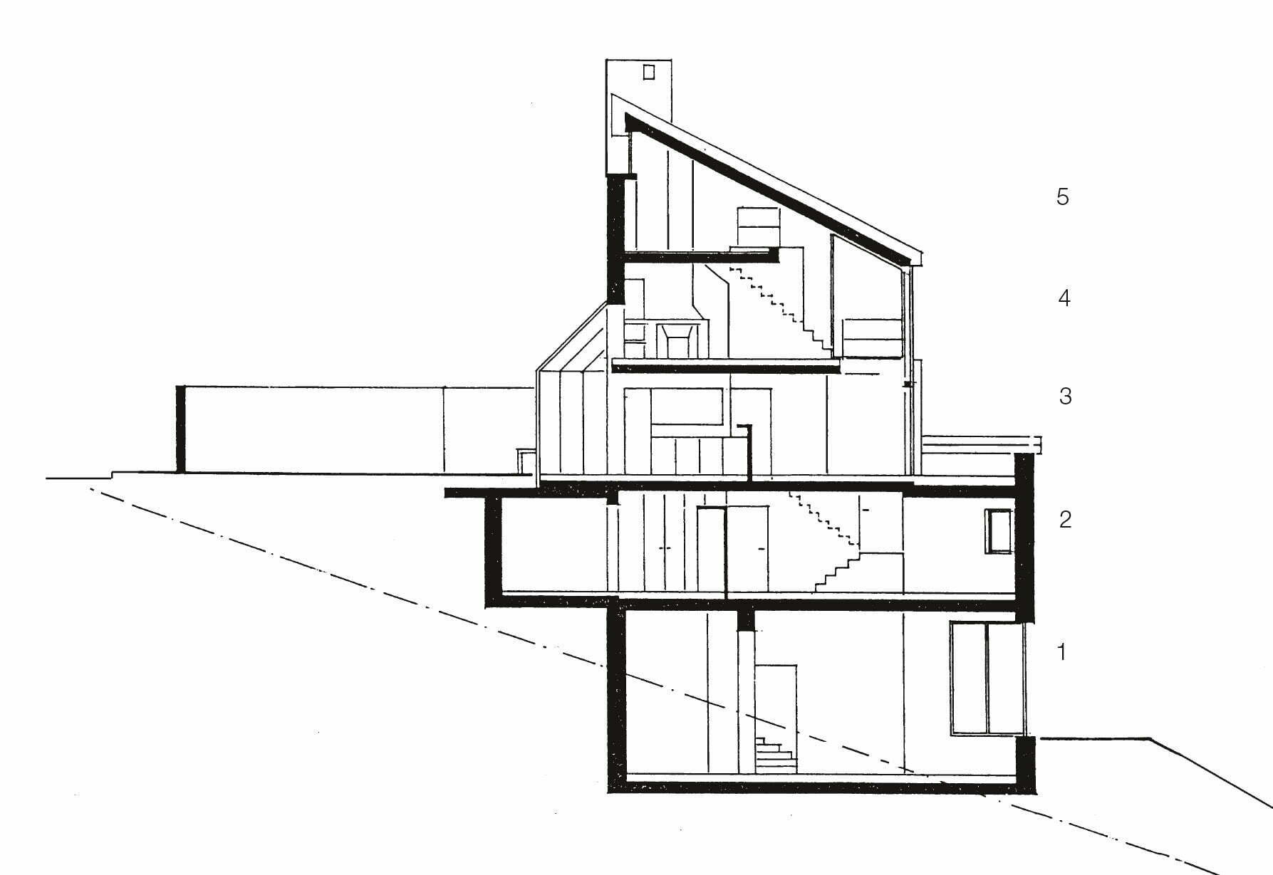
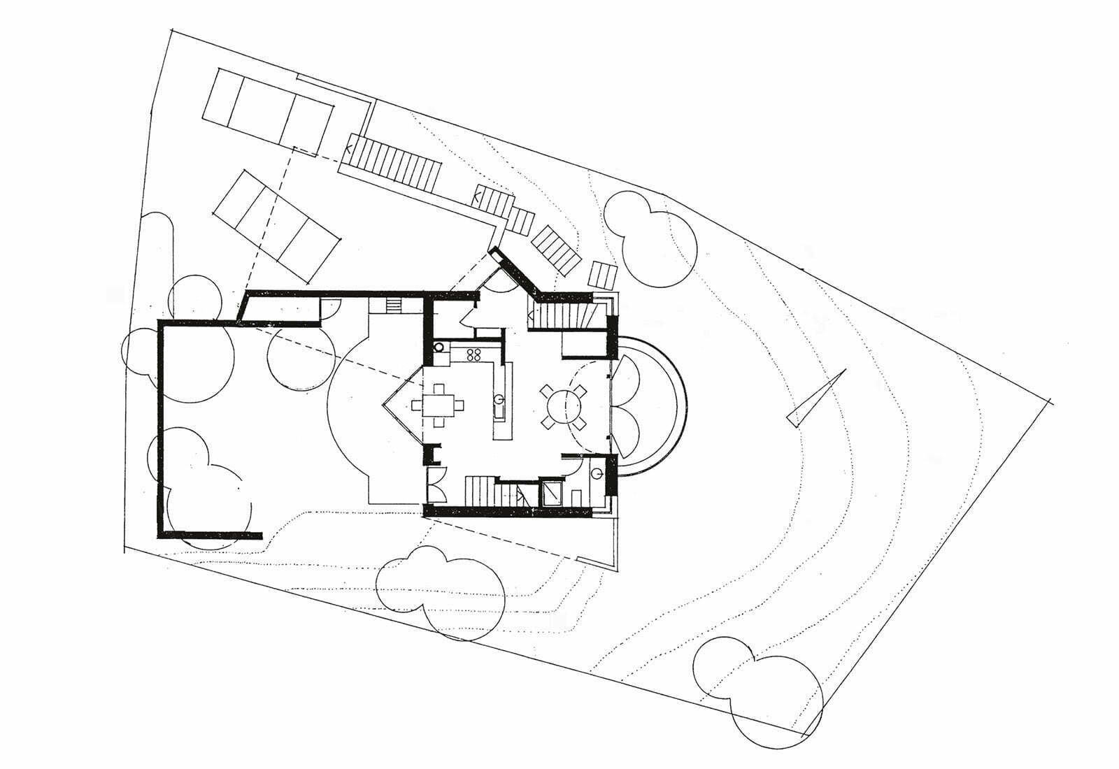
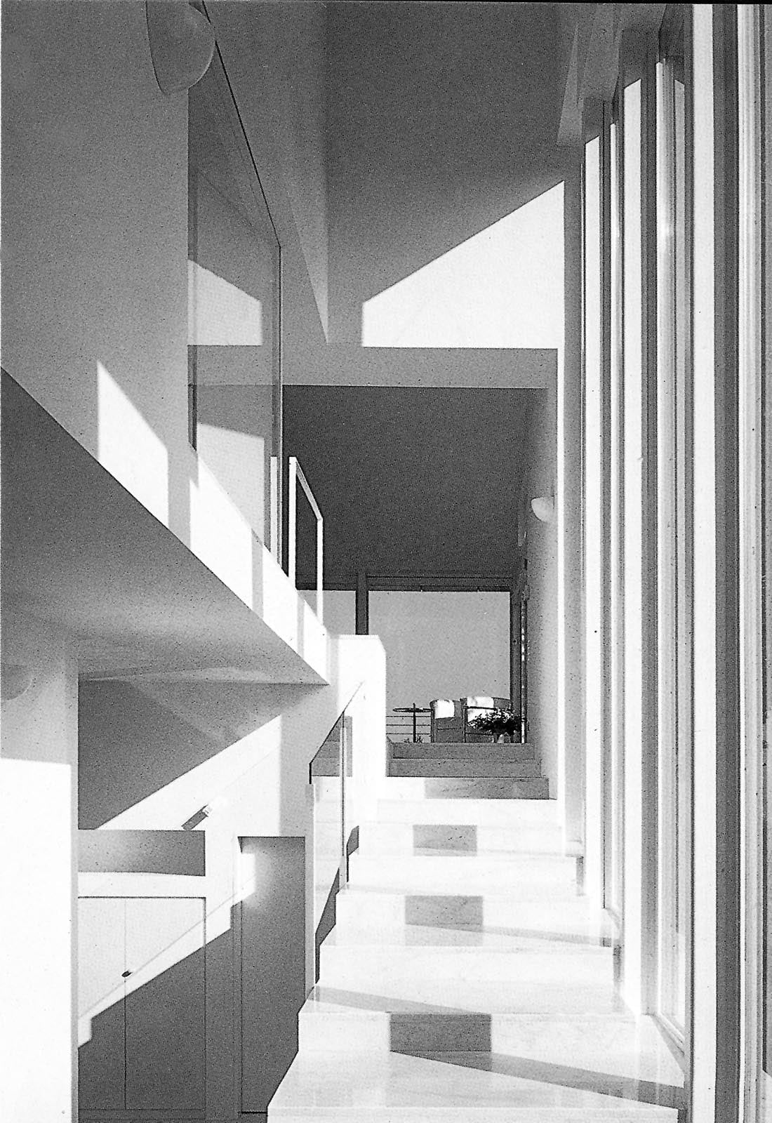
The house for a couple who are both photographers was a demonstration for my conception of architecture as an arena of debate between contrasts. The sloping site faces the convex curve of the lake to the east and the peaks of a mountain range to the west. The basement of an existing house was retained on the site. The narrow lot led to the concept of a tower house with one room per floor (photo studio, sleeping, cooking-dining, living, library)- a housing form that was prevalent in the early middle ages. A storage room on each floor is reserved for a future elevator. Open stairs connect the floors freely. The house responds to the curve of the lake on the valley side with a round terrace and to the peaks on the mountain side with the pyramid of the winter garden.The round forms on the valleyside are repeated with the concave cut in the dining room ceiling above the eating area and the convex balcony of the library, forming a cascade of round forms. The sloped roof reflects the slope of the terrain.
Hodler House, 1988
Kilchberg (Zurich)
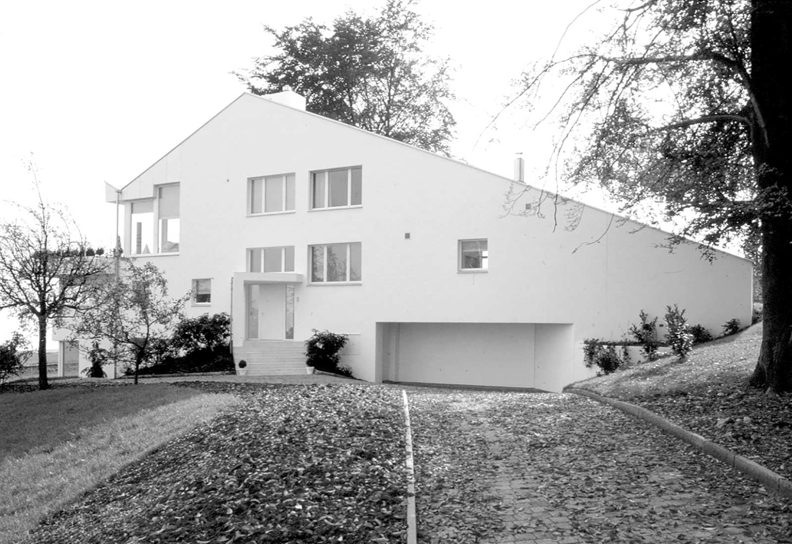
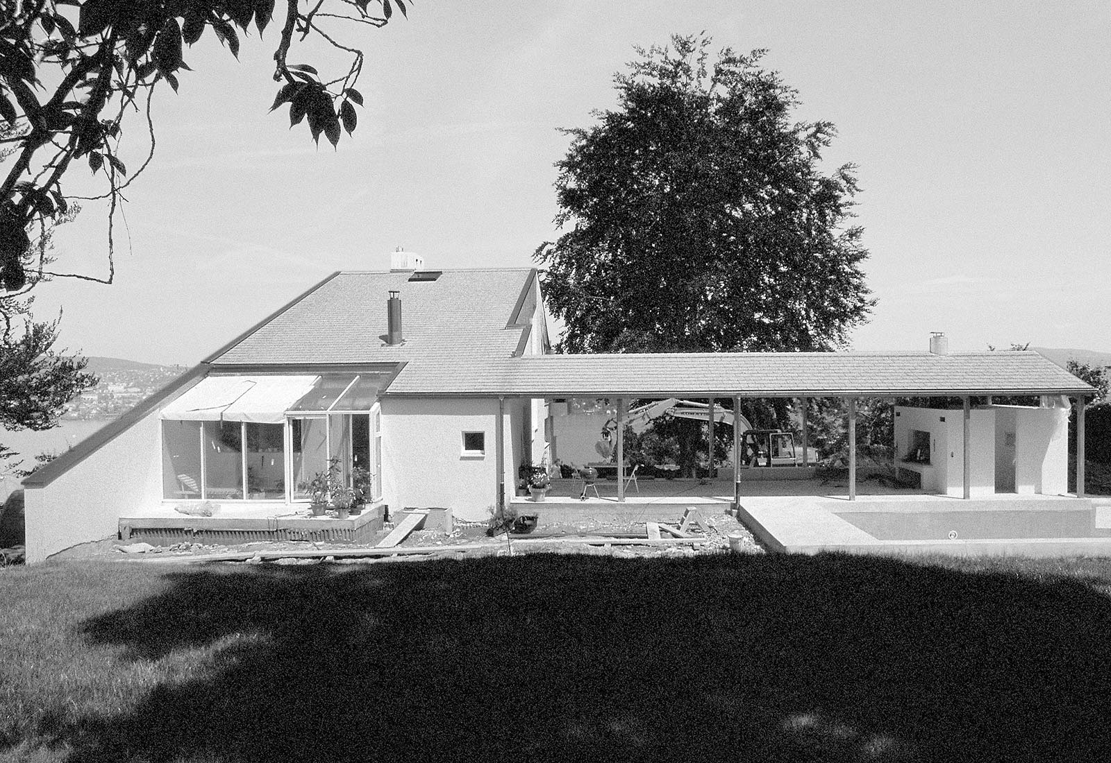
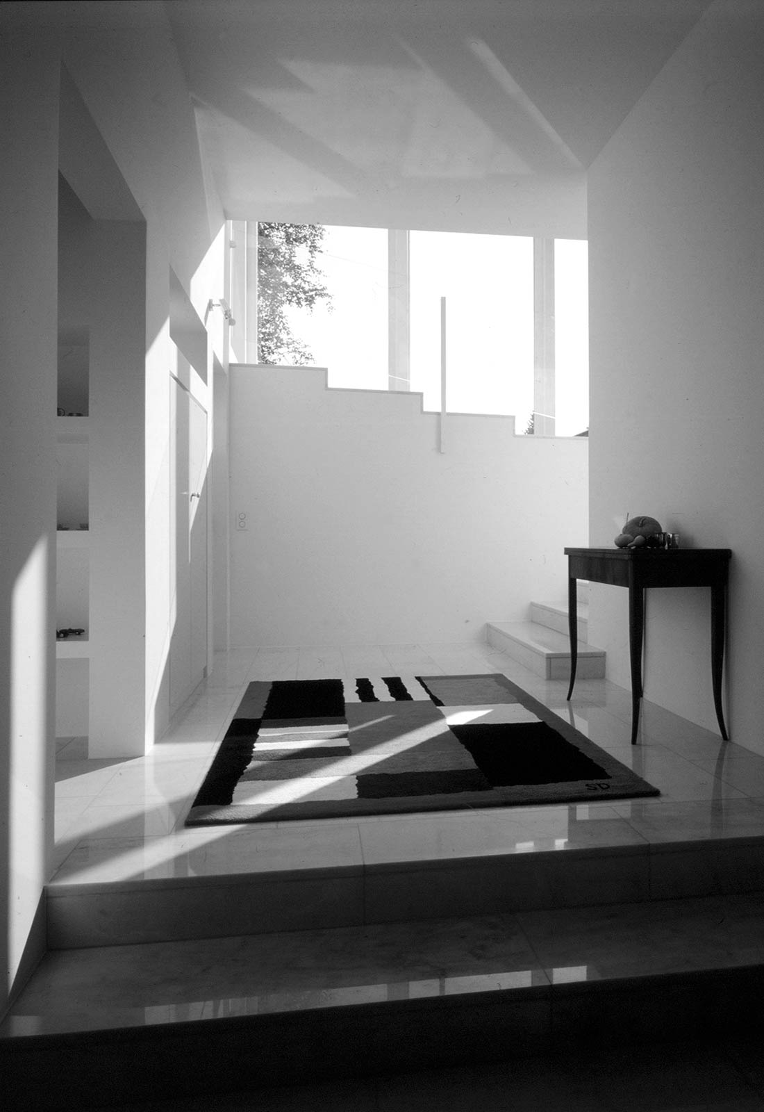
The house lies on an eastern slope high above the Lake Zurich. The narrow side of the elongated plan faces the lake such that the two longer sides take part in the view diagonally and that the building does not appear as a wall when seen from the lake. The living area on the upper floor is connected with dining and garden areas with a wide flat stair. The house and the perpendicularly placed porch with a pool surround a large copper-beech tree.
Dutler House, 1992
Vallauris (France)
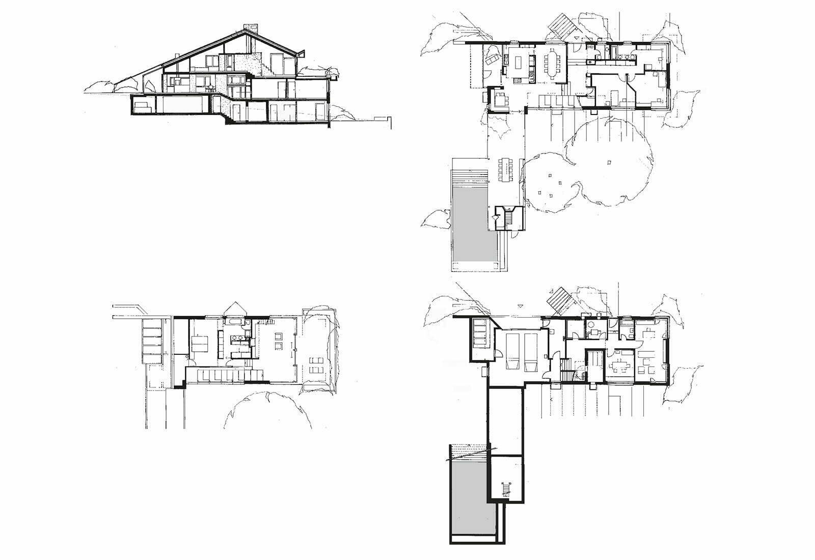
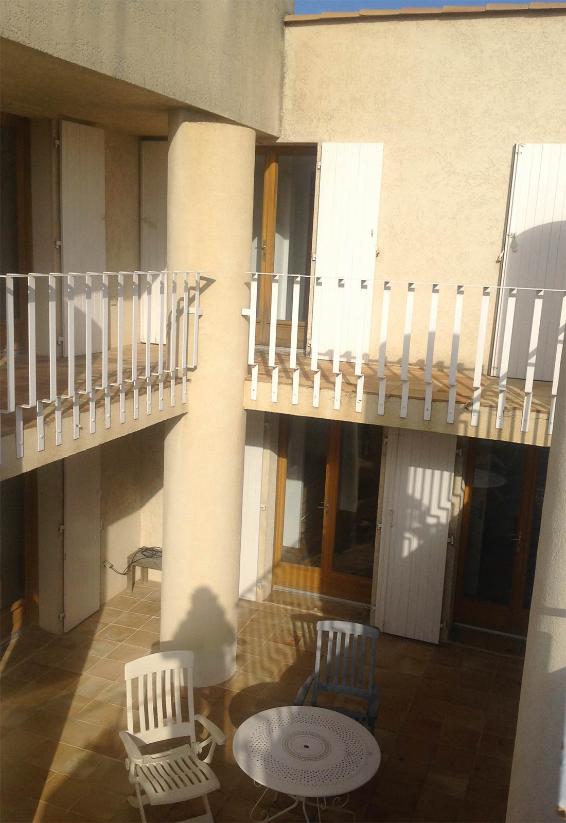
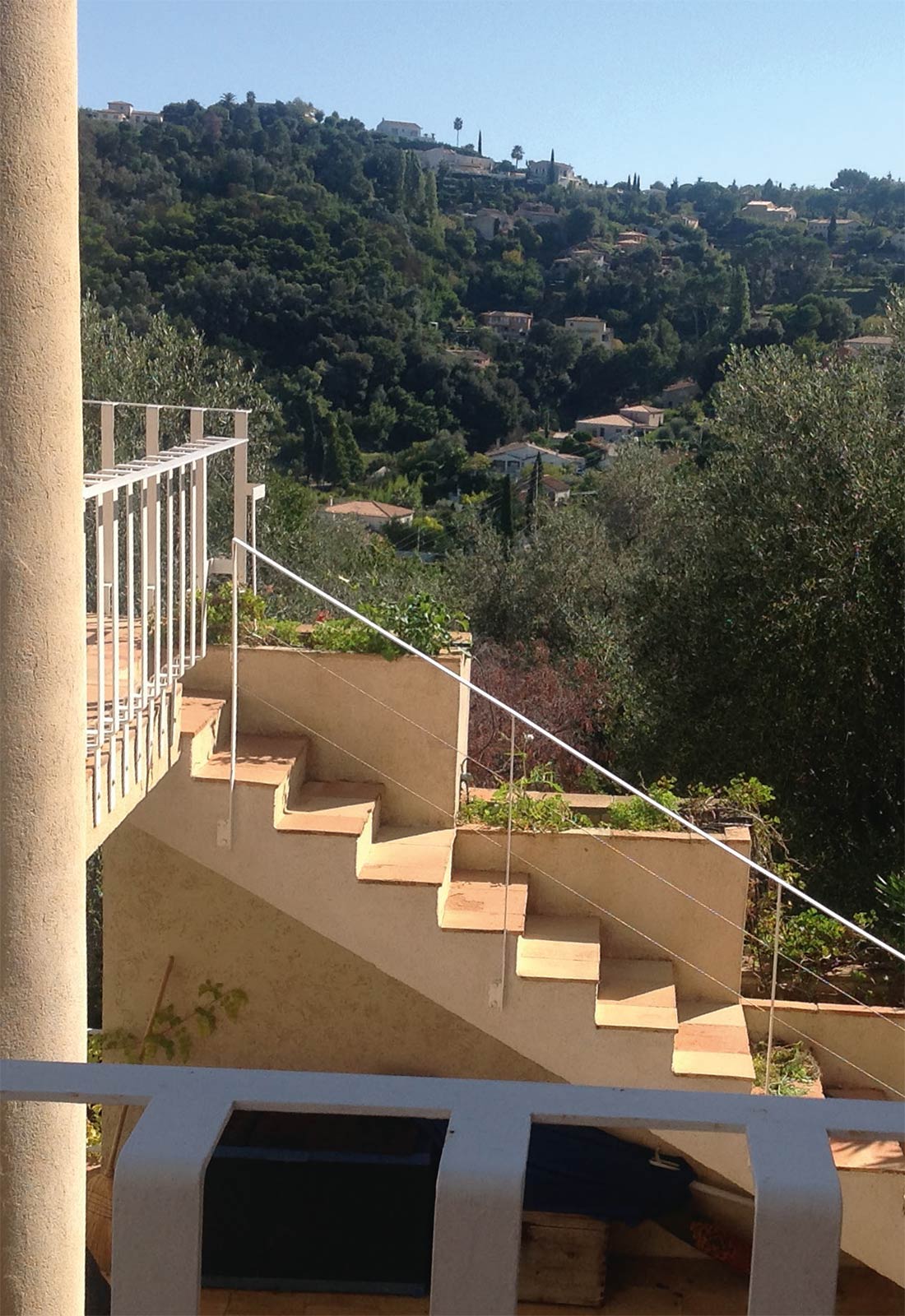
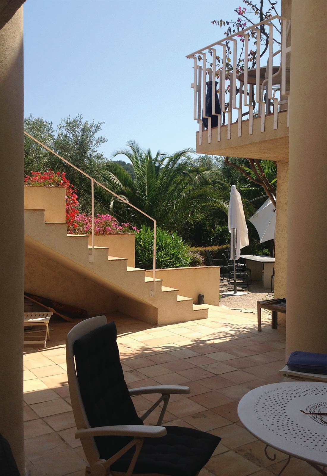
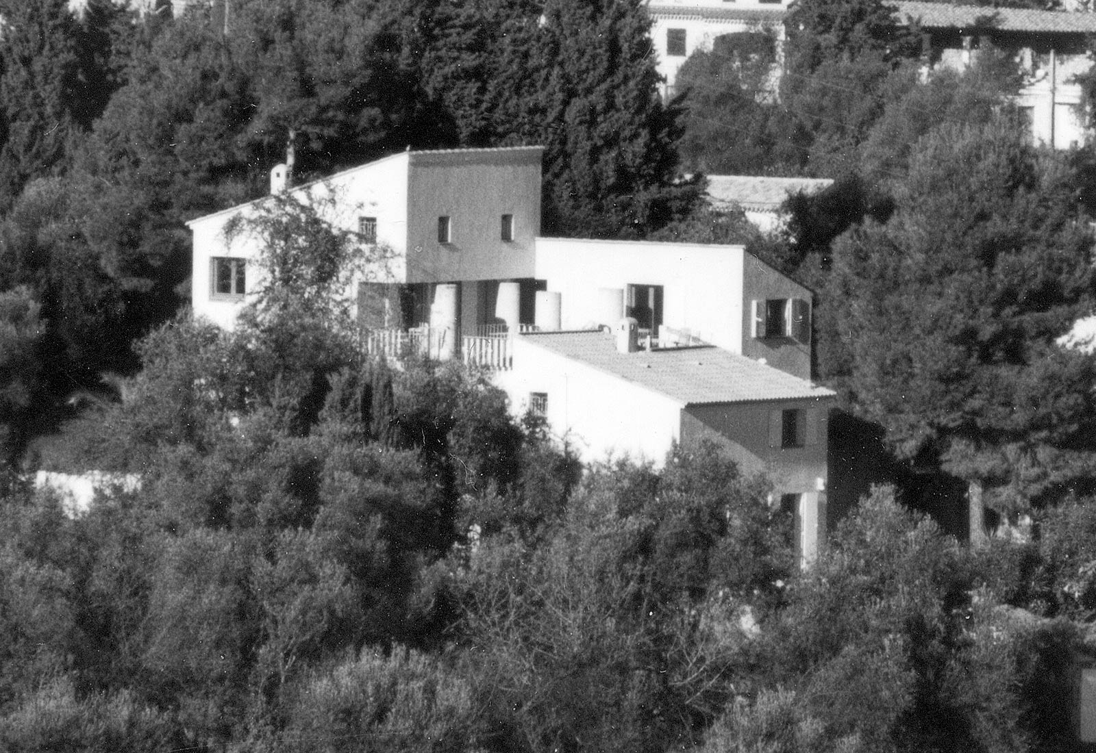
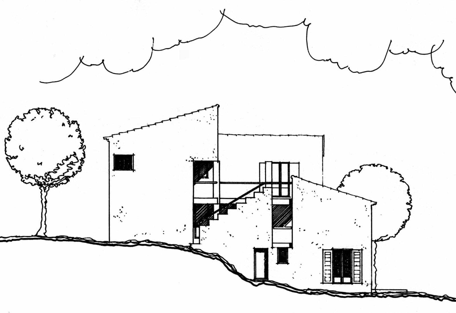
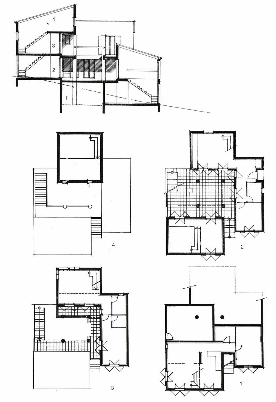
The theme of this house deals with the idea of the courtyard. Three ascending wings of the house follow the movement of the sloping terrain and form a central courtyard which is treated not as a leftover space, but as the heart and driving force of the concept, emphasized with a square of massive columns. The contrast of introverted closed private courtyard to the wide open view into the surrounding hills and the sea, achieves tension and makes the house alive. The project had to follow the restrictive building ordinance: facades in ocre-beige, roof covered with roman tiles at a 10 to 15 degree slope, openings as standing rectangles.
Staff housing, 1968
Heuried (Zurich)
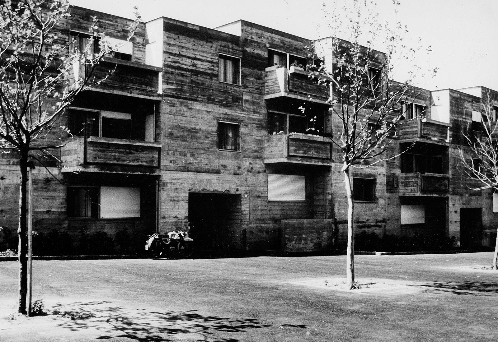
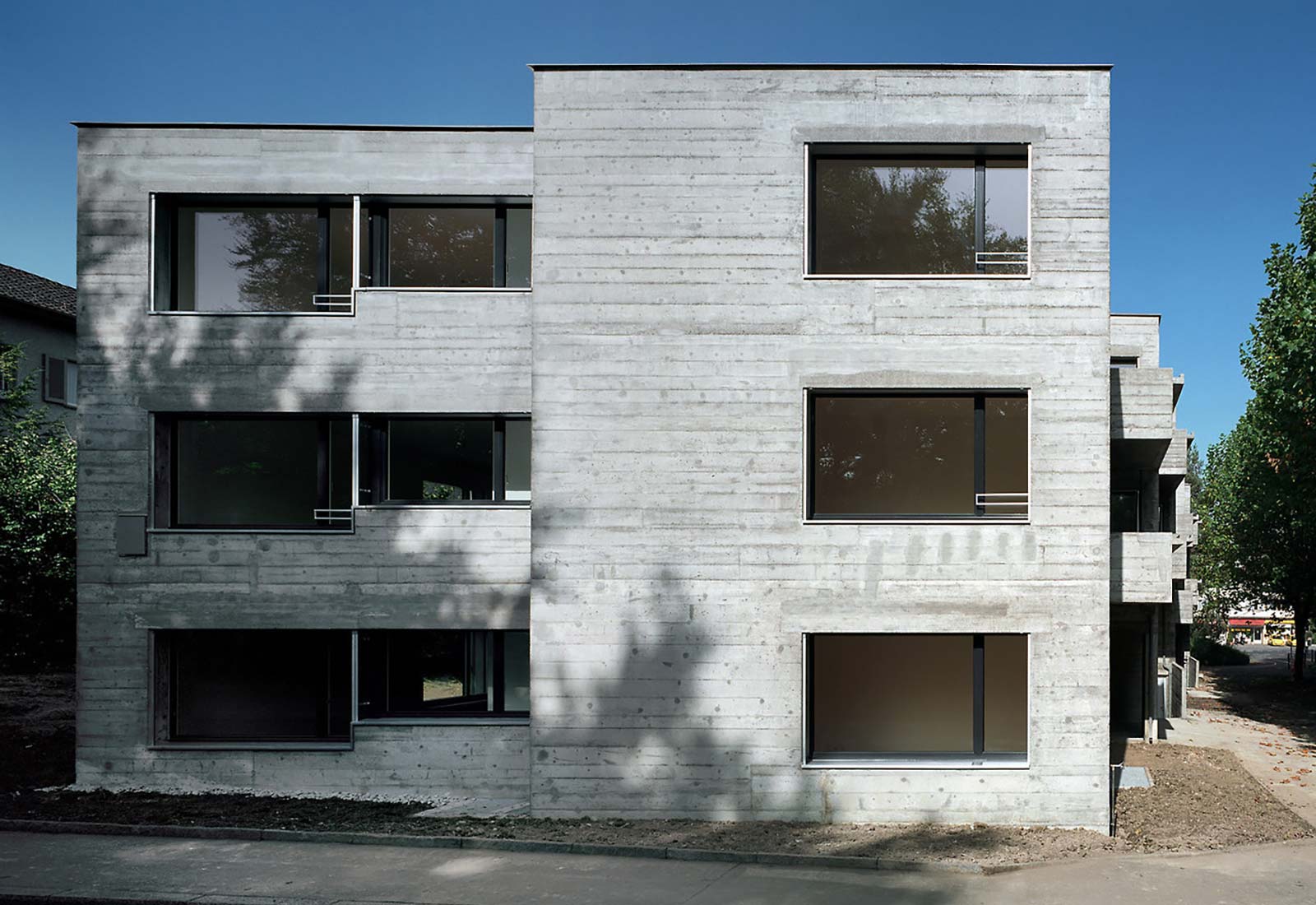
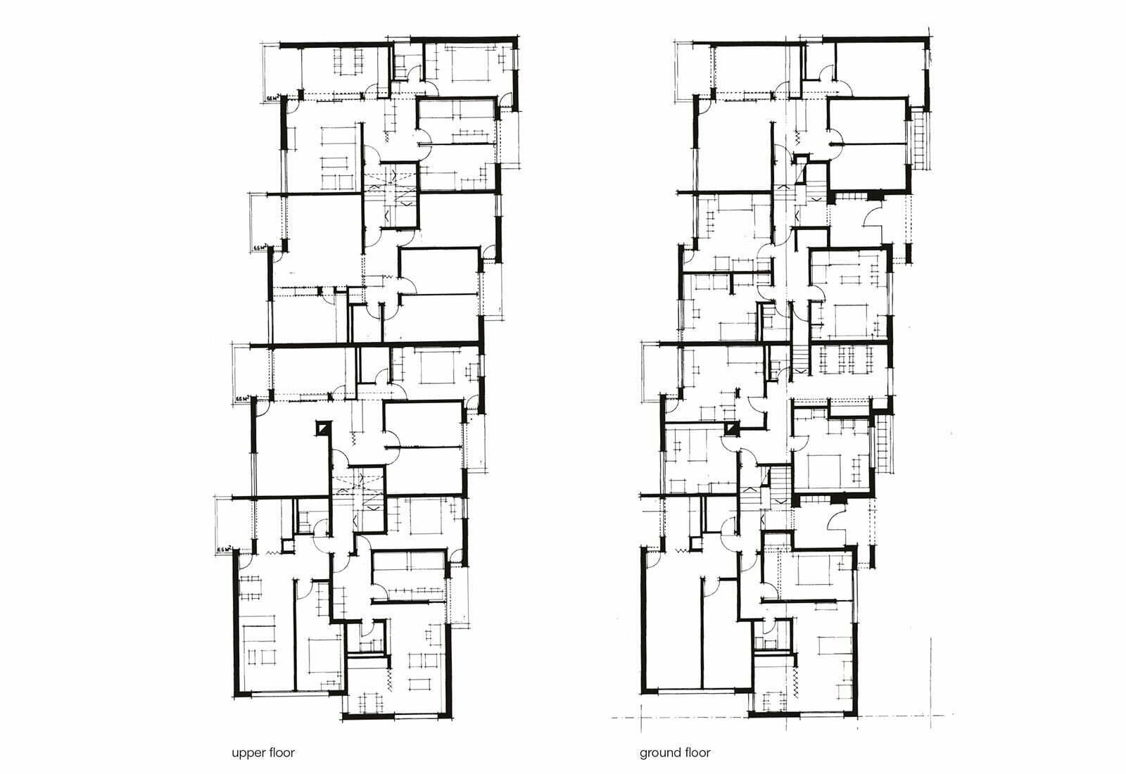
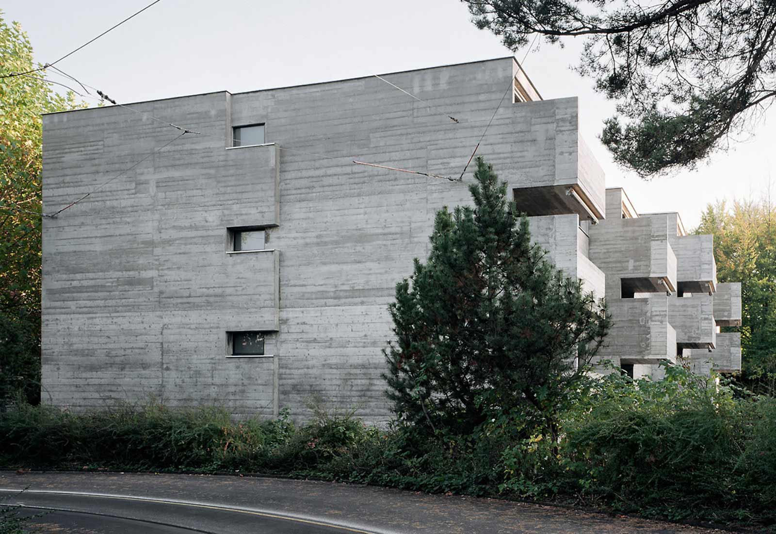
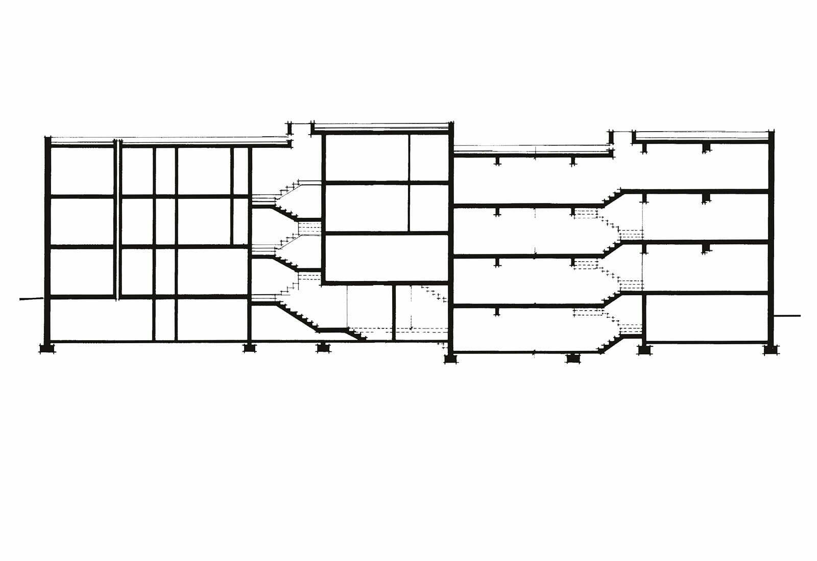
This apartment building for city employees was built shortly after the nearby recreation center. After 34 years of use it was restored by the young architects Galli and Rudolf who preserved the concrete facades and improved the plans of the somewhat small apartments by turning two apartments into one. The narrow balconies were enlarged by a half meter.
Terrace house, 1968
Höngg (Zurich)
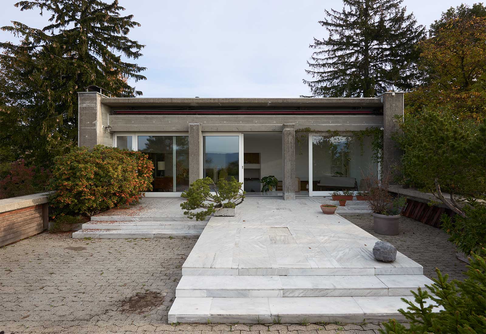
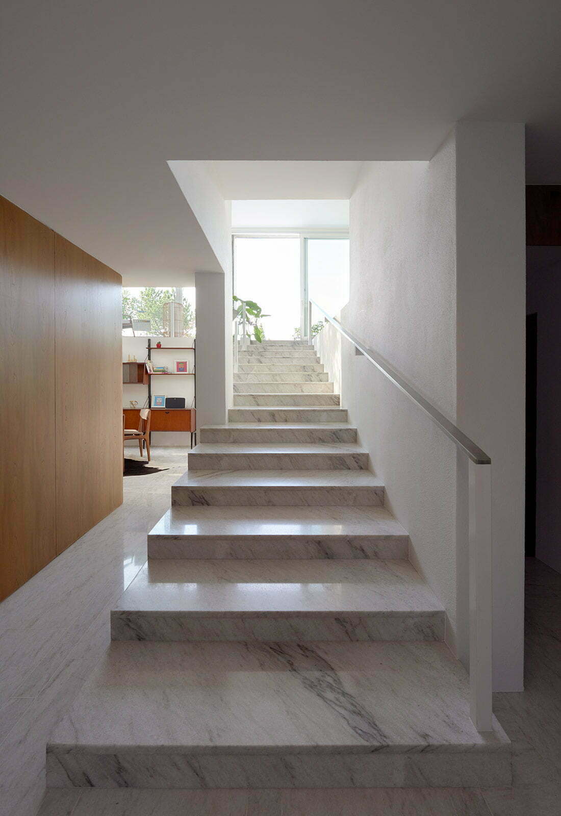
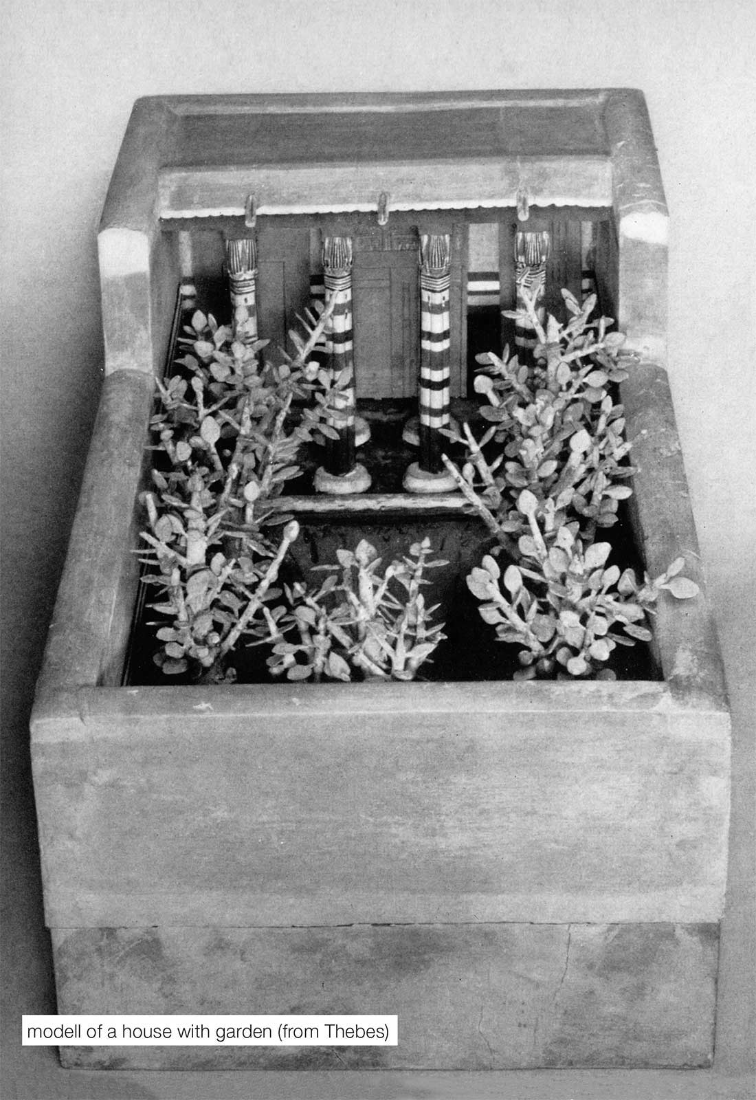
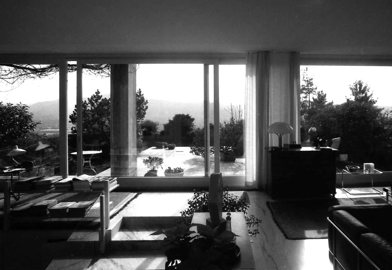
This two-family terrace house (1968) expresses continuity of basic values in housing. The design was inspired by a model of a house I had discovered in the Egyptian Museum of Cairo which was found in a pharaos grave. The interior is separated from the walled garden by a row of columns marking the transition between public and private. A further important element of the house is the stair which leads from the entrance to the terrace, ascending to the light, symbolizing redemption. The house is a registered historic monument.
51 row houses, 1972
Dinhard (Zurich)
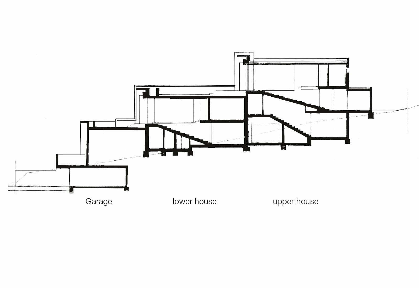
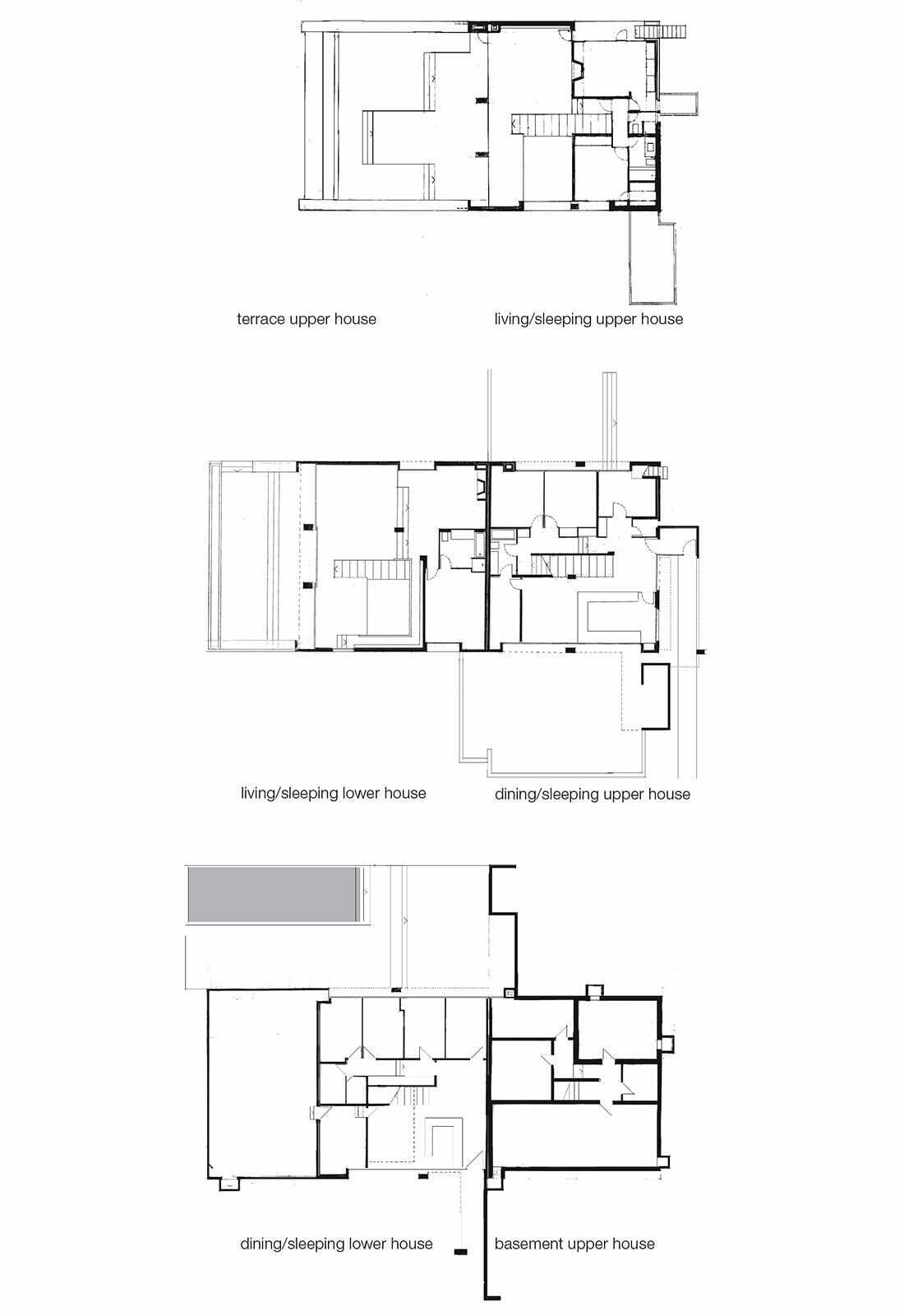
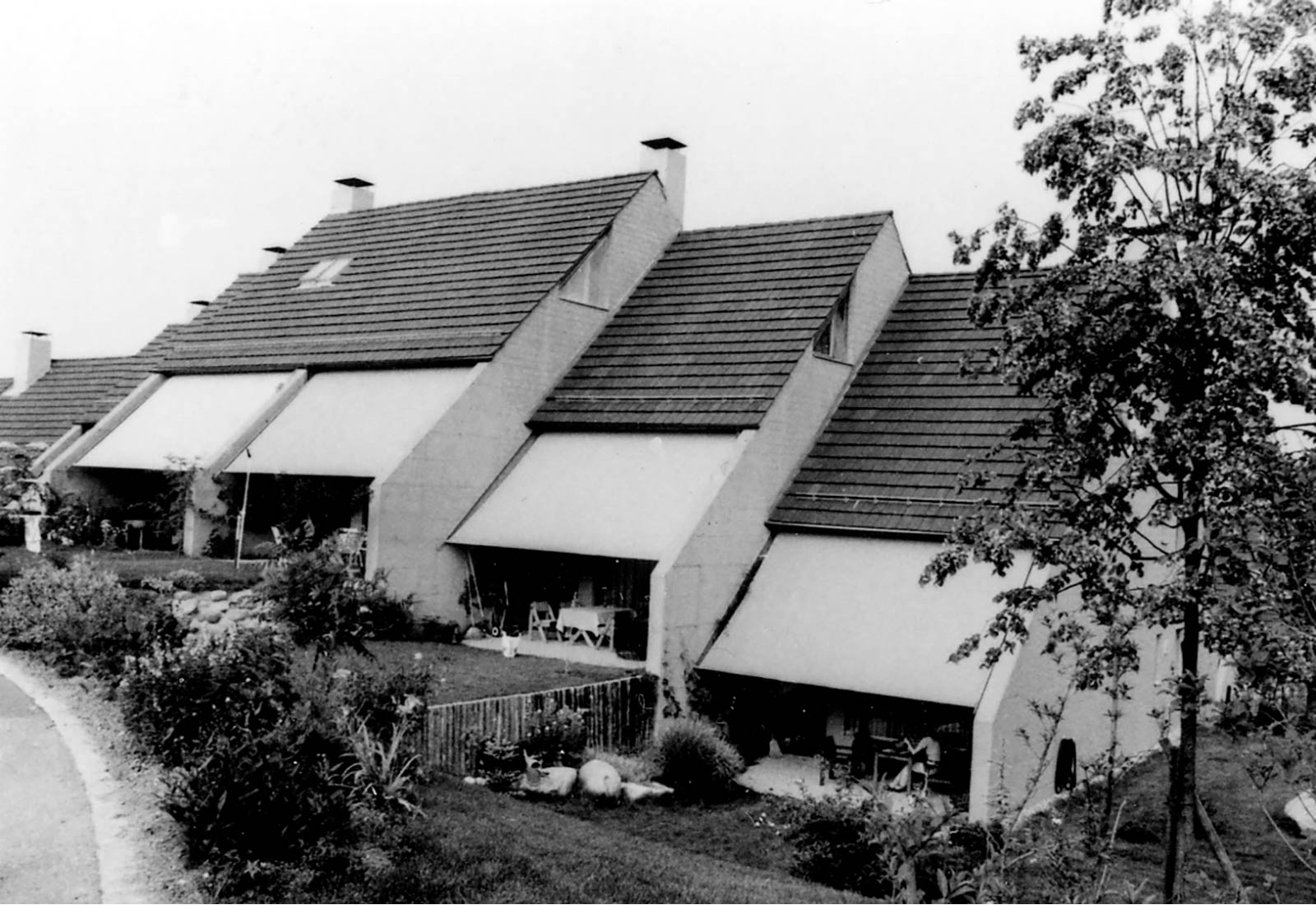
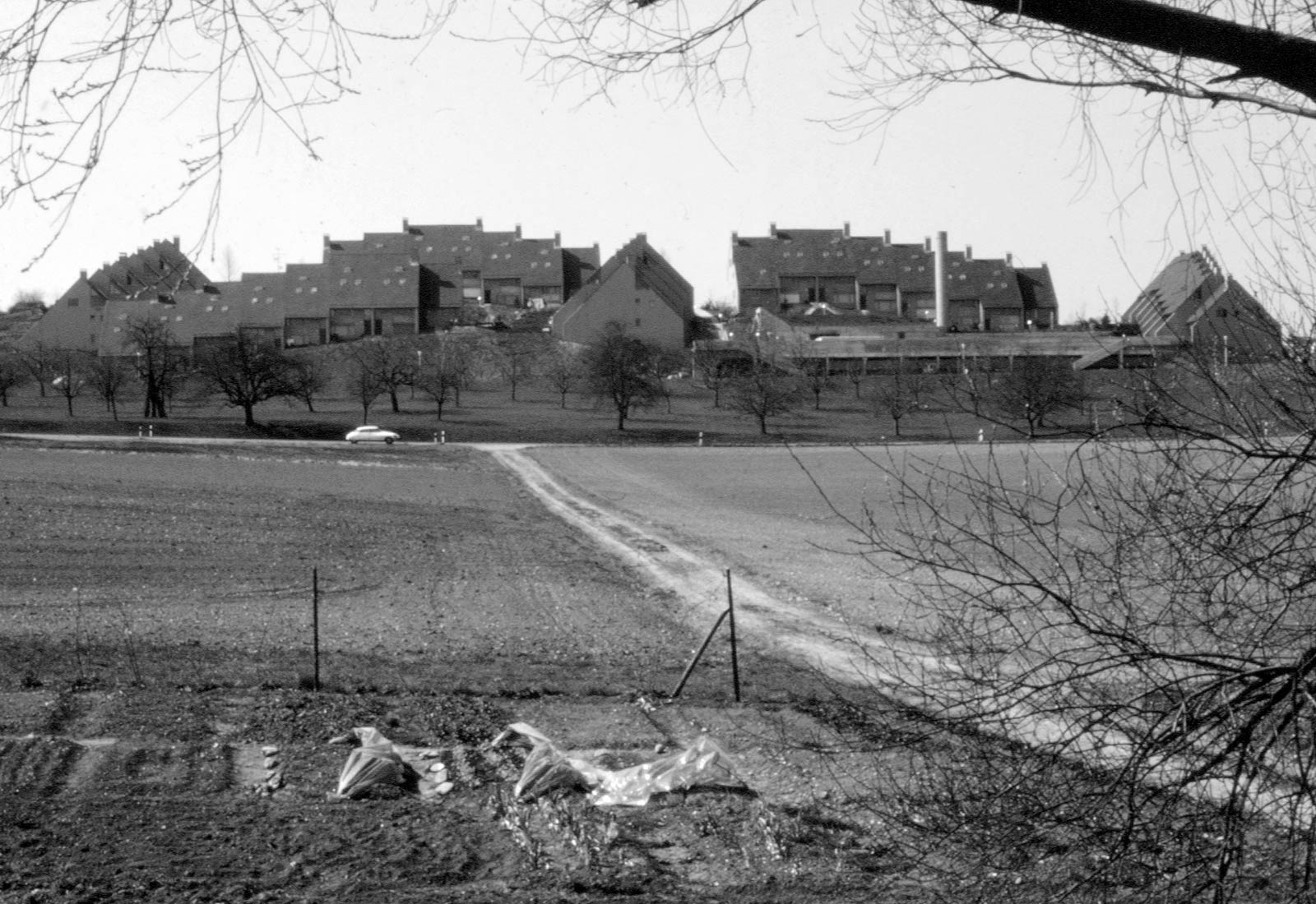
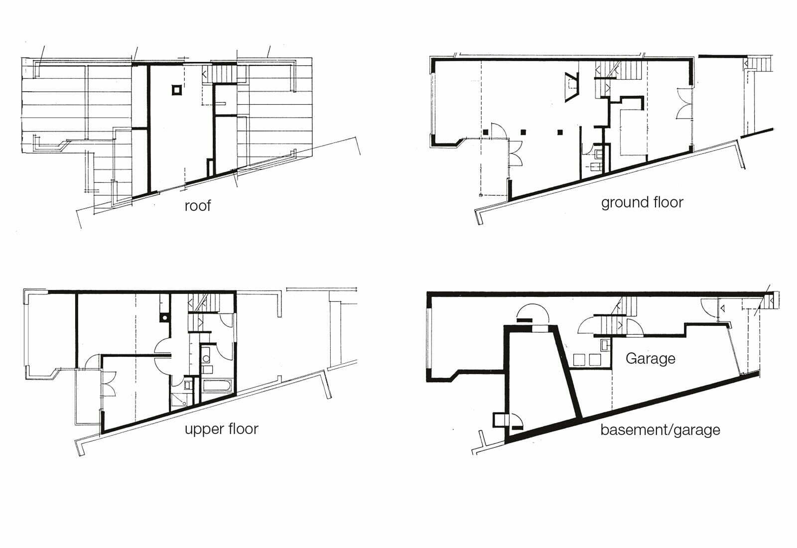
A scheme with 51 row houses with 2 to 5 bedrooms was constructed at the edge of a rural community. The houses measure 5.50 m in width and have a north-south or east-west orientation. By staggering the houses in plan and section the exposed gable walls allow for windows to give light to the uppermost level. Outdoor ground level partition walls with a wide awning create private outdoor spaces.
Two underground garages with 67 spaces, a 6 by 15 m swimming pool, an open field, playgrounds and a community room are shared by all. The houses take up the dominating tile roofs of the surrounding buildings.
Round village Benglen, 1982
(Zurich)
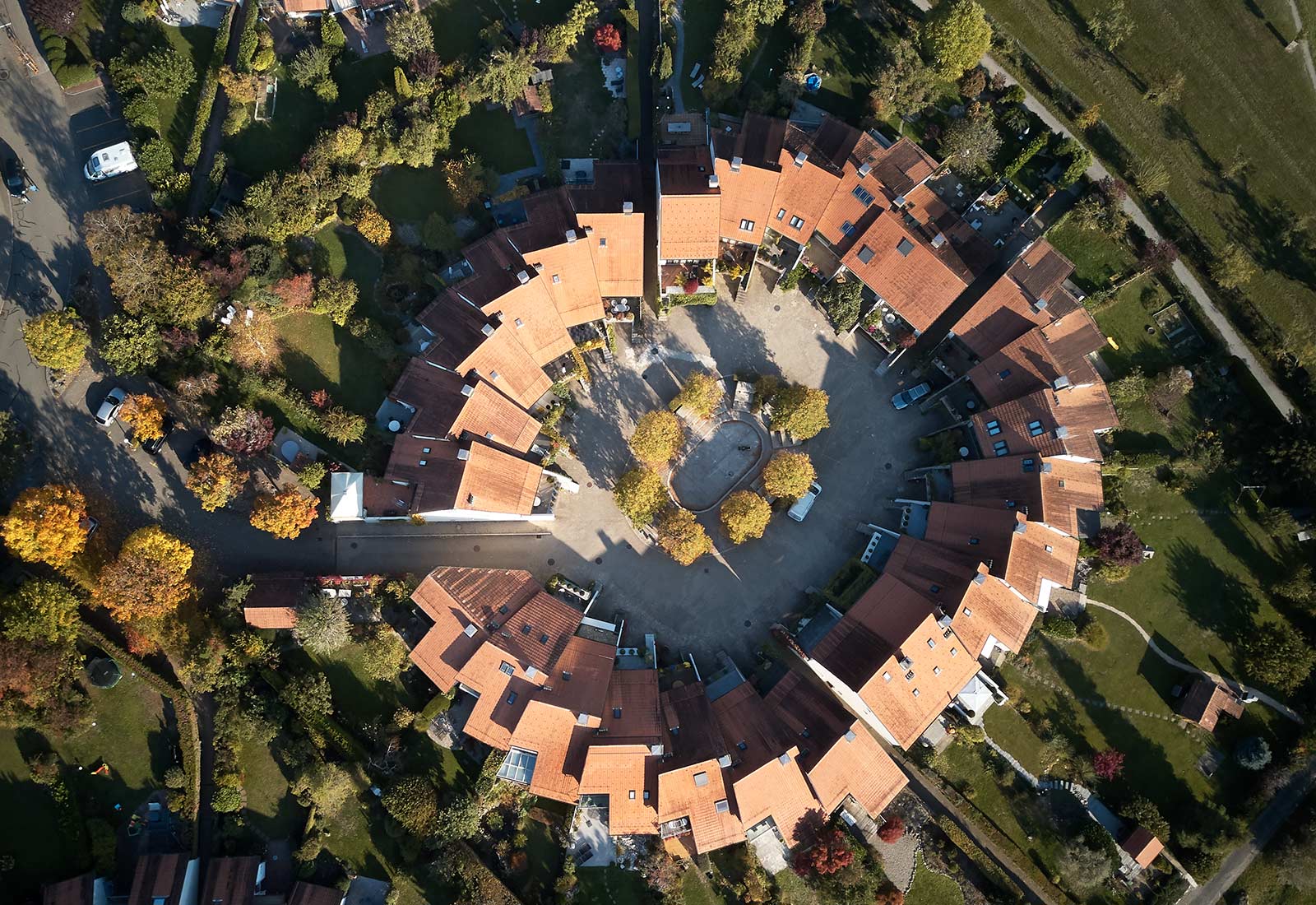
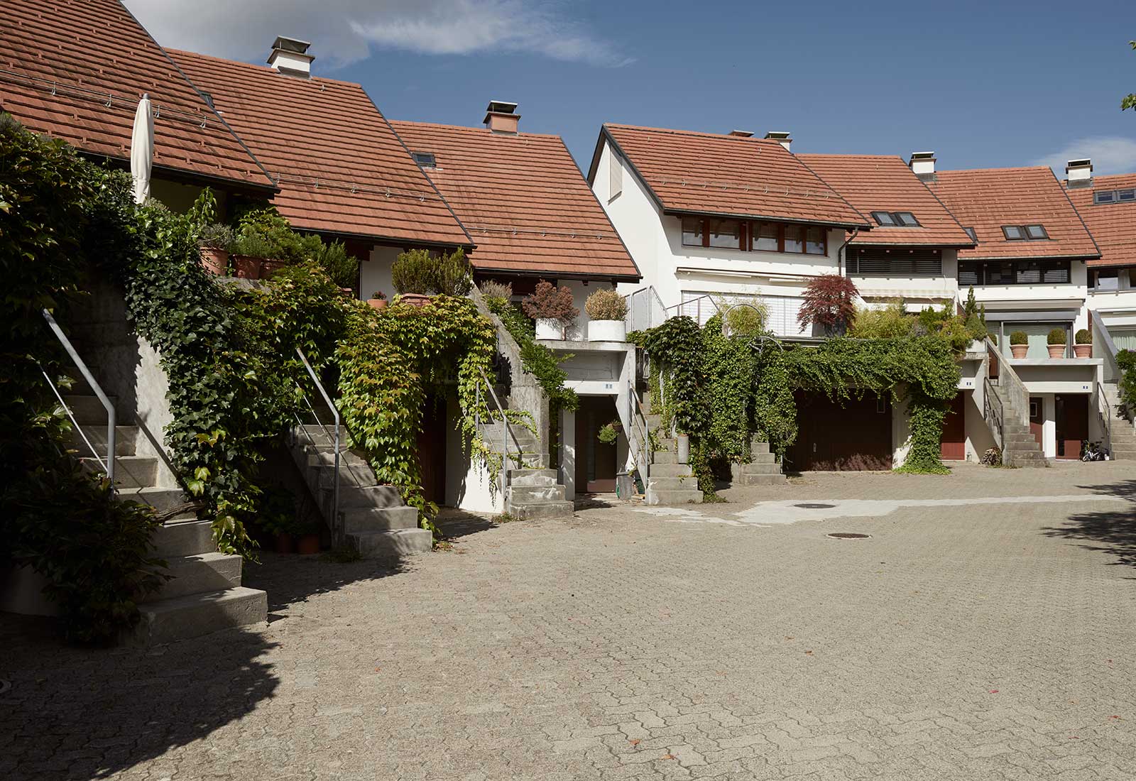
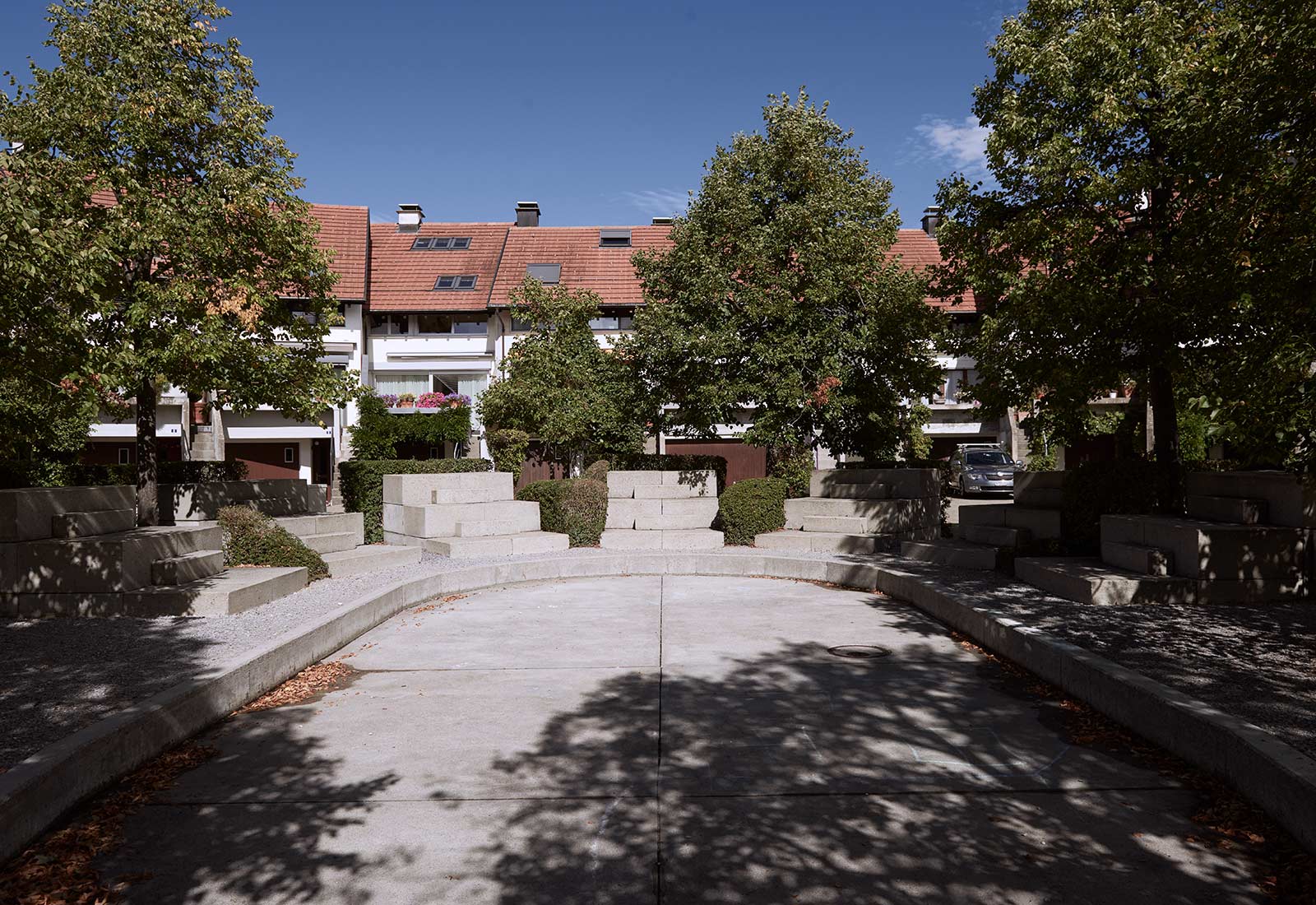
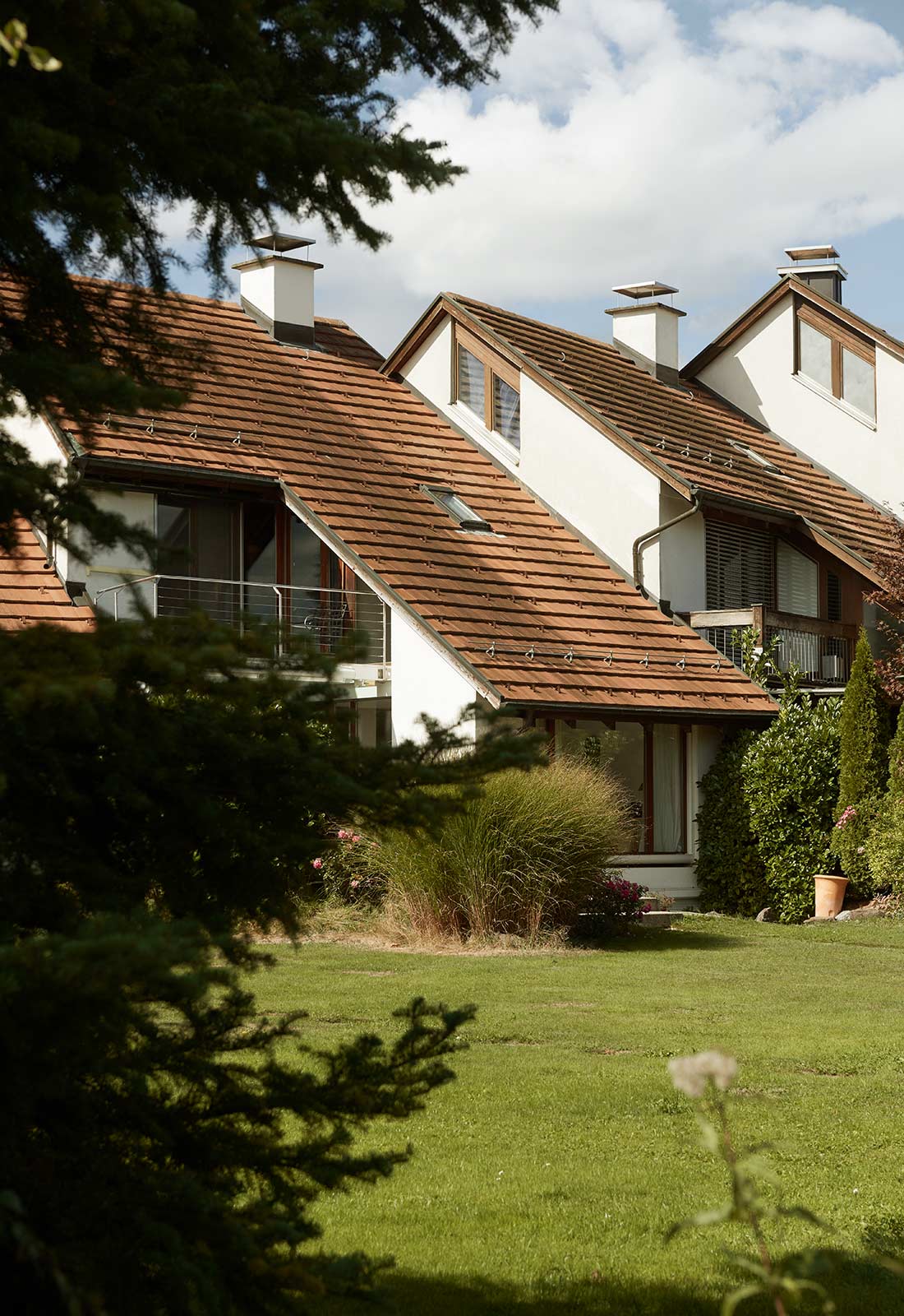
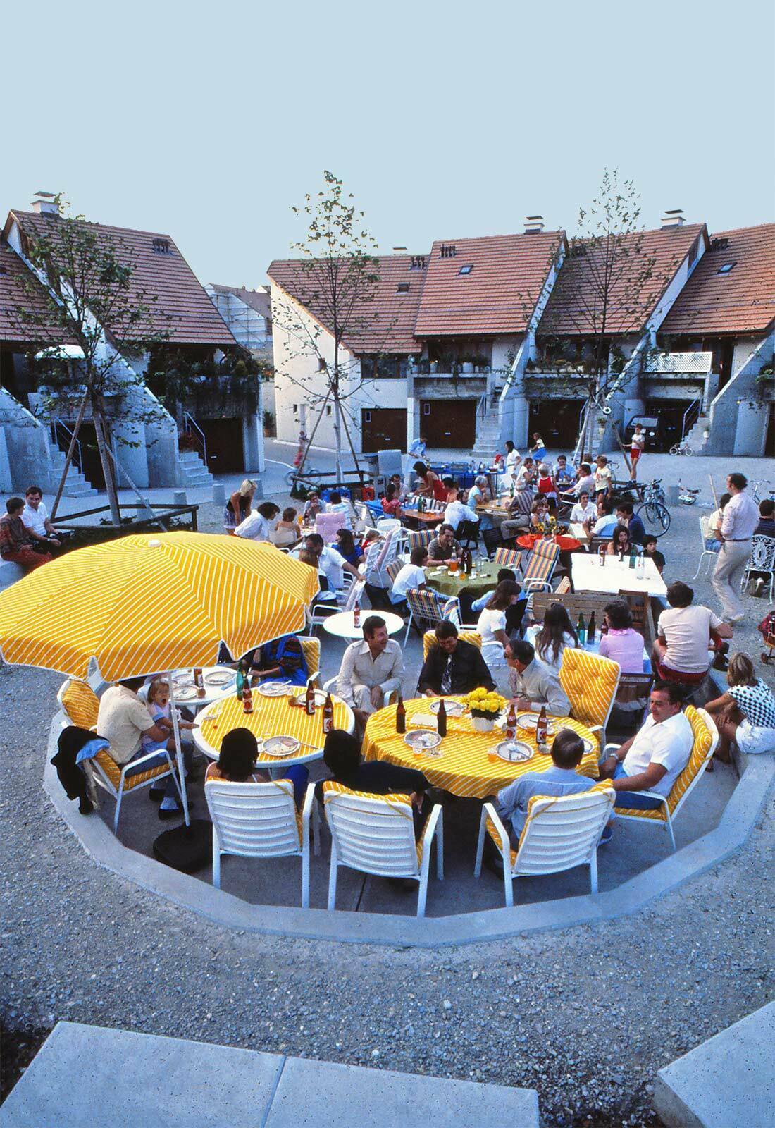
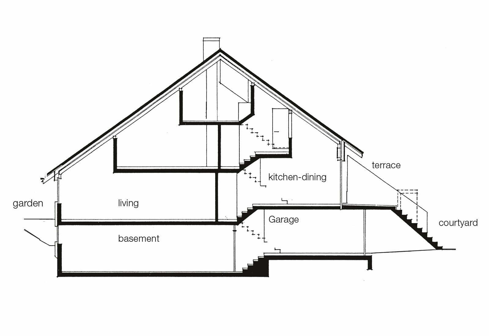
The theme is the contrast between individual and collective, family and community. The wedge-shaped houses open on their narrow side onto a courtyard as a place of entry, play and common activities and participate therein from the upper level terrace. The broad garden side opens onto the private yard and creates the illusion of expansiveness through the wide angle view. The cobblestone-paved, urbanistic courtyard gives access to the garage in each house and serves as a playground, a combination that proved ideal. The village was built for a general contractor with conventional forms.
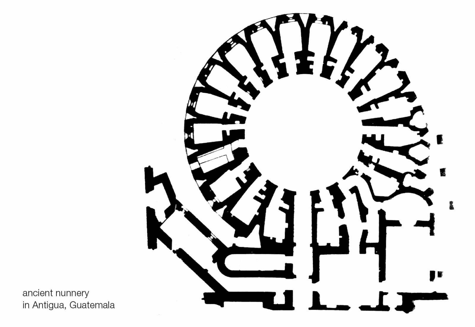
I was inspired by the plan of an ancient nunnery in Antigua, Guatemalan, that I had visited 20 years earlier.
Transformation Neumarkt 17, 1964
Zurich
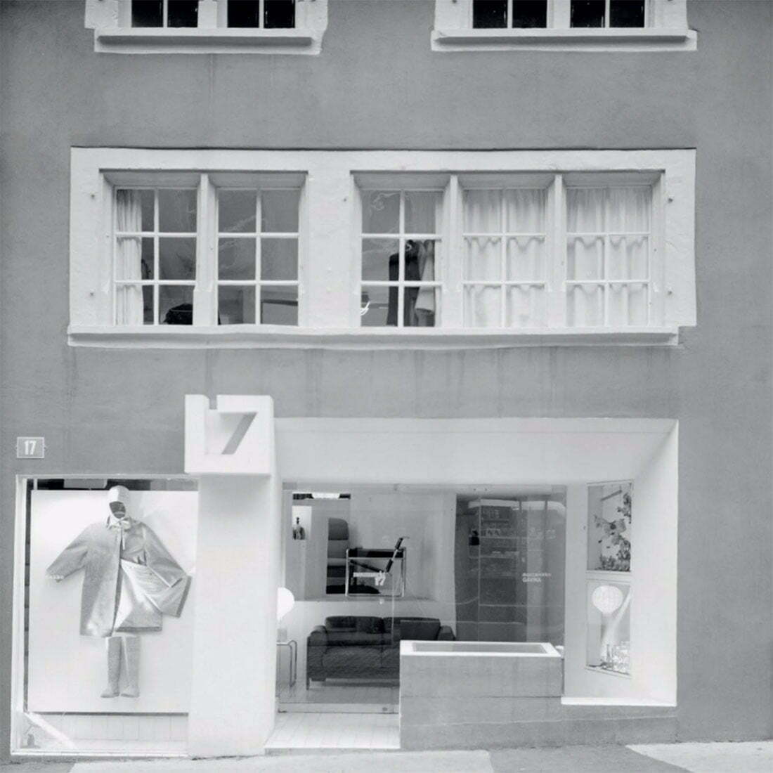
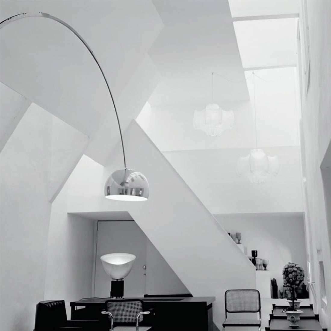
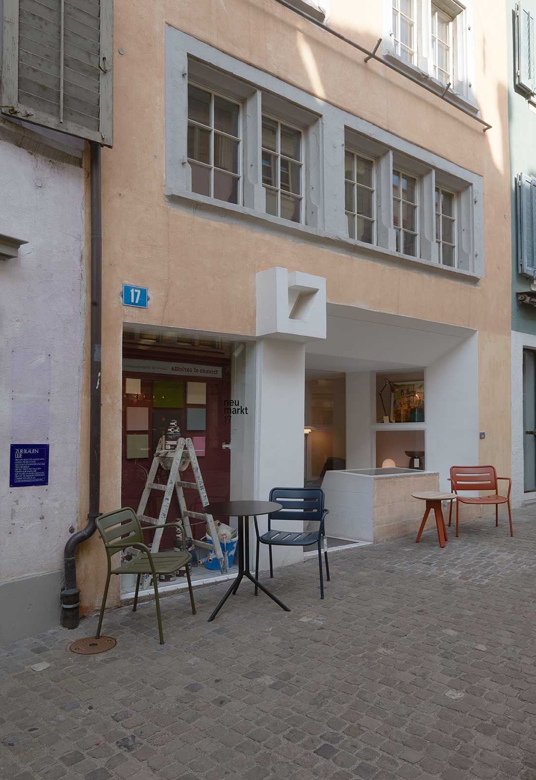
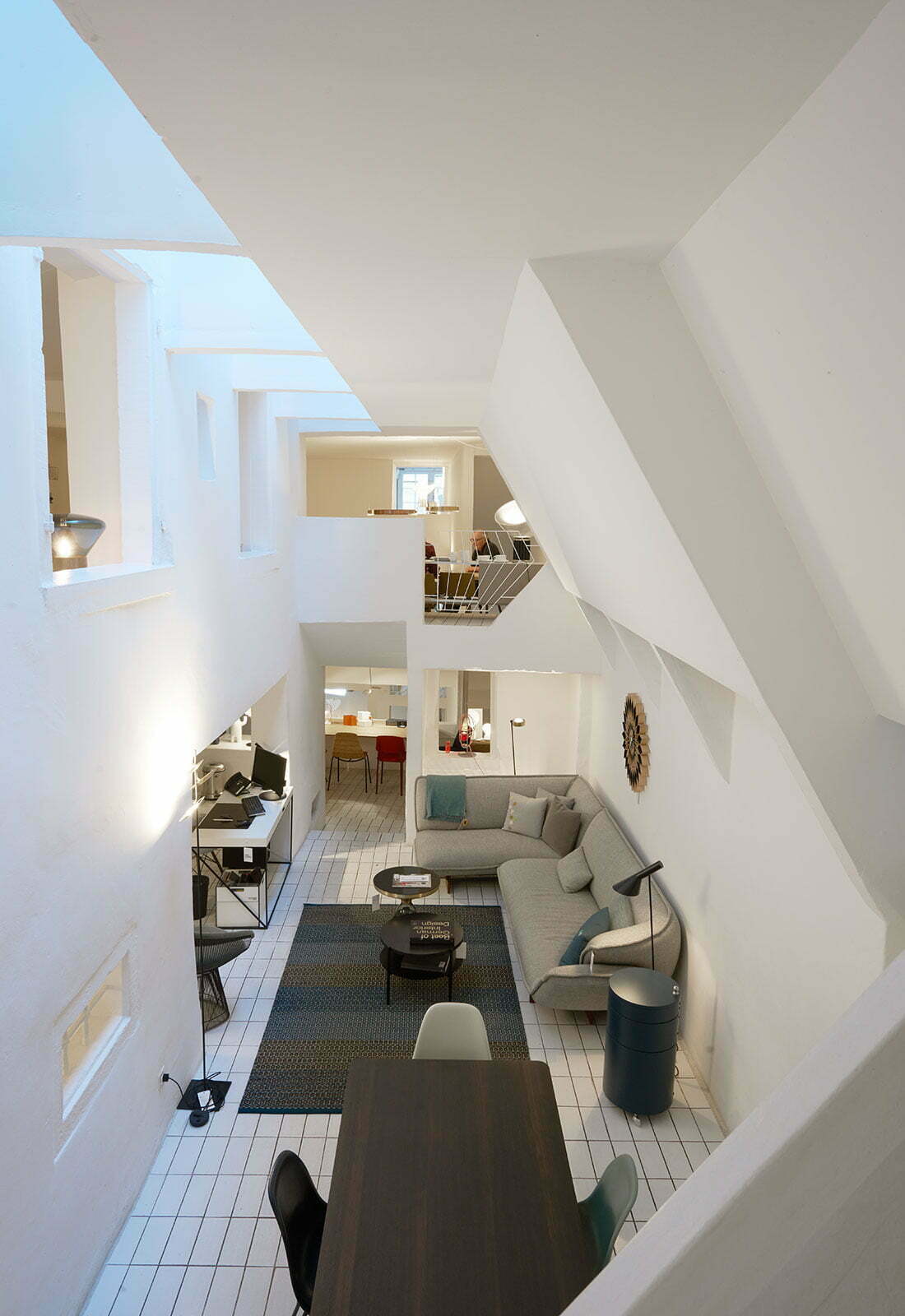
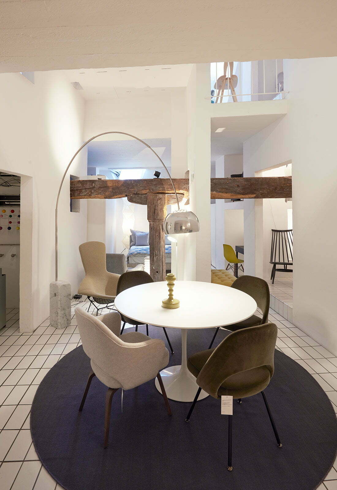
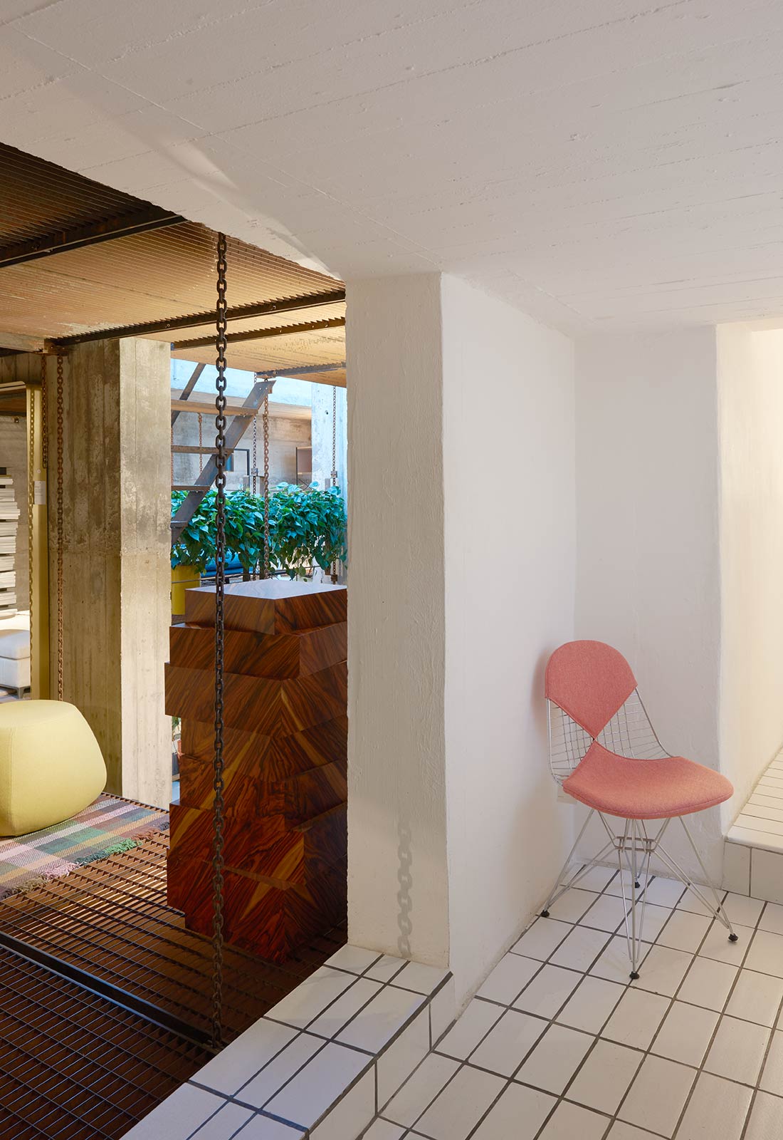
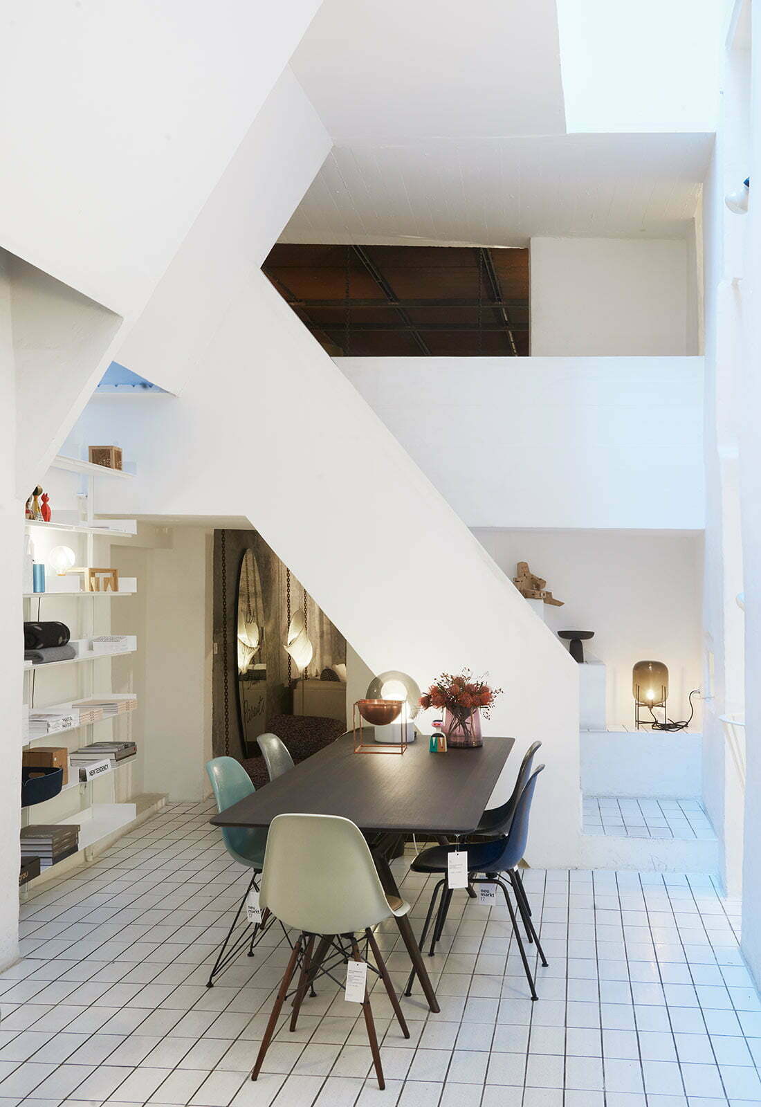
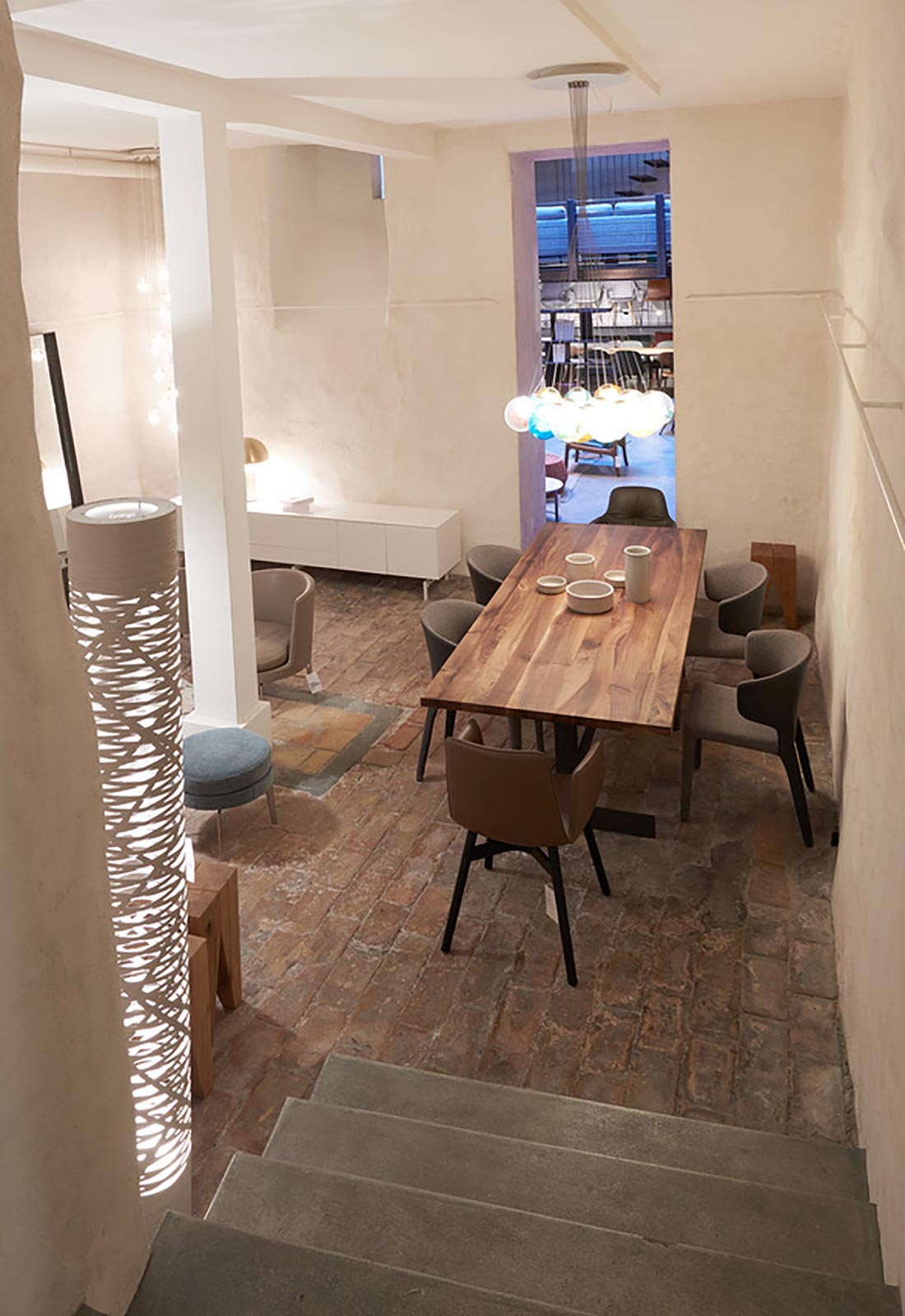
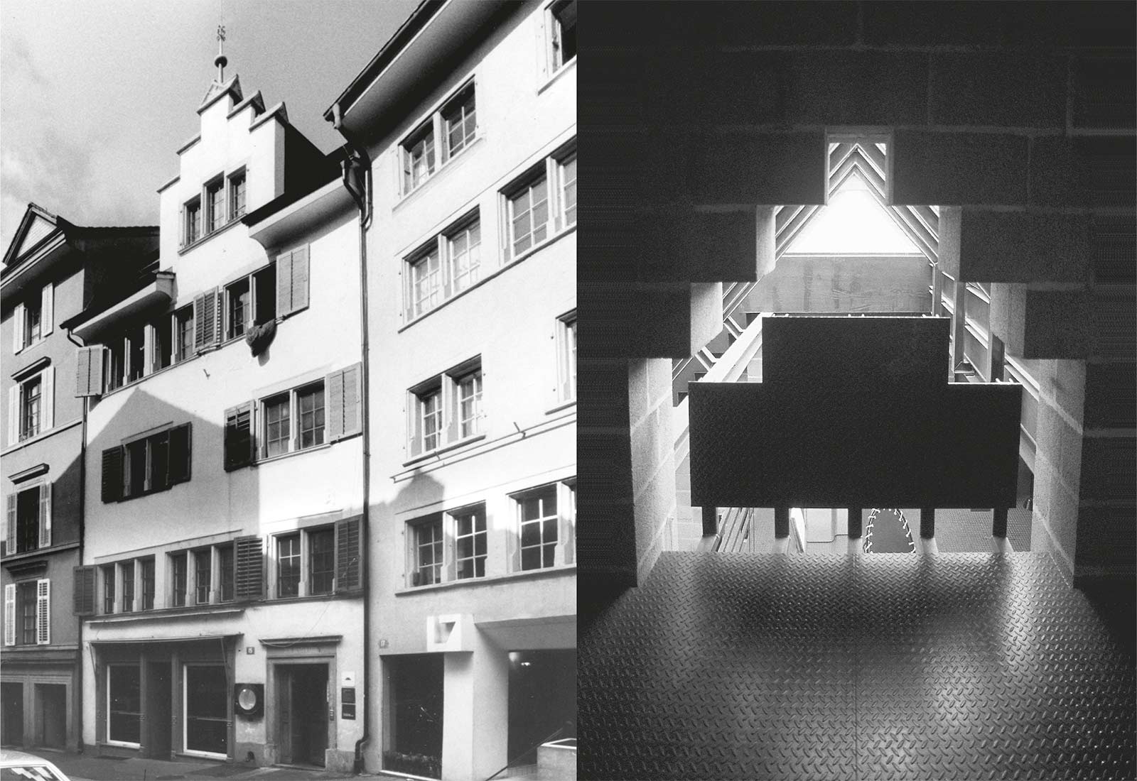
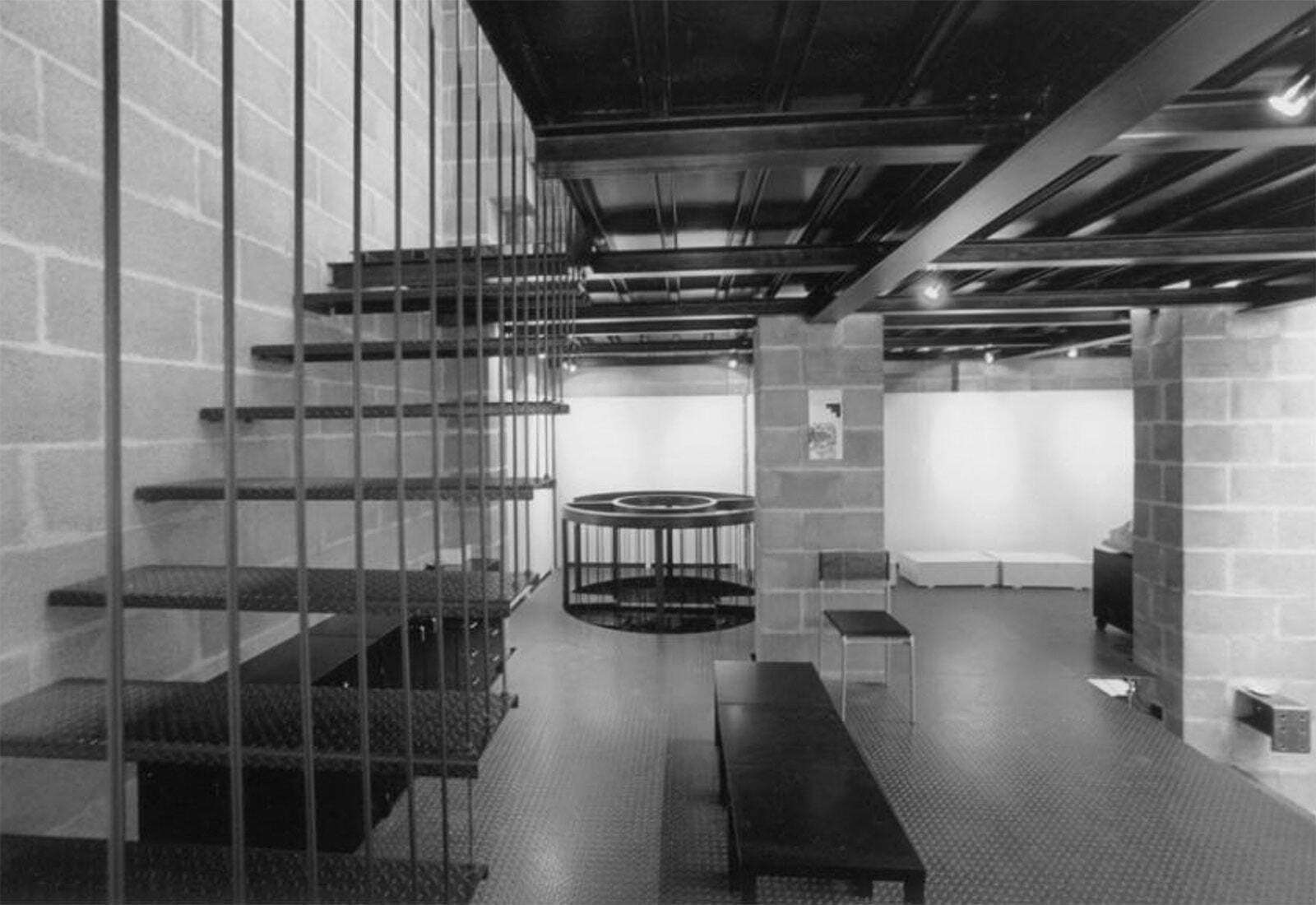
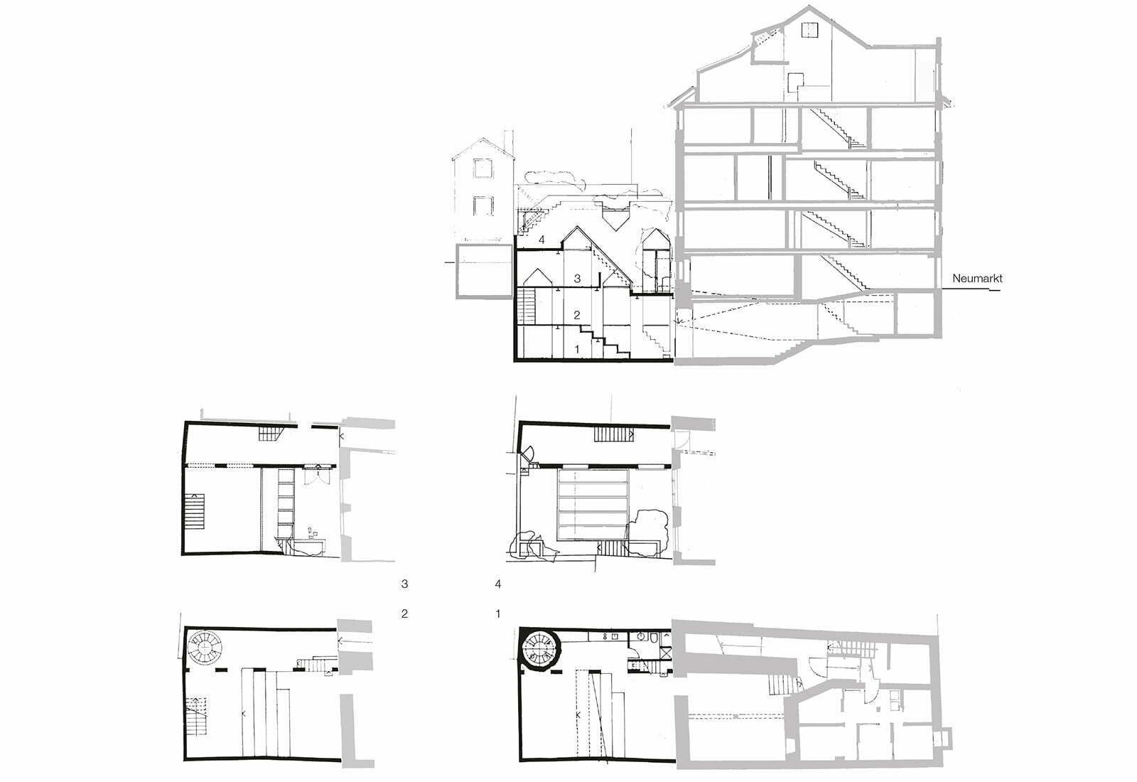
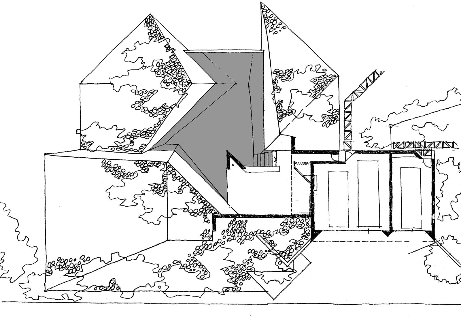
The upper floors of the medieval building were underpinned while the three lower stories were built up from the bottom anew. The rear courtyard was covered and integrated into the sales spaces. Inspired by a remark in a lecture by Aldo van Eyck, I tried to reproduce the contrast and spatial variety of the surrounding street space of the old town in the building at a reduced scale. The project was set in motion by a promise from the
furniture producer Dino Gavina that he would give us the sales rights to his furniture program if we could present the most interesting store design in Switzerland. The project was approved by Piergiacomo Castiglioni, the famous designer in Milan. The sculpturally designed walls and ceilings are white while the floors are covered with white tiles.
Though the store is highly dysfunctional for display purposes, it still attracts many customers after 40 years through its unique design. This transformation would not be possible today. So it is a document of the loss of freedom dealing with old buildings substance.
Showroom Predigergasse, 1978
Zurich
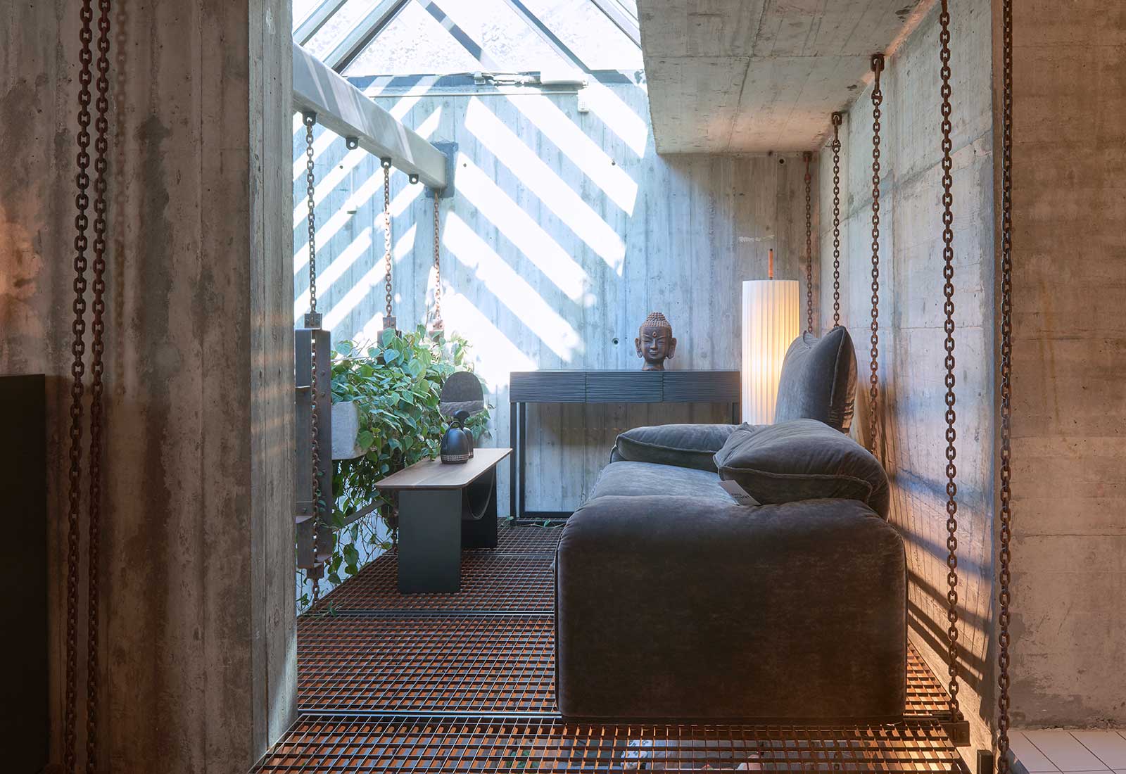
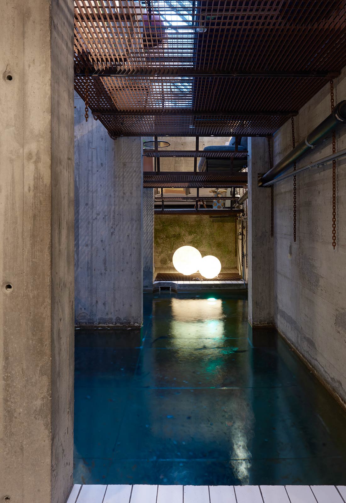
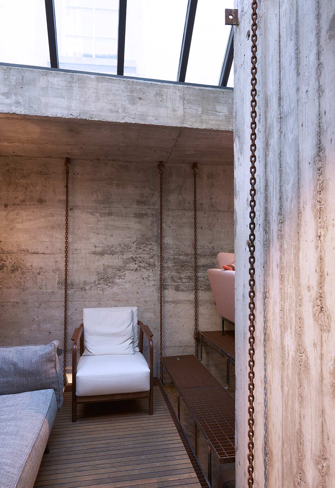
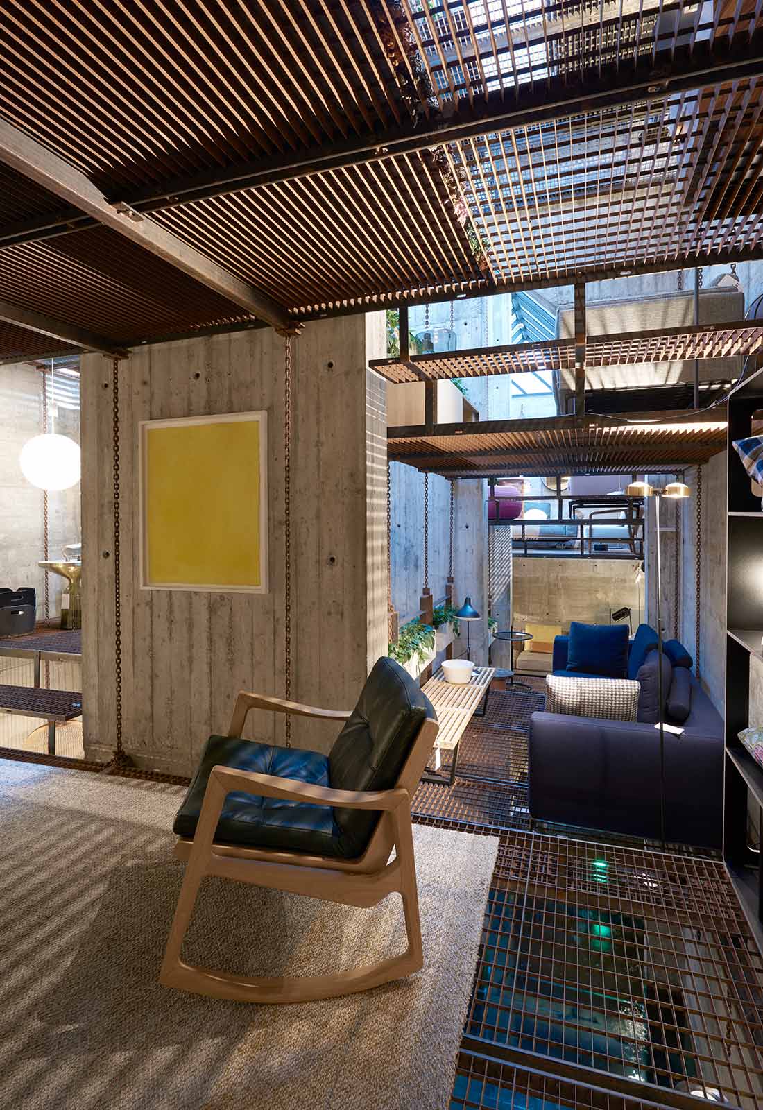
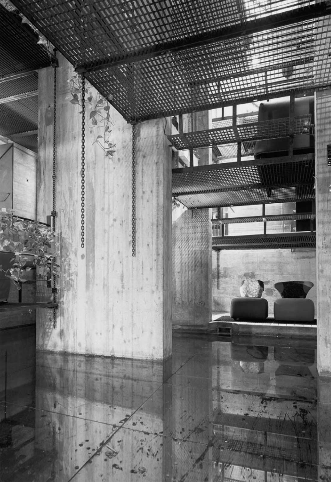
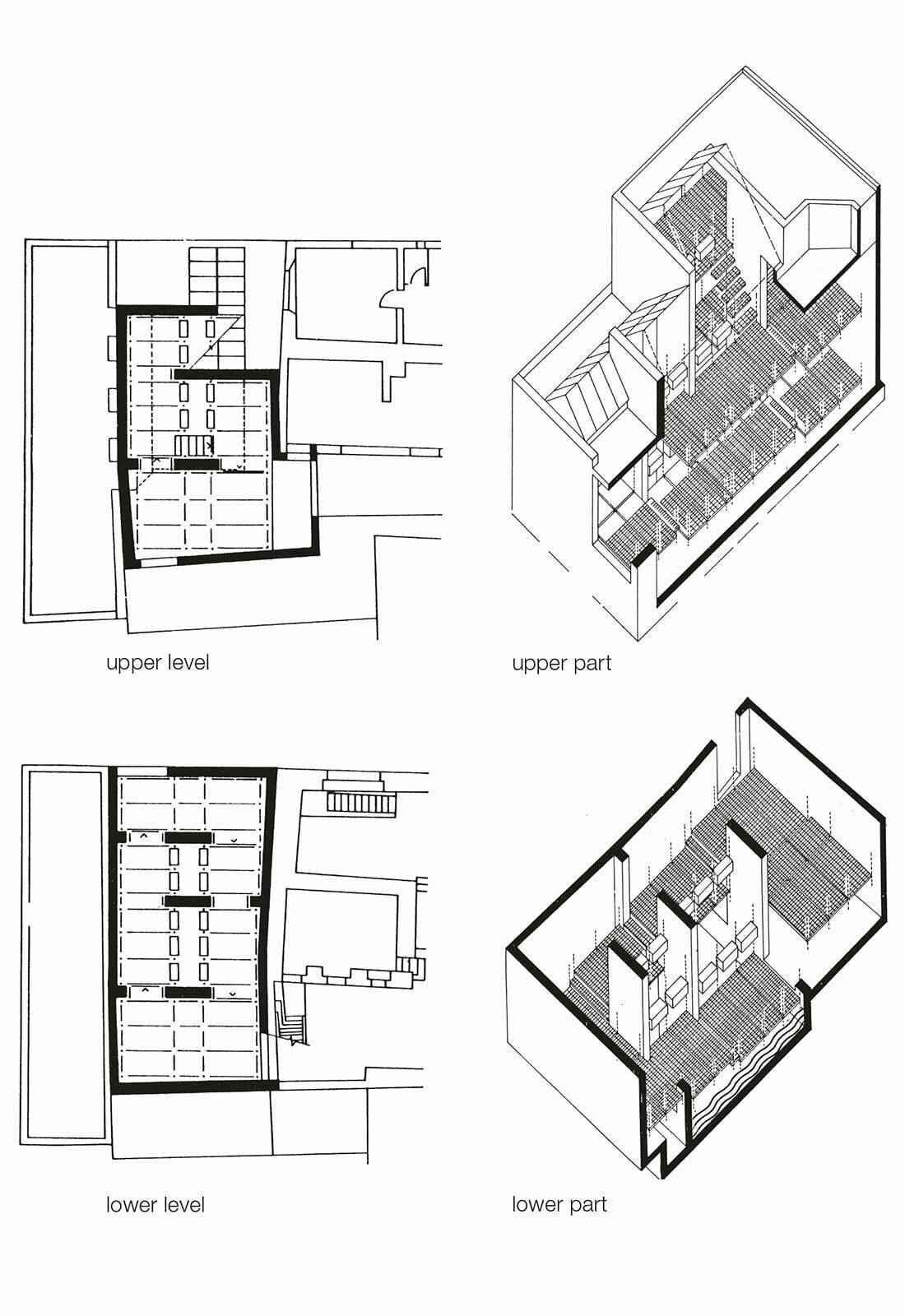
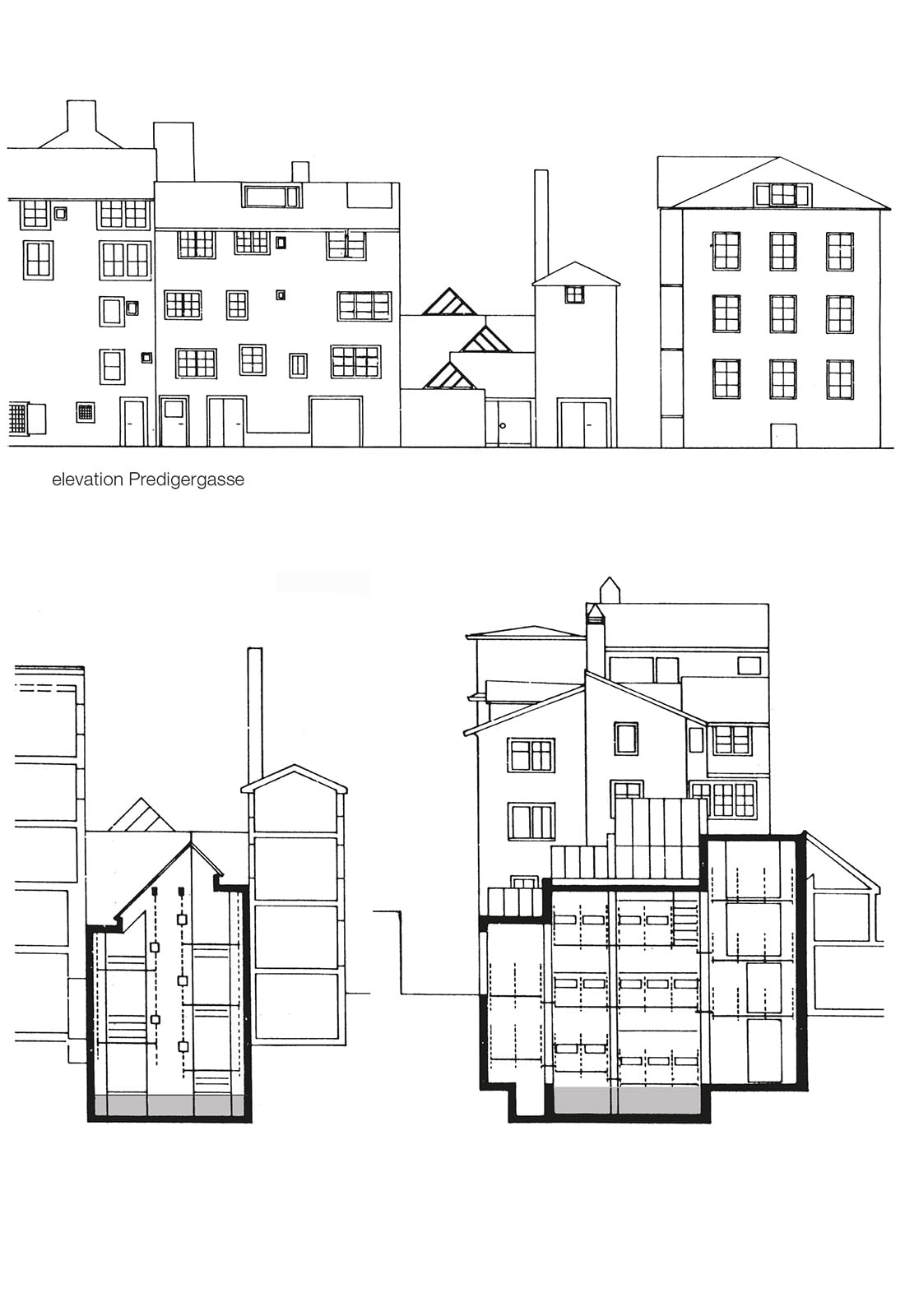
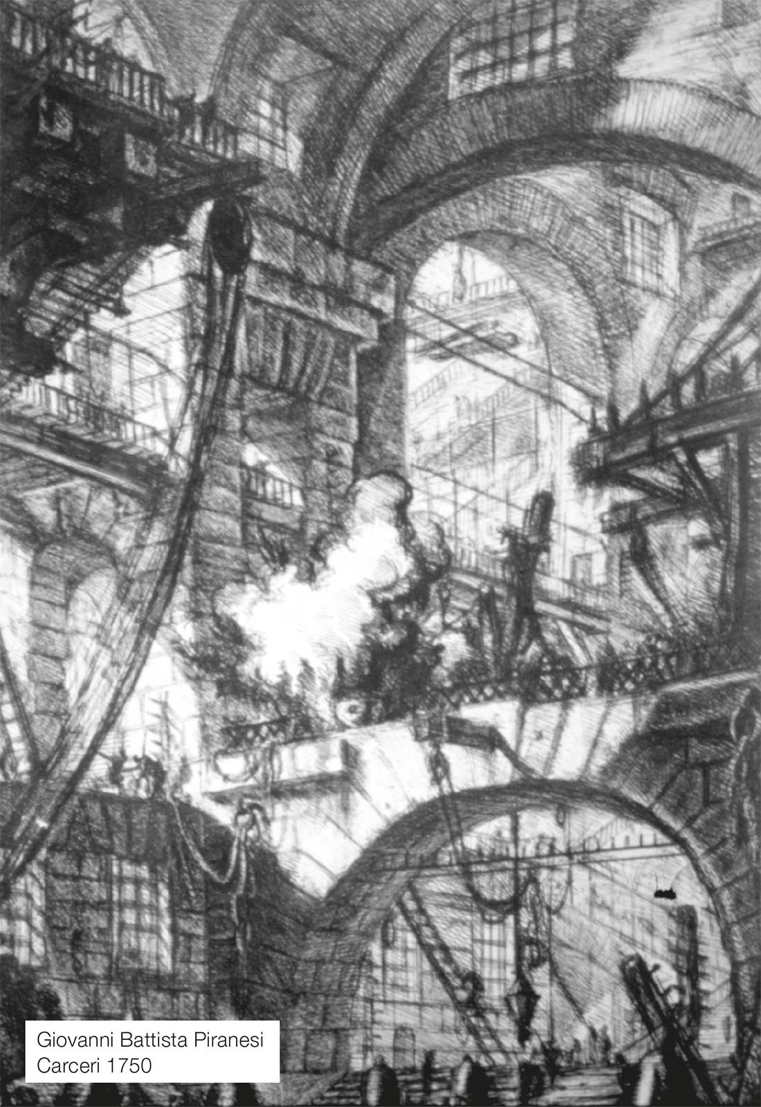
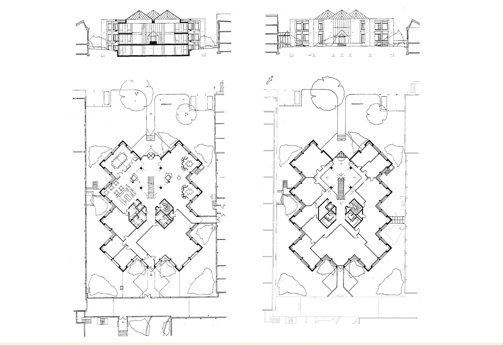
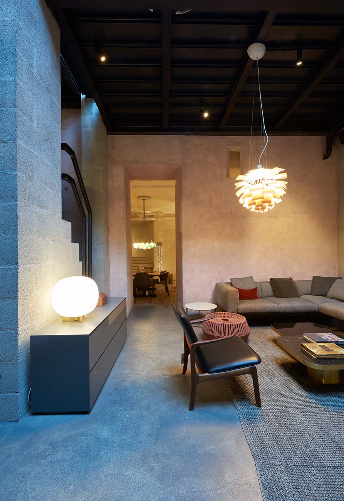
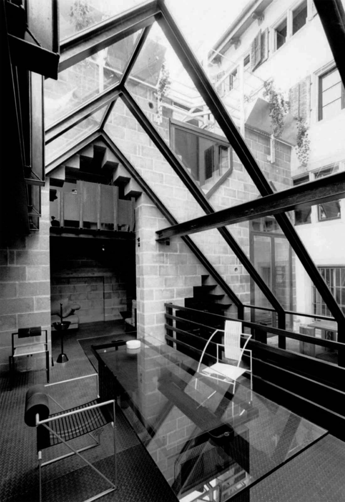
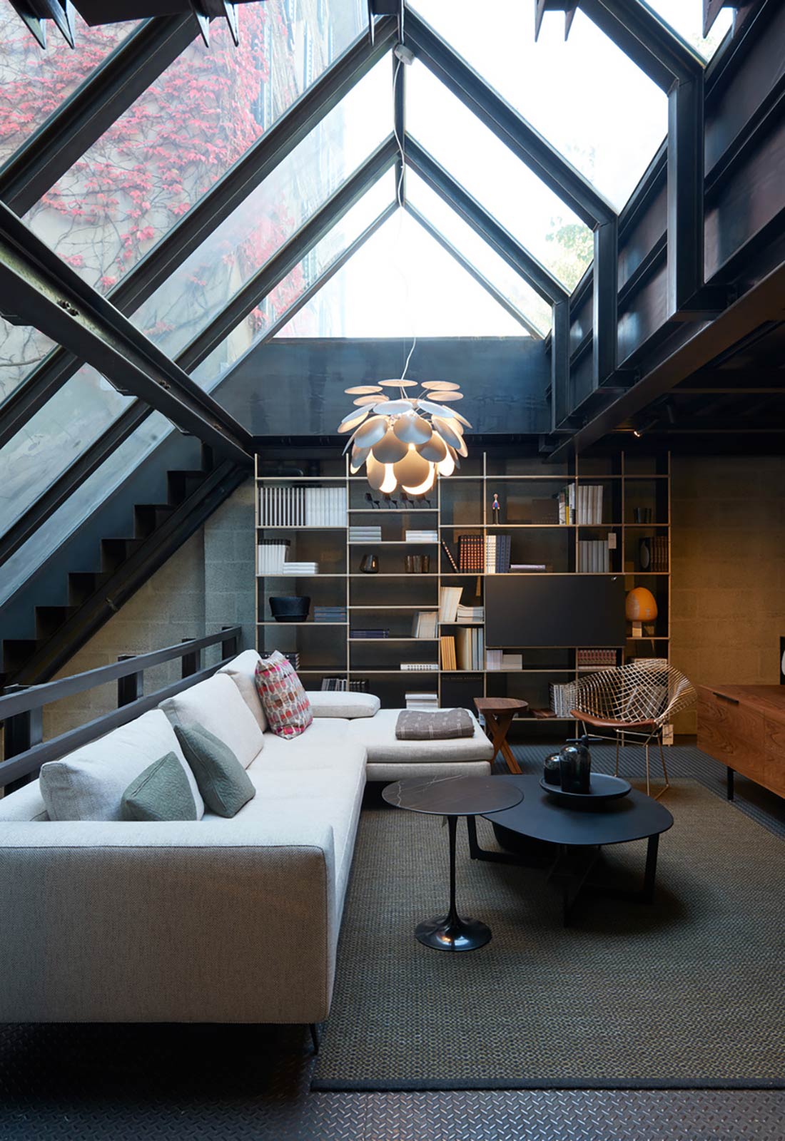
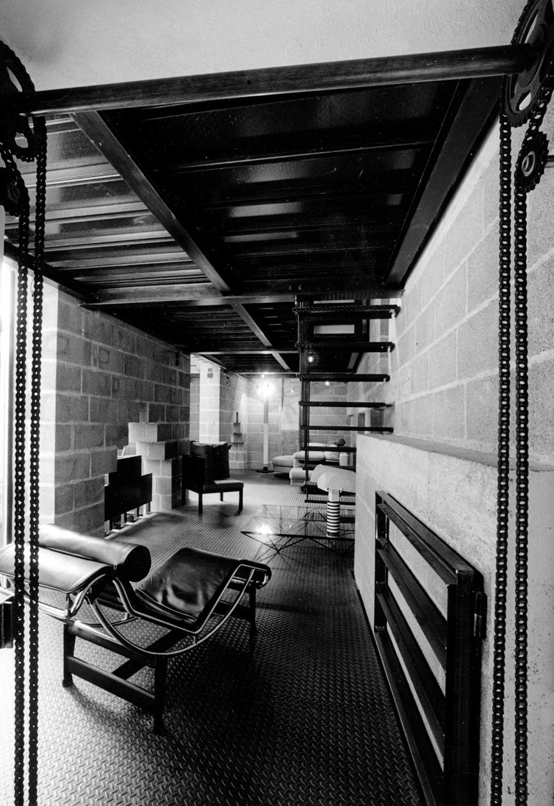
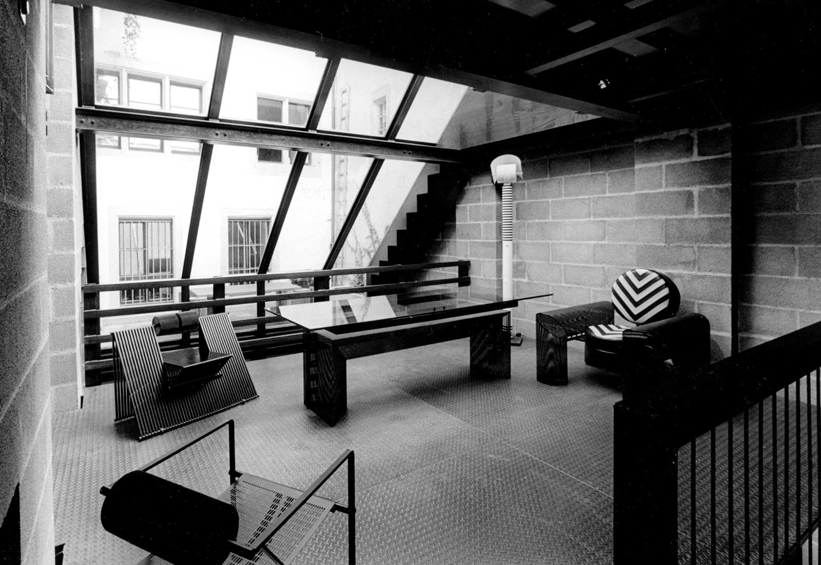
The small addition to a furniture store on a lot of 6 x 12 m enclosed by higher buildings in the Old Town was inspired by two sources. It is a reverence to Giovanni Battista Piranesi whose carceri drawings deeply impressed me. I tried to recreate the impression of light breaking into a mysterious space from high above.
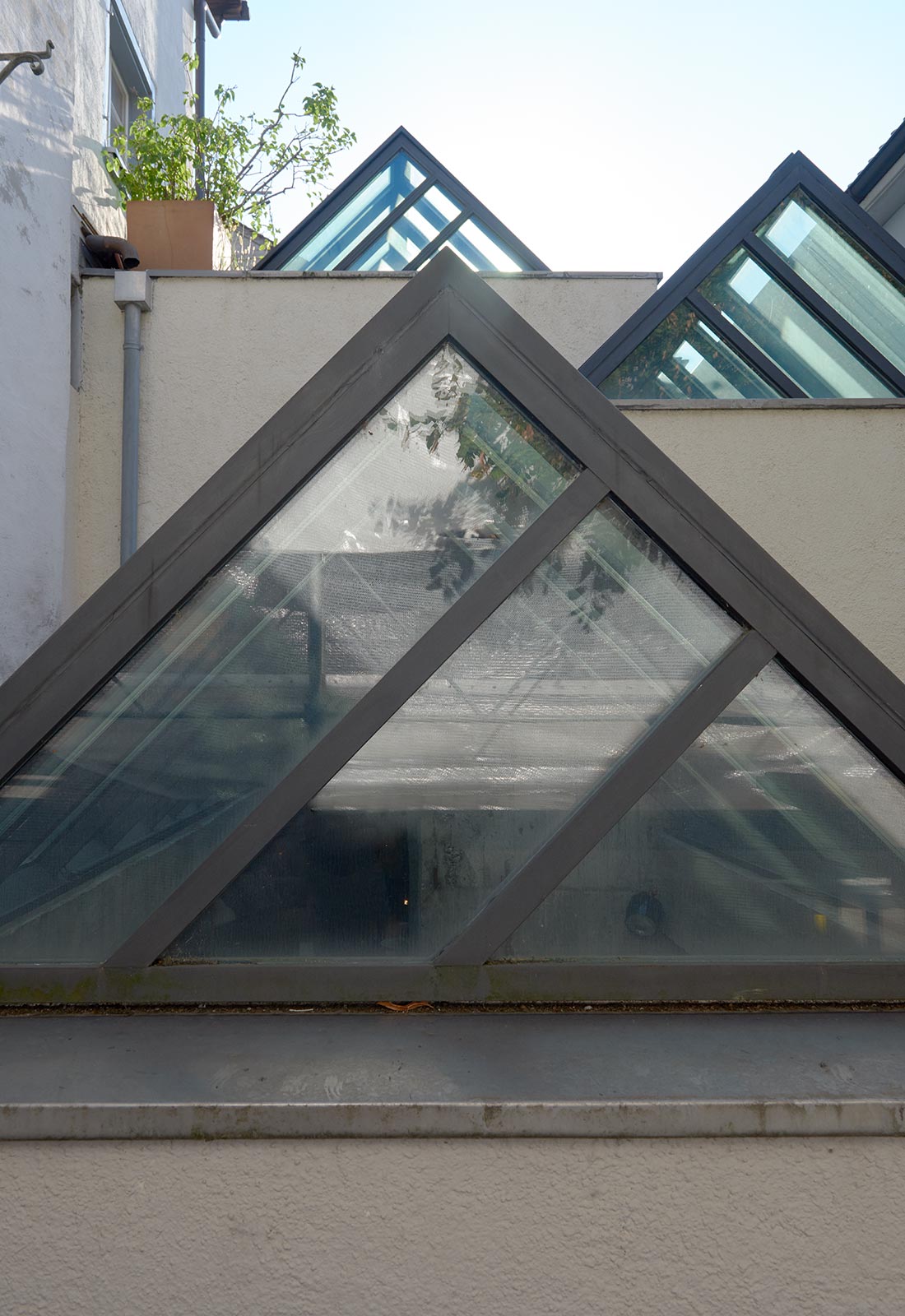
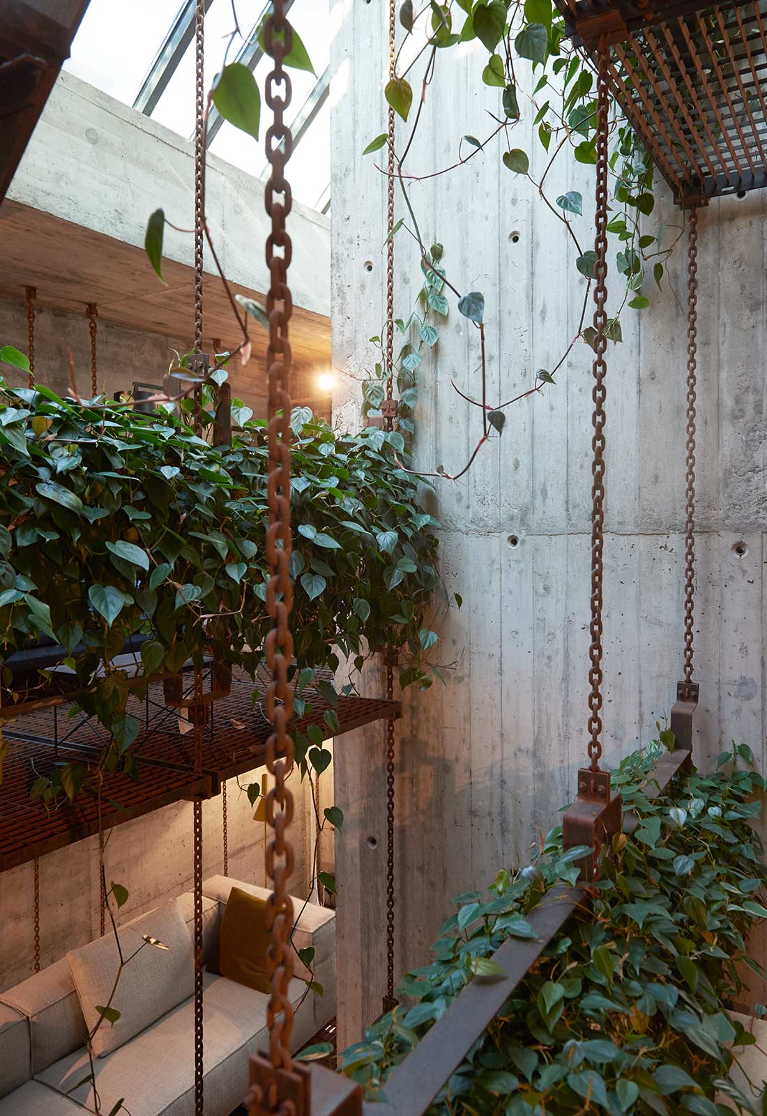
On the other hand it was obvious in a totally enclosed space, where only the sky and the earth, the above and the below have significance, to deal with gravity, the pervading force in making buildings. Heavy eight-meter-high concrete pillars carry the roof to which metal grate floor elements are attached with delicate steel chains climbing and turning spiral-like over three turns. The balance of pressure and tension creates the feeling of harmony. The light enters the space through a series of glass pyramid-shaped staggered skylights. Water – gravity’s most obedient element – collects in a pool at the bottom with a mirrored floor to reflect the light back upward. At the same time, large-leaf plants in 20 suspended planters let their leaves fall lazily to the water below.
Office GGK, 1981
Zurich
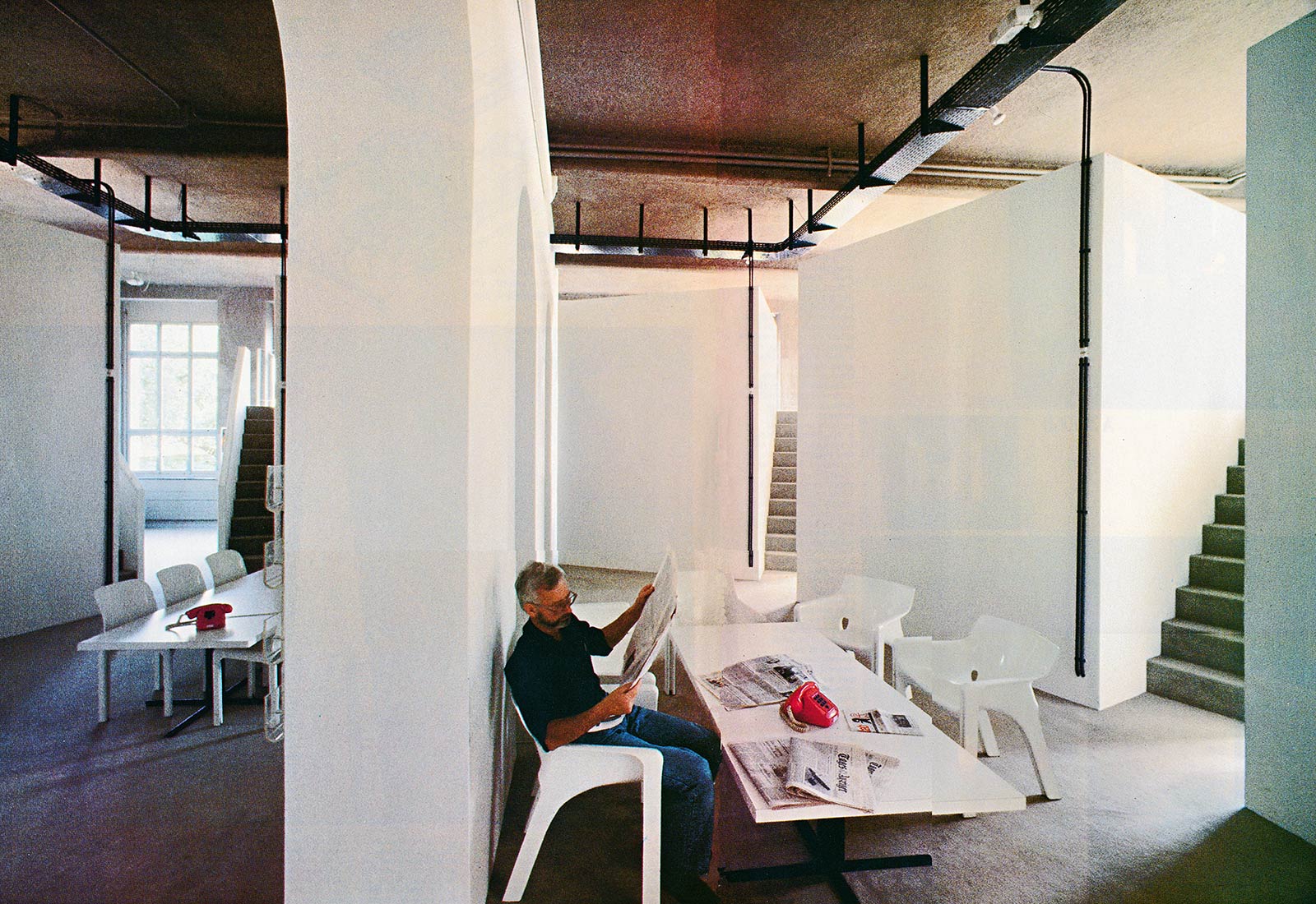
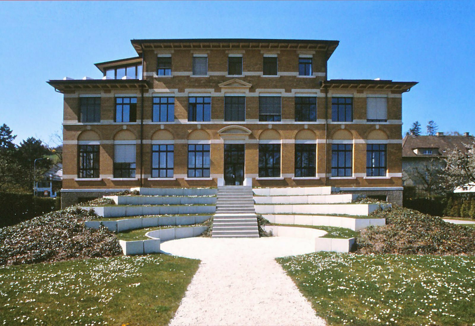
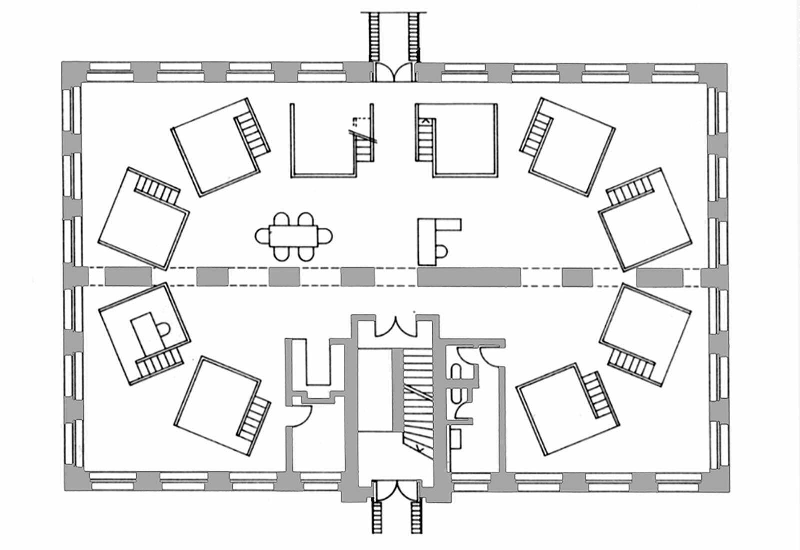
In a former industrial building built in 1910 on the shore of Lake Zurich the lower floors were modified to accommodate an advertising agency while the penthouse was to become the owner’s apartment.
The design takes place on two different levels: one being the meaning of the activities of the firm and the other being a topographic dialogue with the site. The GGK under Paul Gredinger was among the world’s most innovative companies at the time and sought a corresponding architectural presence.
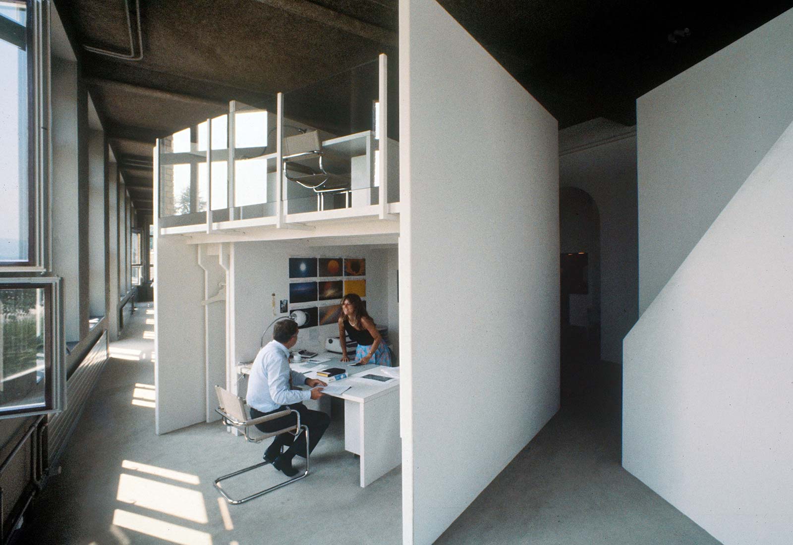
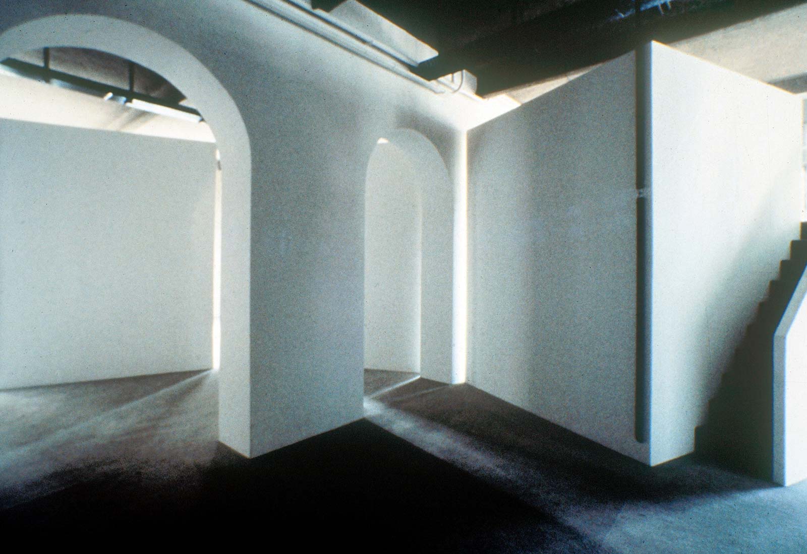
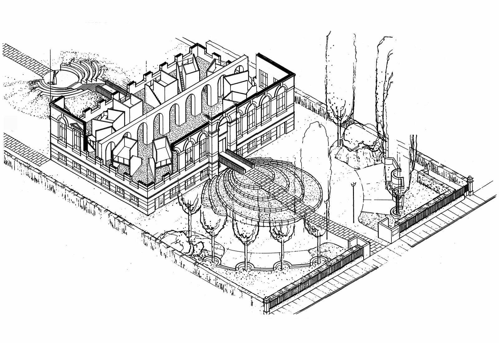
I tried to express the idea of the worldwide market conquest of products and services through advertising with the forms of colonial architecture and came upon the instruments of the Roman Empire: the aqueduct, the arena and the Circus Maximus. The existing spaces on the ground floor were complete removed while the access from street and the exit to the lake were newly designed. The existing arched opening in the central bearing wall was repeated to suggest the impression of a aqueduct. The 10 two-story work cubicles were freely placed in the shape of a flat ellipse forming a square in the center for reception and communication the form of the Circus Maximus. They are open towards the outside and closed towards the square thus emphasizing the contrast between individual work and communication.
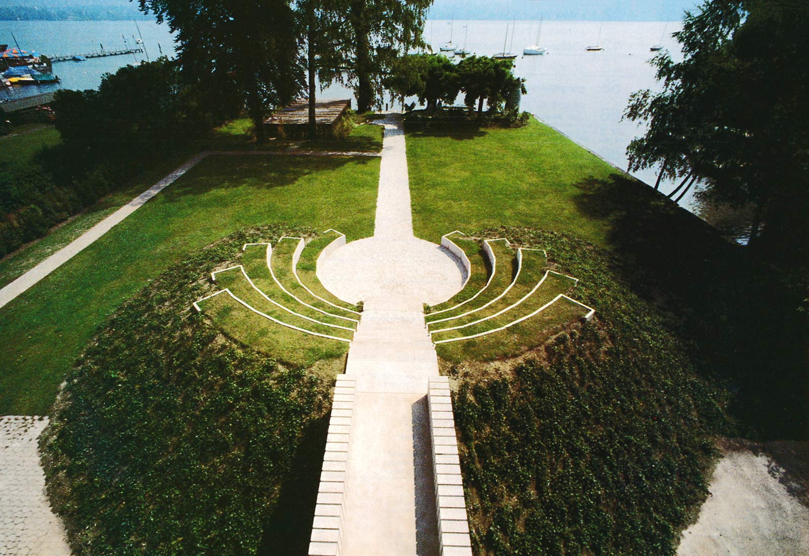
The access from the street to the slightly raised ground floor leads over an artificial hill and a concrete bridge while the exit to the lake leads over a similar bridge and through a small arena. The contrast between land and water was emphasized by means of contrasting circular convex and concave forms.
Penthouse apartment
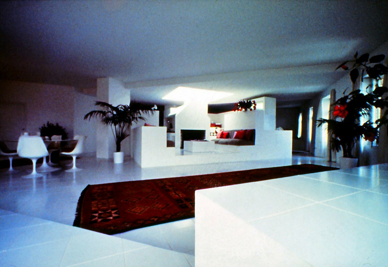
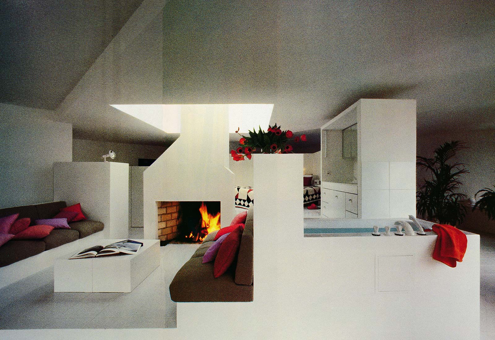
In the penthouse apartment I tried to separate functions from space. The existing apartment were removed down to the staircase and ancillary spaces. The floor of the open space was covered with white tiles. The foor functions of cooking/dining, living, hygiene and sleeping were pressed into a spatially minimized furniture-like square cabin measuring 5.7 m by 5.7 m that was placed diagonally in the centre of the space beneath a large pyramid-shaped skylight. The foor areas are grouped spiral-like about a central fireplace, clilmbing two steps between each space. Depending upon one’s whim, the surrounding empty space can be decorated with flowers or objects on exhibition such that one has an exiting view out into an artificial landscape from the central cabin. Two lake-front terraces supplement the spatial collection.
With this concept an opposite behavior was pursued with respect to the work spaces on the ground floor. Here the middle is occupied and not empty; the light enters into the space from the central skylight instead from the windows in the facade.
Office Creation Baumann Langenthal, 1984
(Berne)
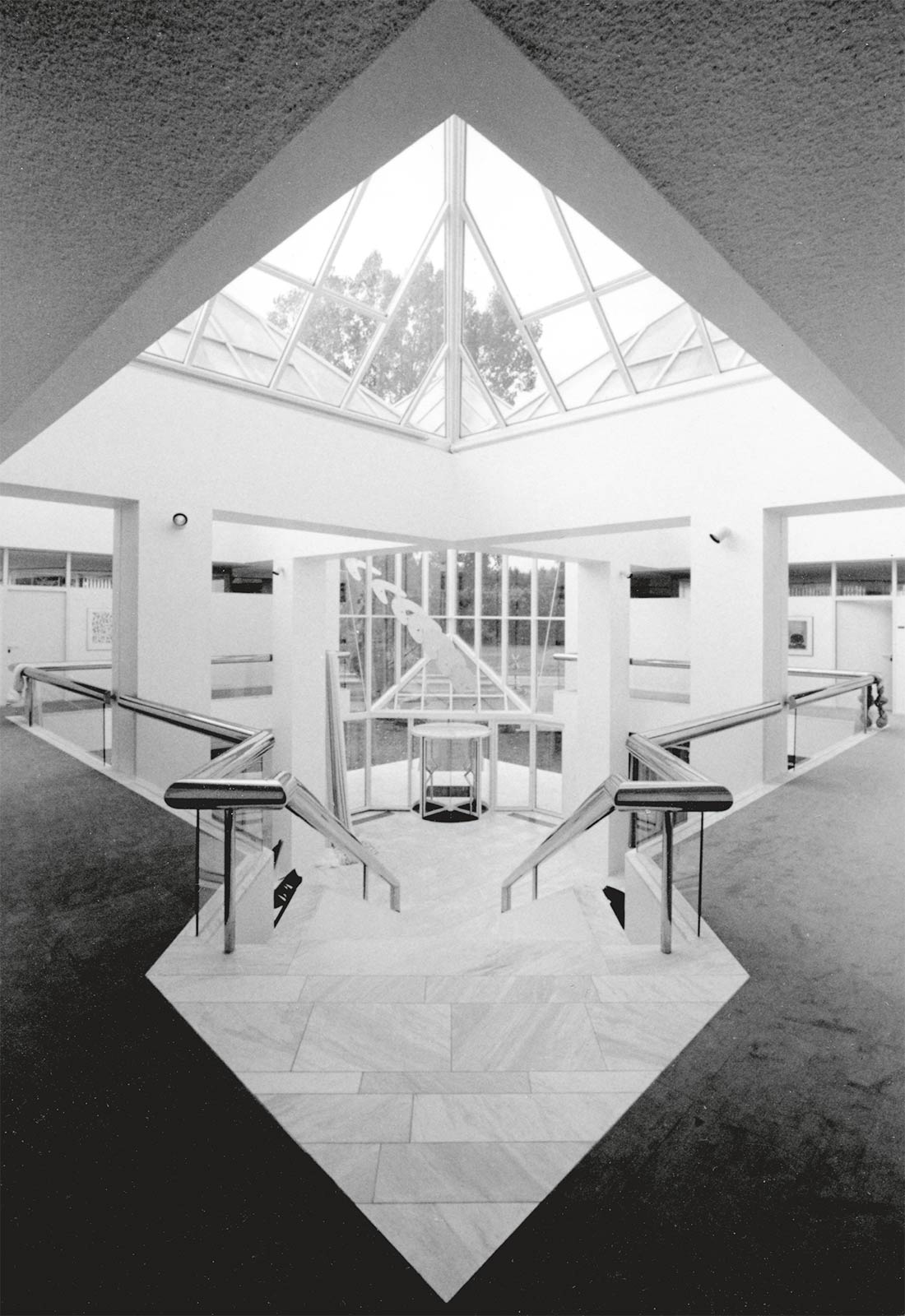
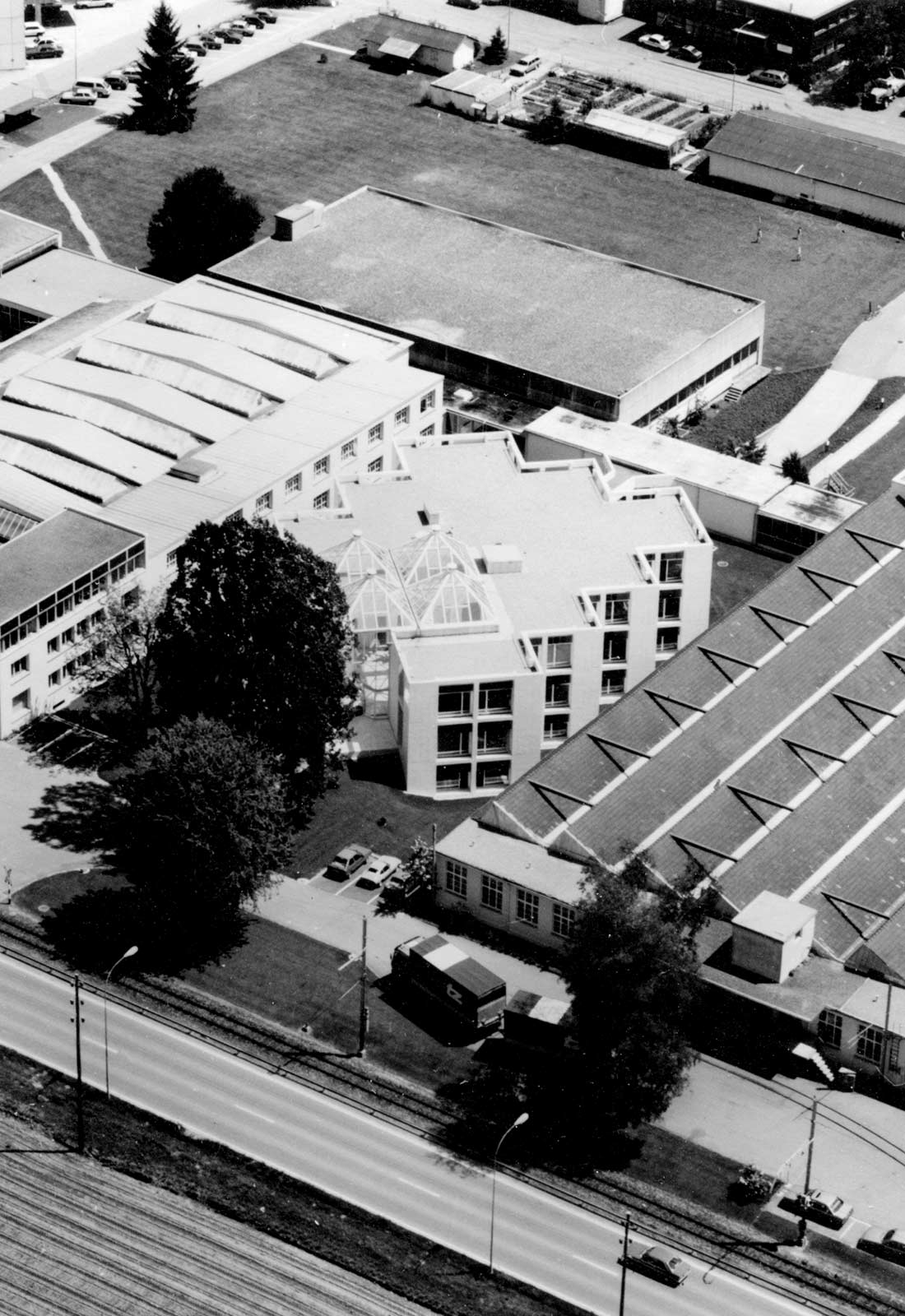
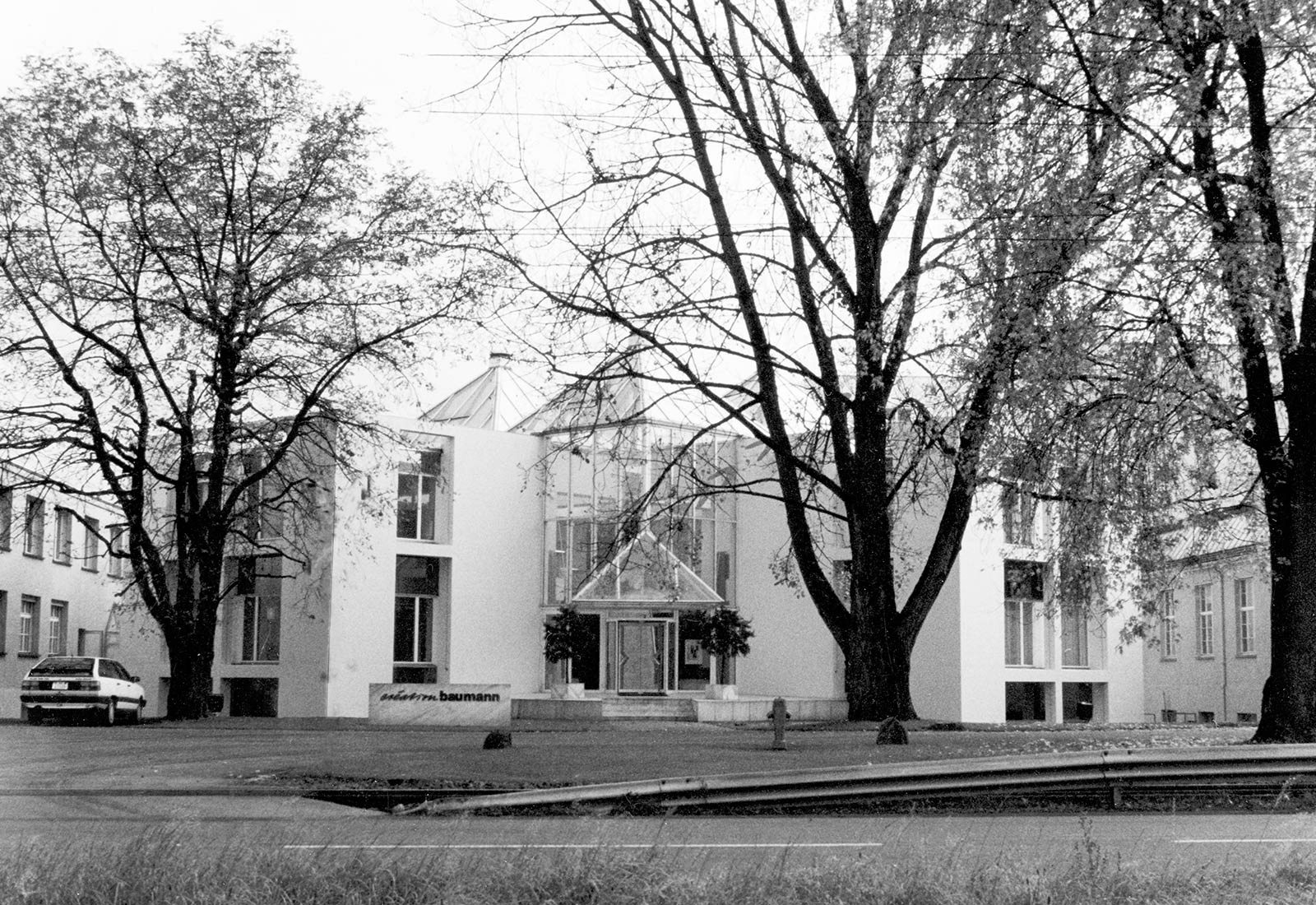
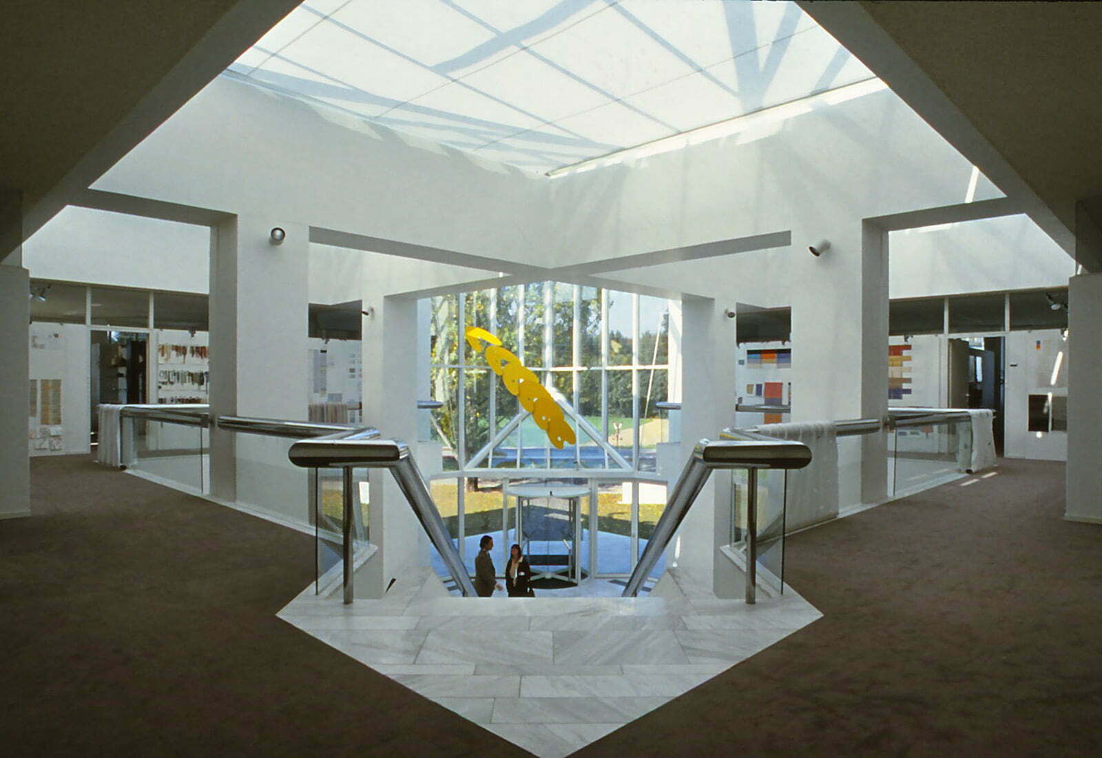
Showroom and administration areas were conceived as the heart of the company on a hithero empty site at the center of the factory grounds. Rotating the plan by 45° emphasizes the building’s importance and allows for an interesting relationship between old and new. The showroom celebrates daylight as the impetus for
the production of curtains with foor large glass pyramids. Their multiple number refers to industrial serial production.
The integral artwork by Ueli Berger presents the twelve-step transformation of an artist’s color pallet into a boomerang that is being hurled from the showroom out into the world.
Addition Neumarkt 15, 1987
Zurich
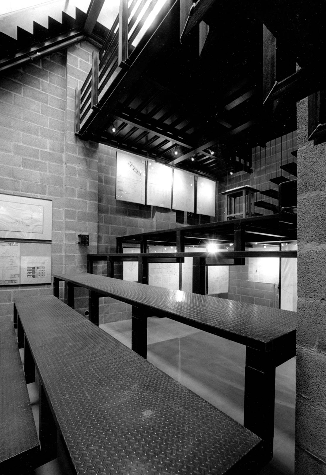
The addition to the back of a medieval building houses exhibition spaces and a small auditorium in the lower part and offices in the upper part. The Forum is completely surrounded by higher buildings and receives light through a large skylight. The roof is formed by a series of three terraces that rise spiral-like upward and which serve the apartments in the main building as an outdoor space.
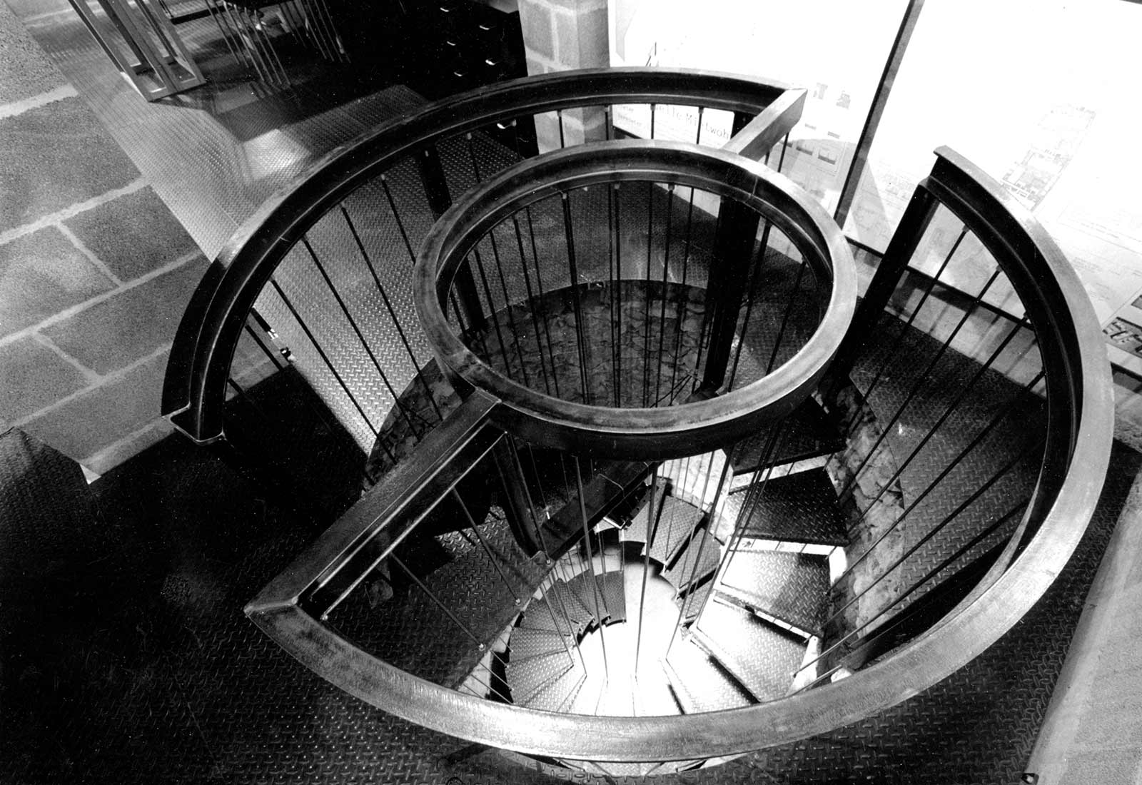
Two special features are the drawbridge, giving access to the upper or the lower level according to the use of the spaces, and the old well from the Middle Ages which was made accessible by a double spiral stair. All building materials had to be carried through the doorway of the main building (large cement blocks for the walls, steel beams and plates for floors and roofs). All steel was left untreated. The minimal 5 mm floor plate thickness allowed the maximum use of the limited building height. The construction in uncovered steal was possible thanks to fire exits on all levels.
Private swimming pool, 1967
Langenthal (Berne)
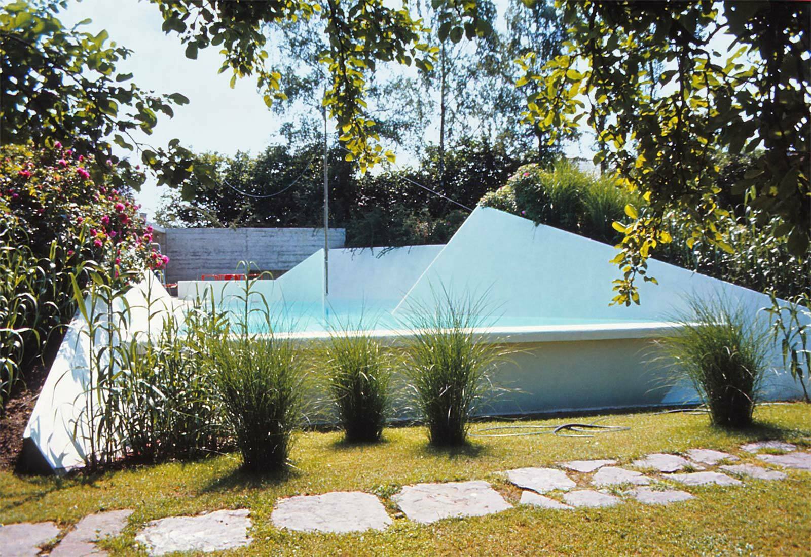
The jagged shape of the basin reminds one of a mountain lake. Water surfaces that disappear behind a corner create the impression of distance. The snow-white color allows the water to luminate in a gentle blue tone.
The swimming pool had to yield to an apartment block in 2002. The memories of hot summer days
remain.
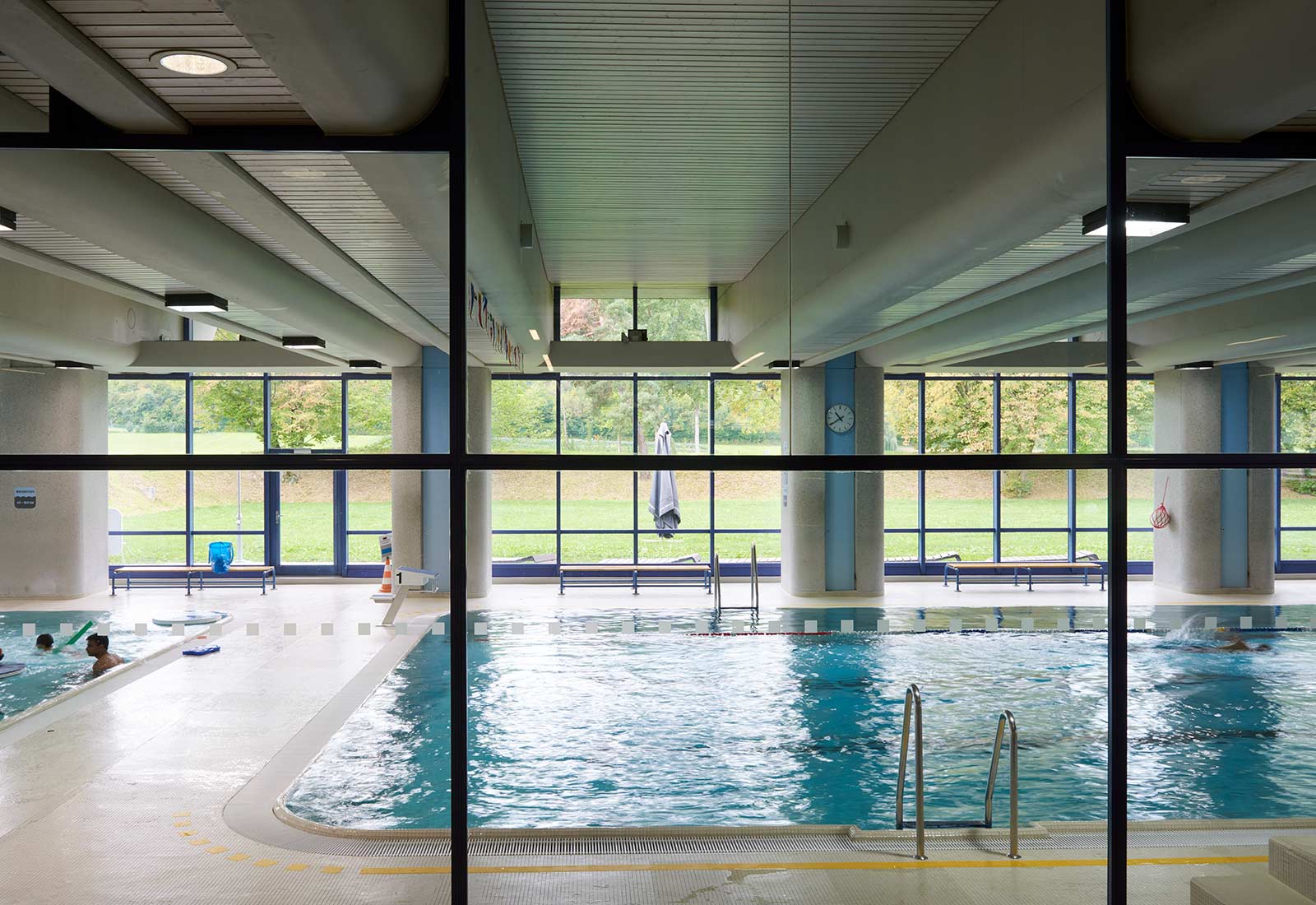
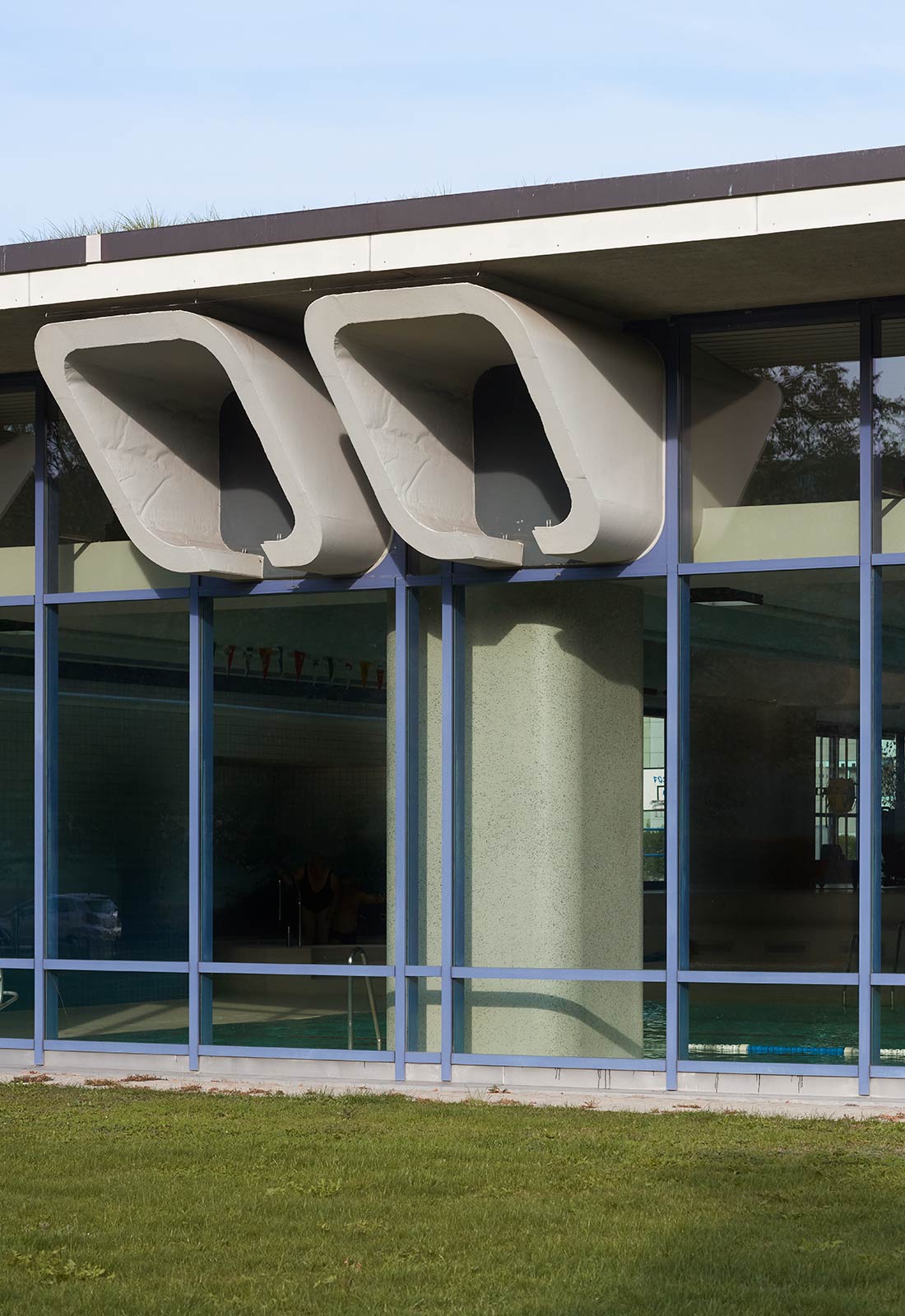
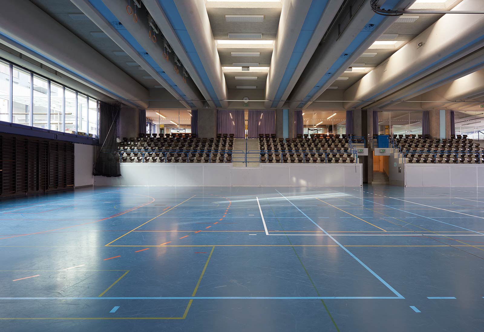
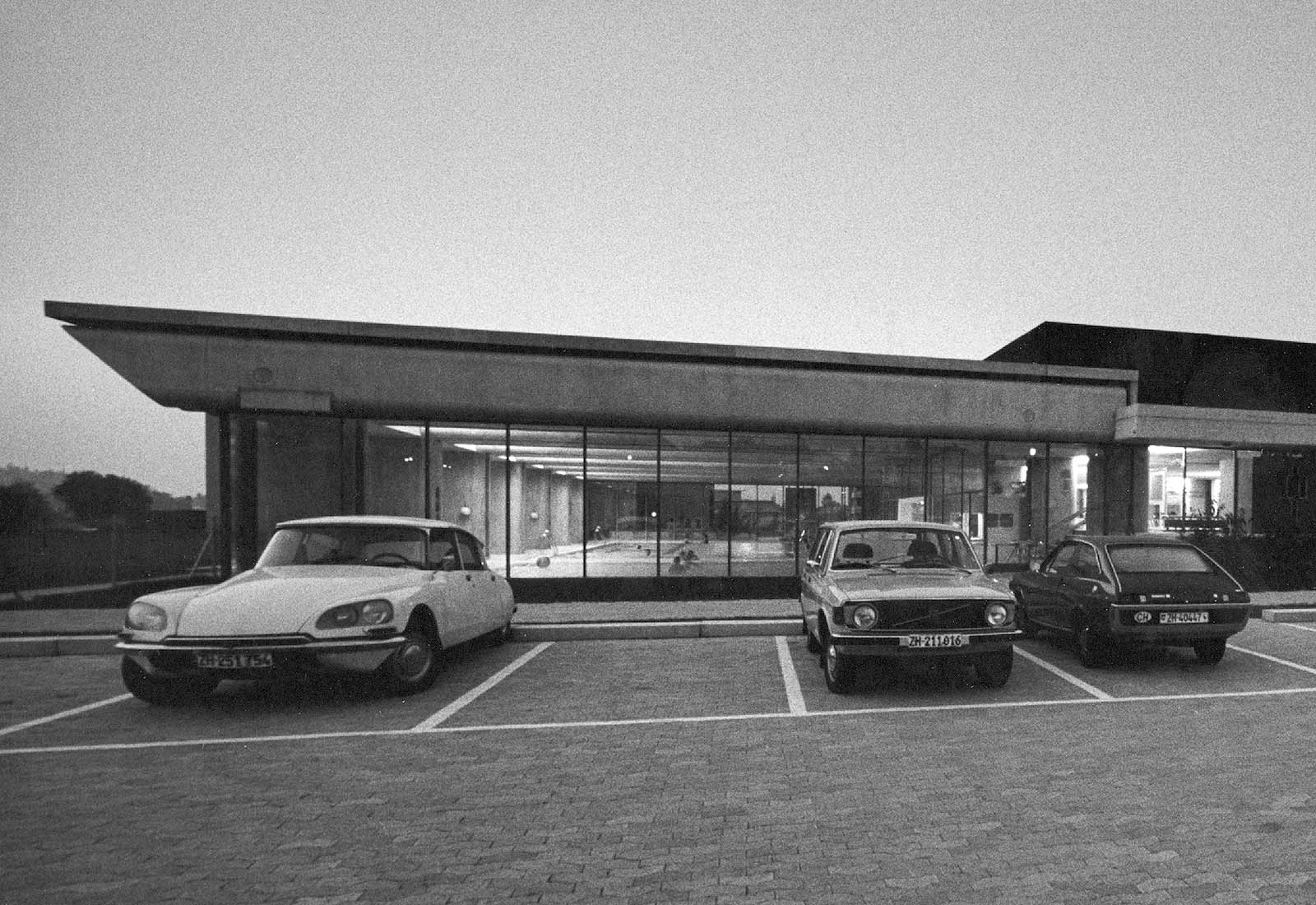
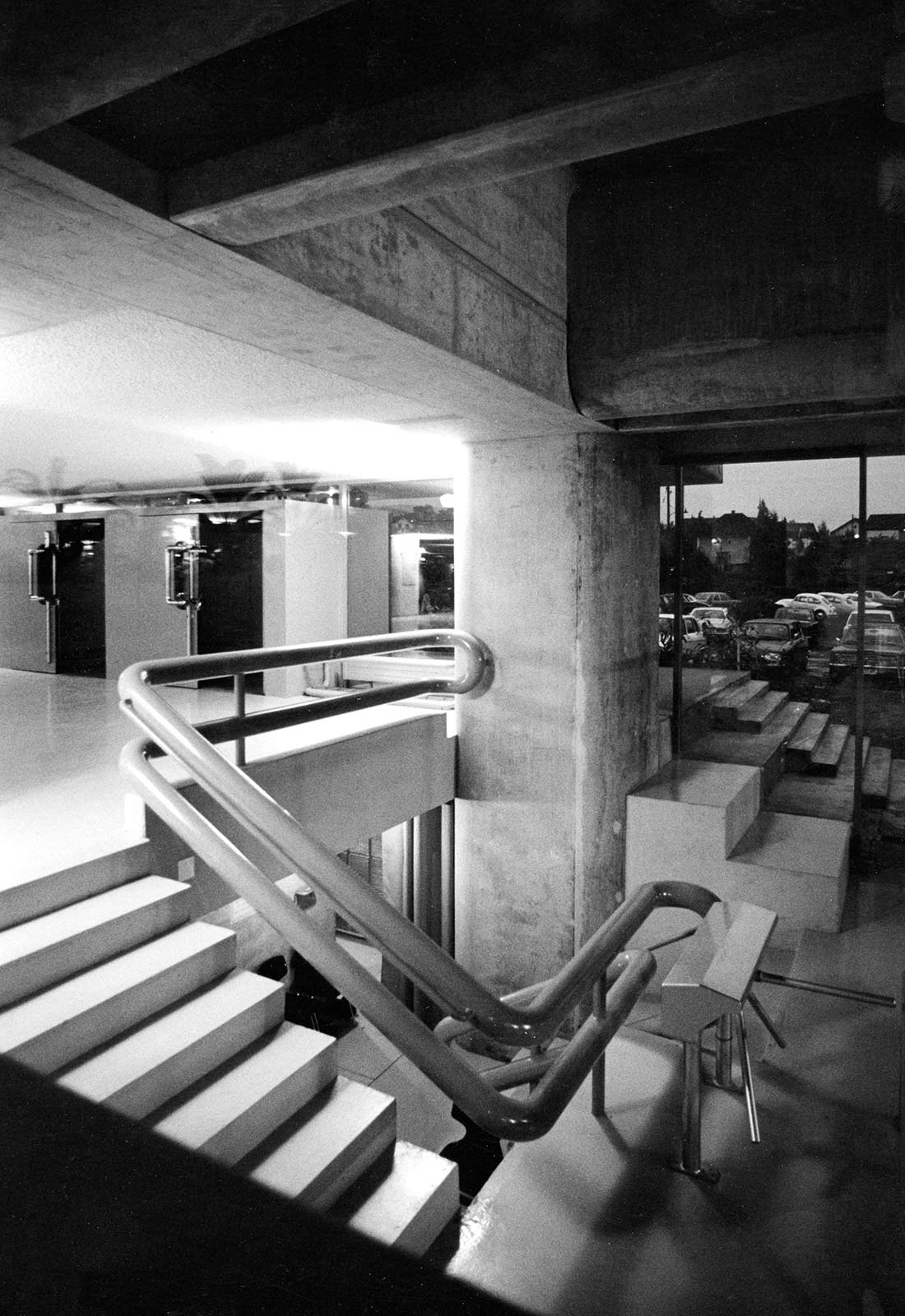
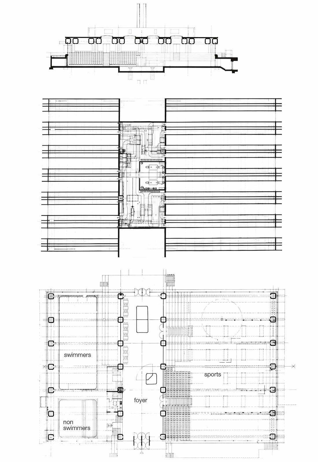
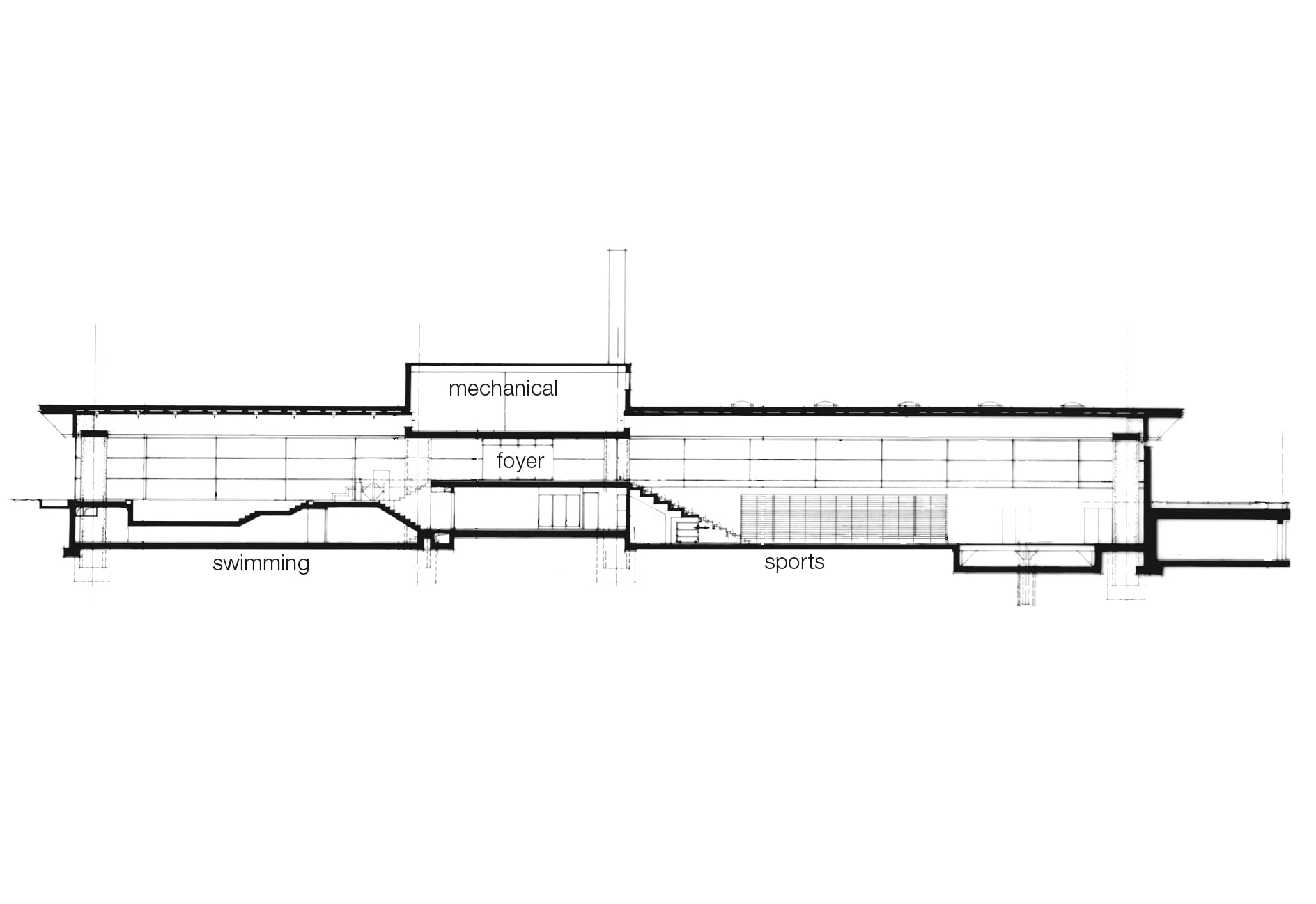
Sports center with indoor pool, 1973
Urdorf (Zurich)
The competition project foresaw the building as the first stage of a community center with stores and a town hall. The foyer would have continued southward as a mall. The shopping center was built later in a different form.
It was intended to make the sports center a focal point among the surrounding loosely-grouped apartment blocks while emphasizing the importance of leisure activities. I chose classic, symmetric forms derived from the primal image of the Doric Temple. Since the mechanical installations were a dominant part of the costs, I turned the ventilation ducts into the building structure. Huge prefabricated prestressed concrete 1.5 x 1.5 m sections form pillars and roof beams while serving at the same time as chases for ventilation and mechanical installations, storage areas for sports equipement and wall partitions. The roof beams are connected directly to the mechanical equipment room above the foyer.
The raised central foyer allows the visitor to take part visually in the unfolding activities. The sports hall has a stage for cultural activities that can be raised from the floor.
Recreation Center Heuried, 1964
Zurich
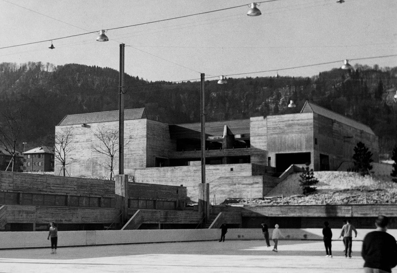
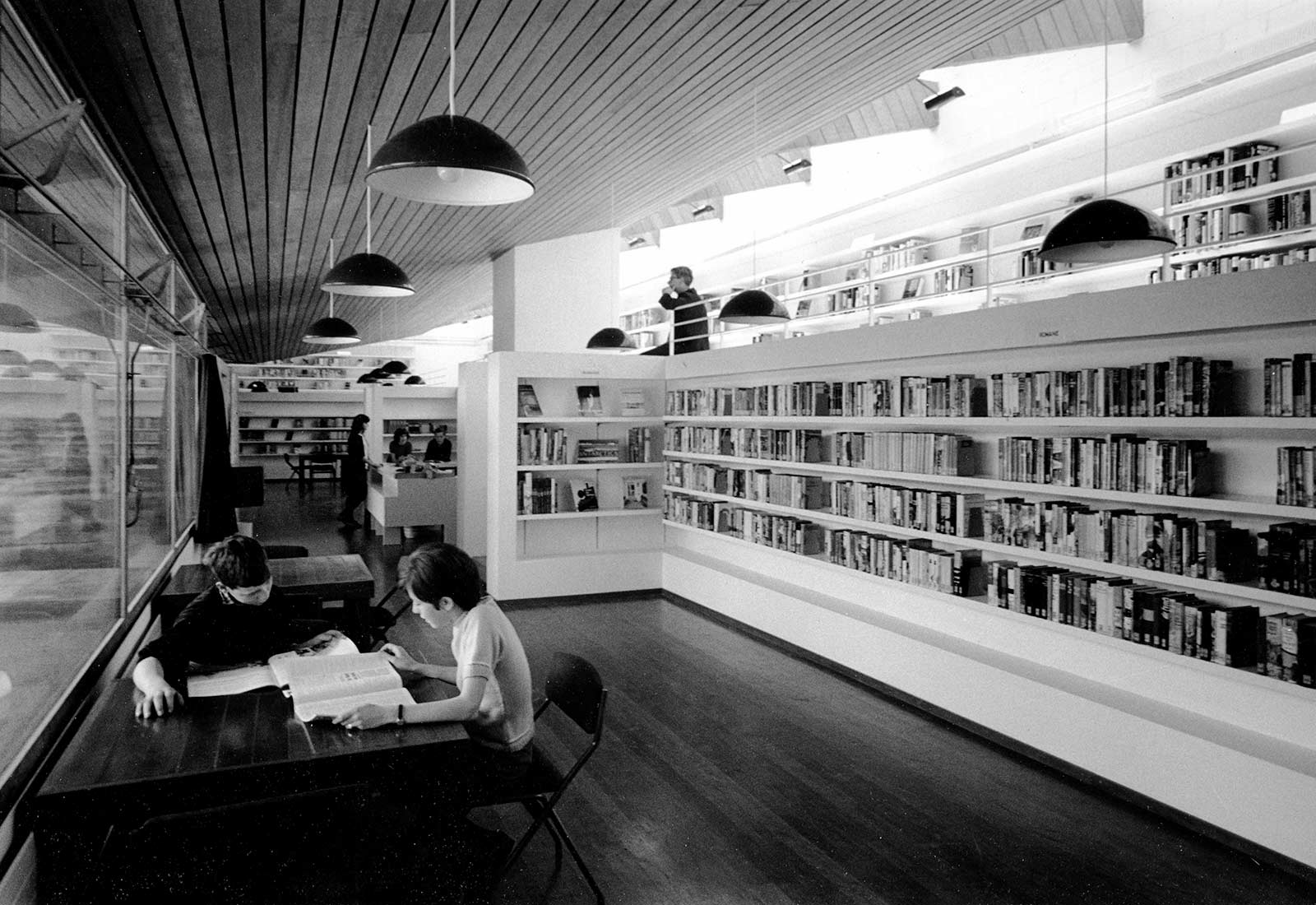
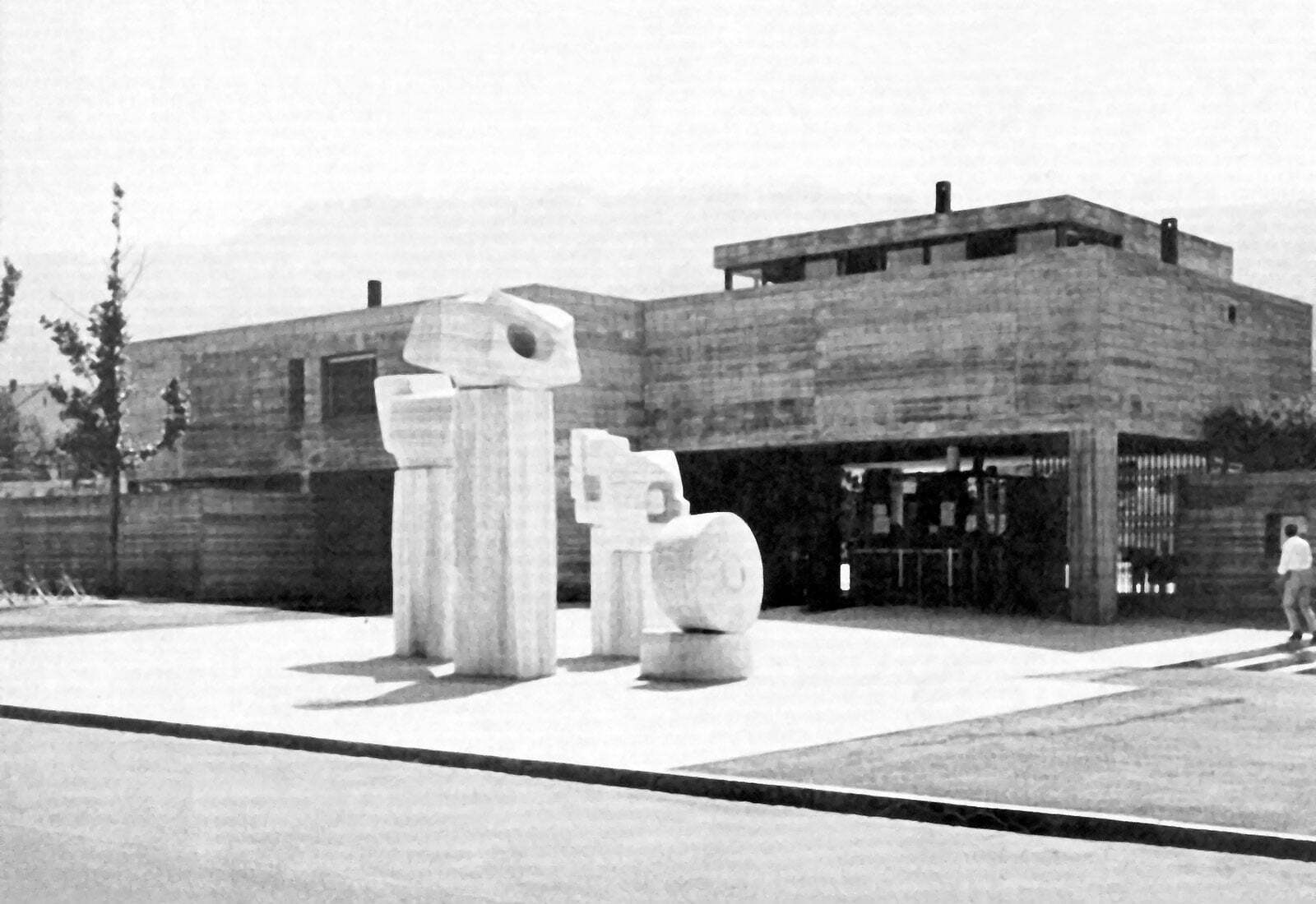
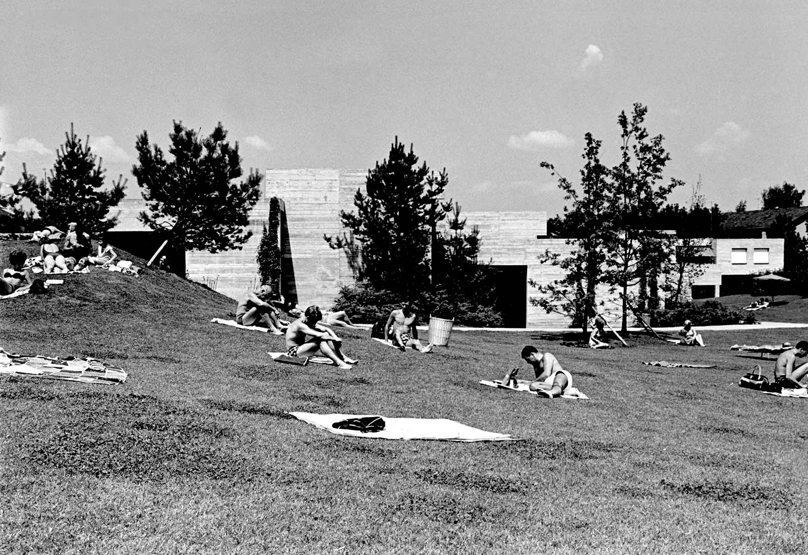
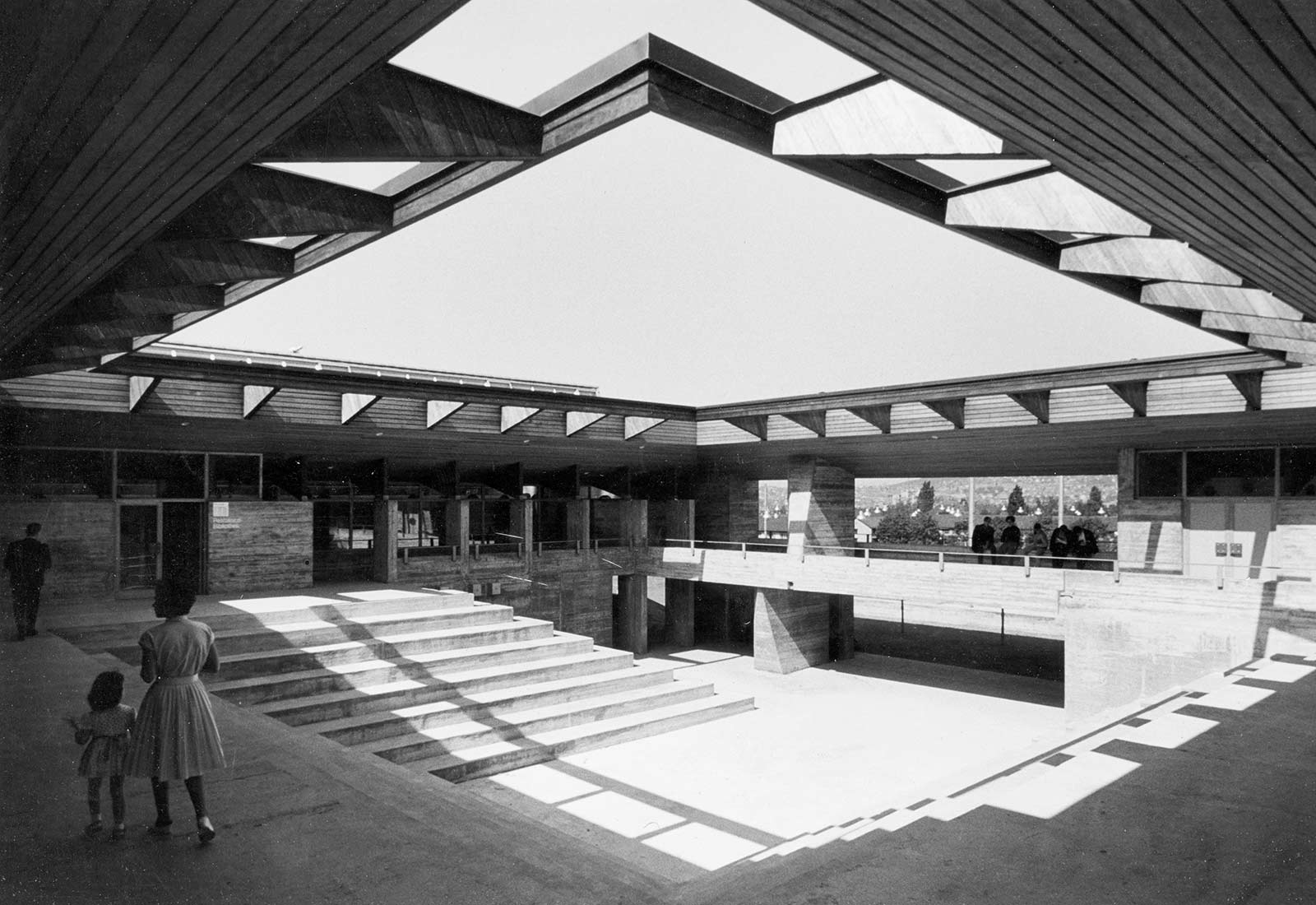
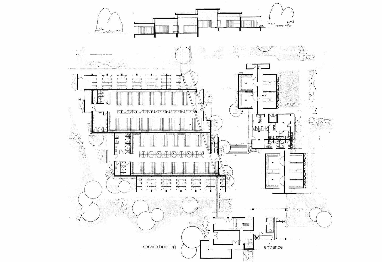
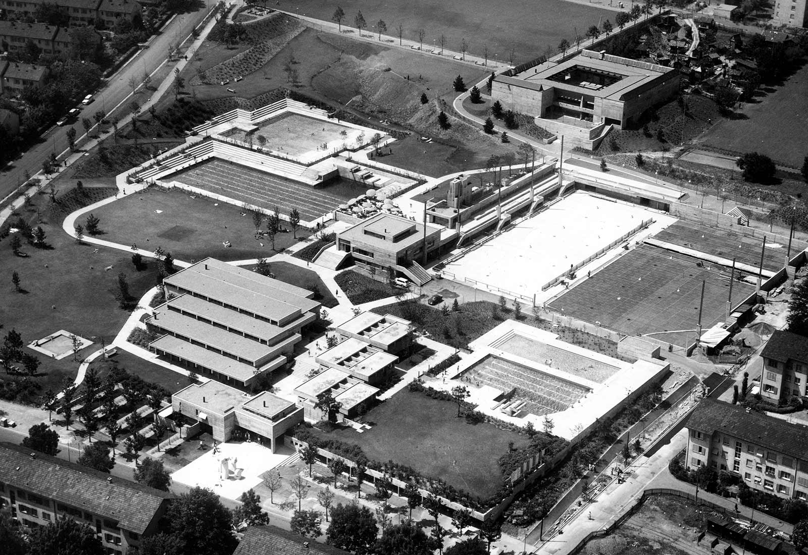
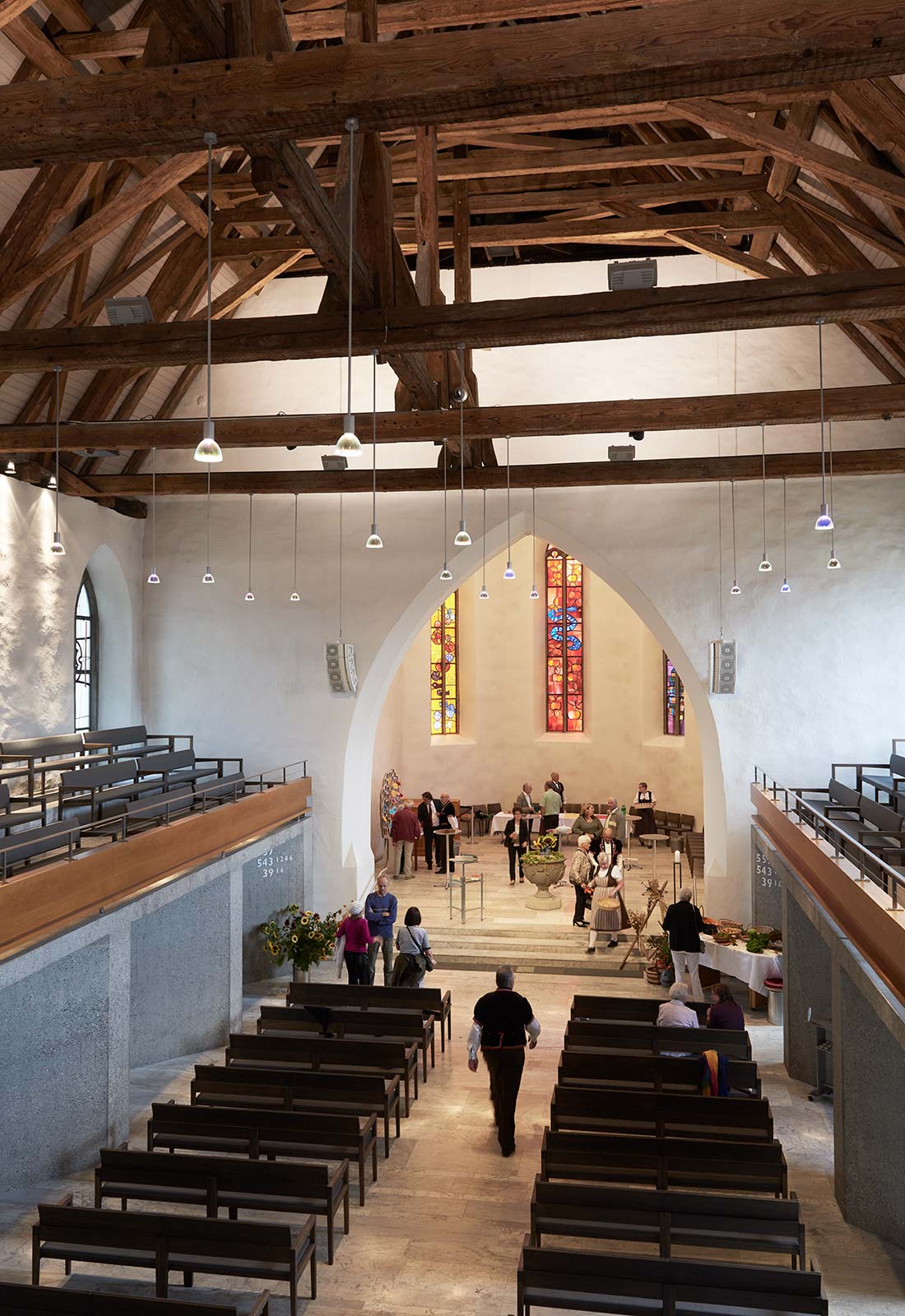
The project grew out of a first prize entry in an open competition. The sport and leisure activities of the Wiedikon quarter were combined upon the site of a 65000m2 former quarry. All buildings are constructed in exposed concrete. Le Corbusier’s influence is strongly felt. With the contrast between the strongly articulated, open dressing rooms beneath horizontally layered roof panes and the compact recreation building that thrones over the facility I wanted to thematize the contrast between bodily revitalization and activities of Muses.The recreation building is completely oriented towards the inner theater courtyard. It had to be later covered for climatic reasons. The landscape design uses indigenous trees and is based on the contrast between dark pine trees (Pinus nigra) and light concrete walls.
Civic center Muttenz, 1961–1970
in collaboration with Rolf Keller
Basel-Landschaft
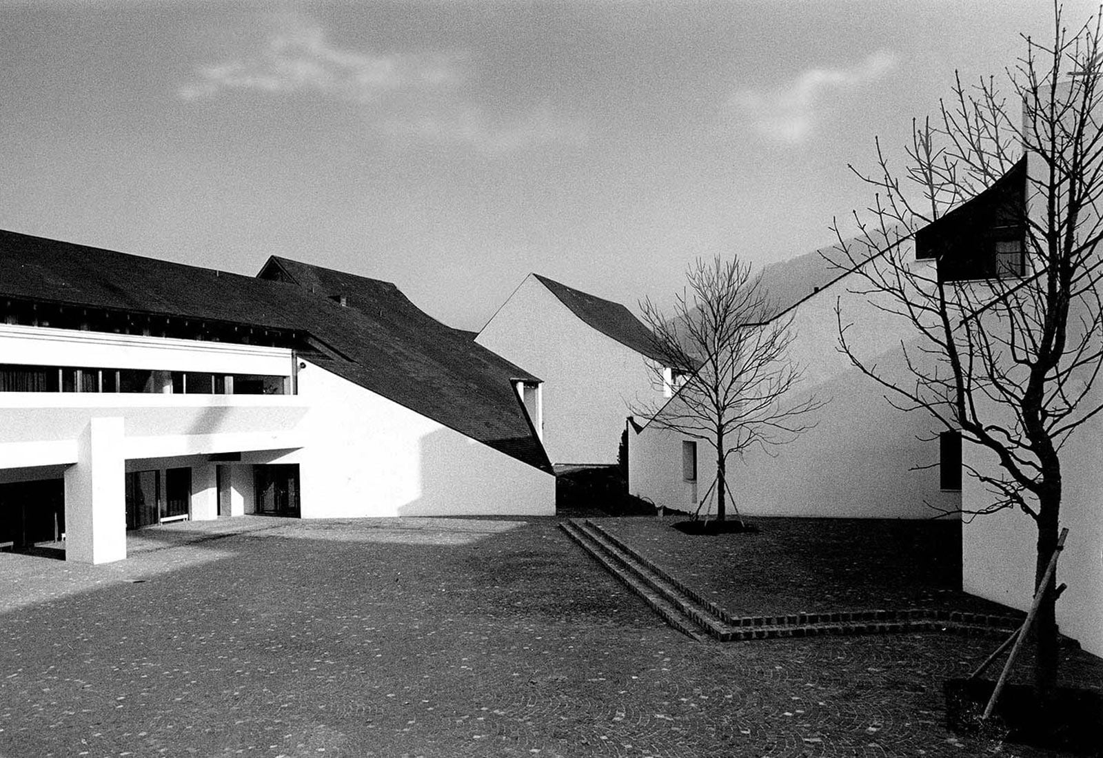
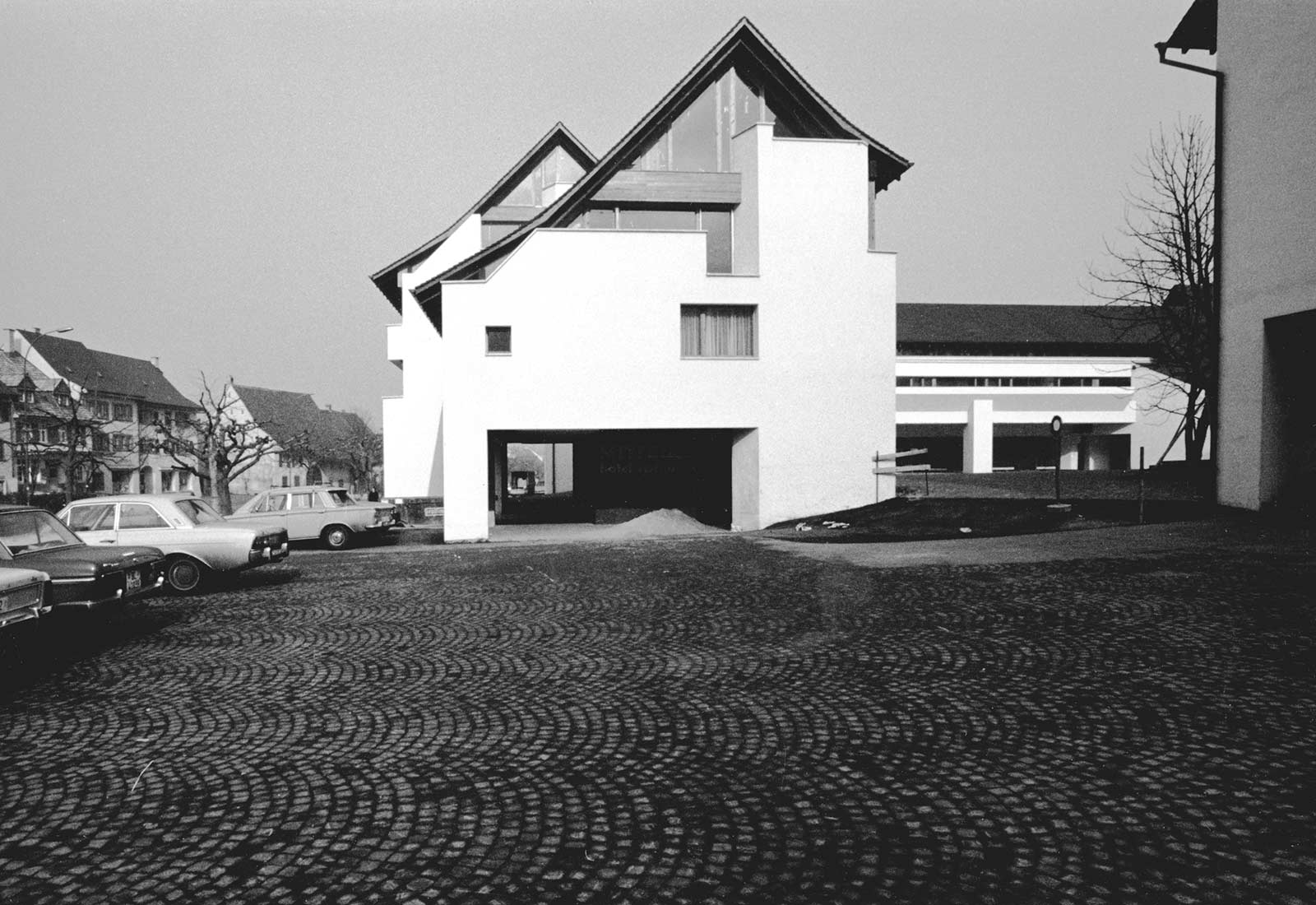
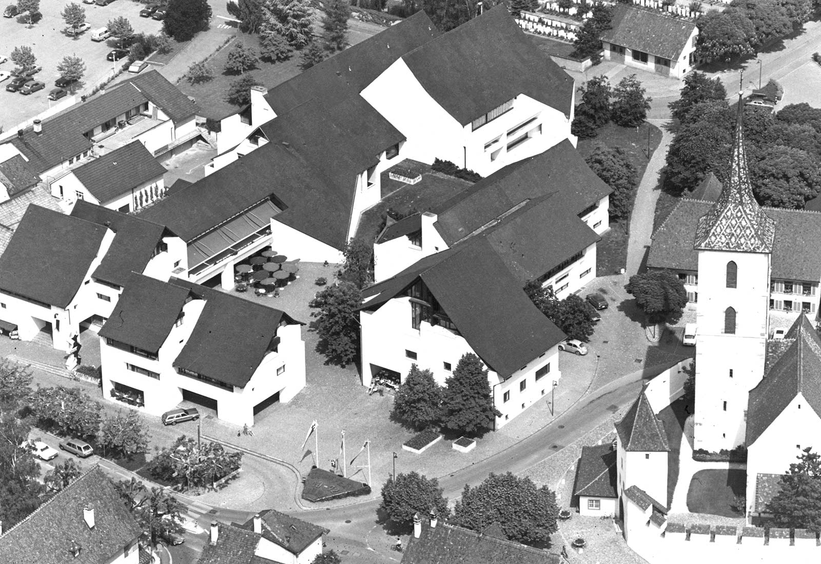
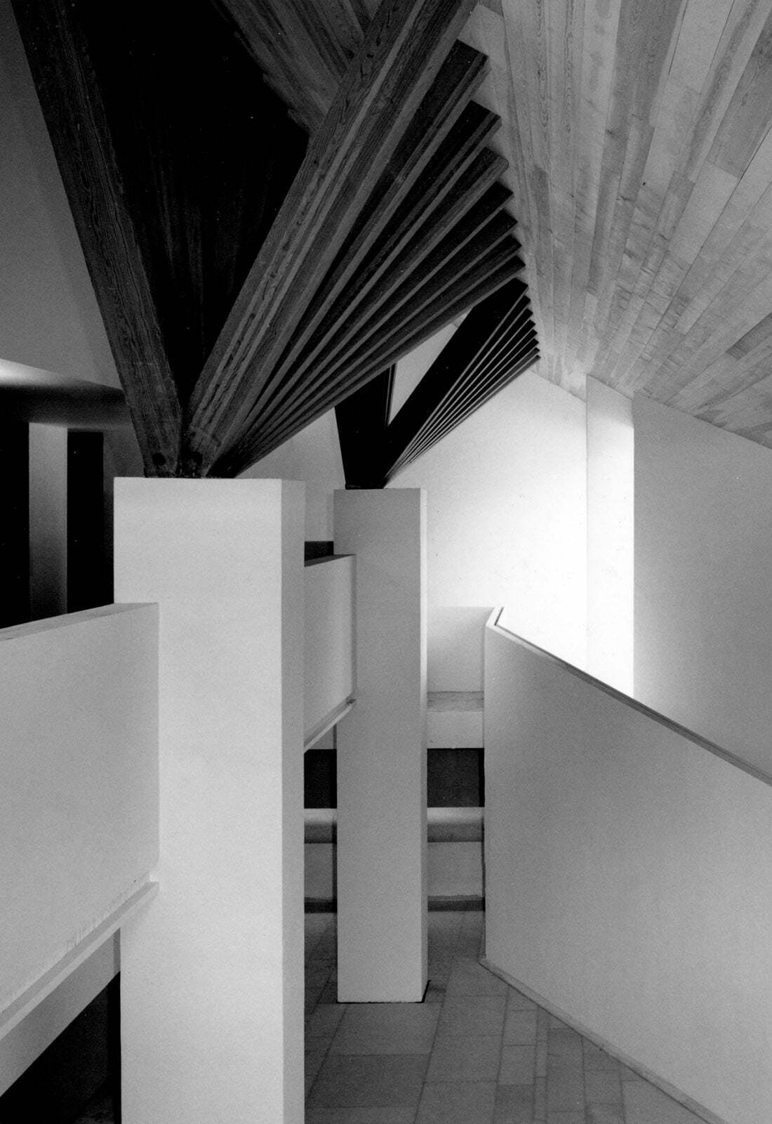
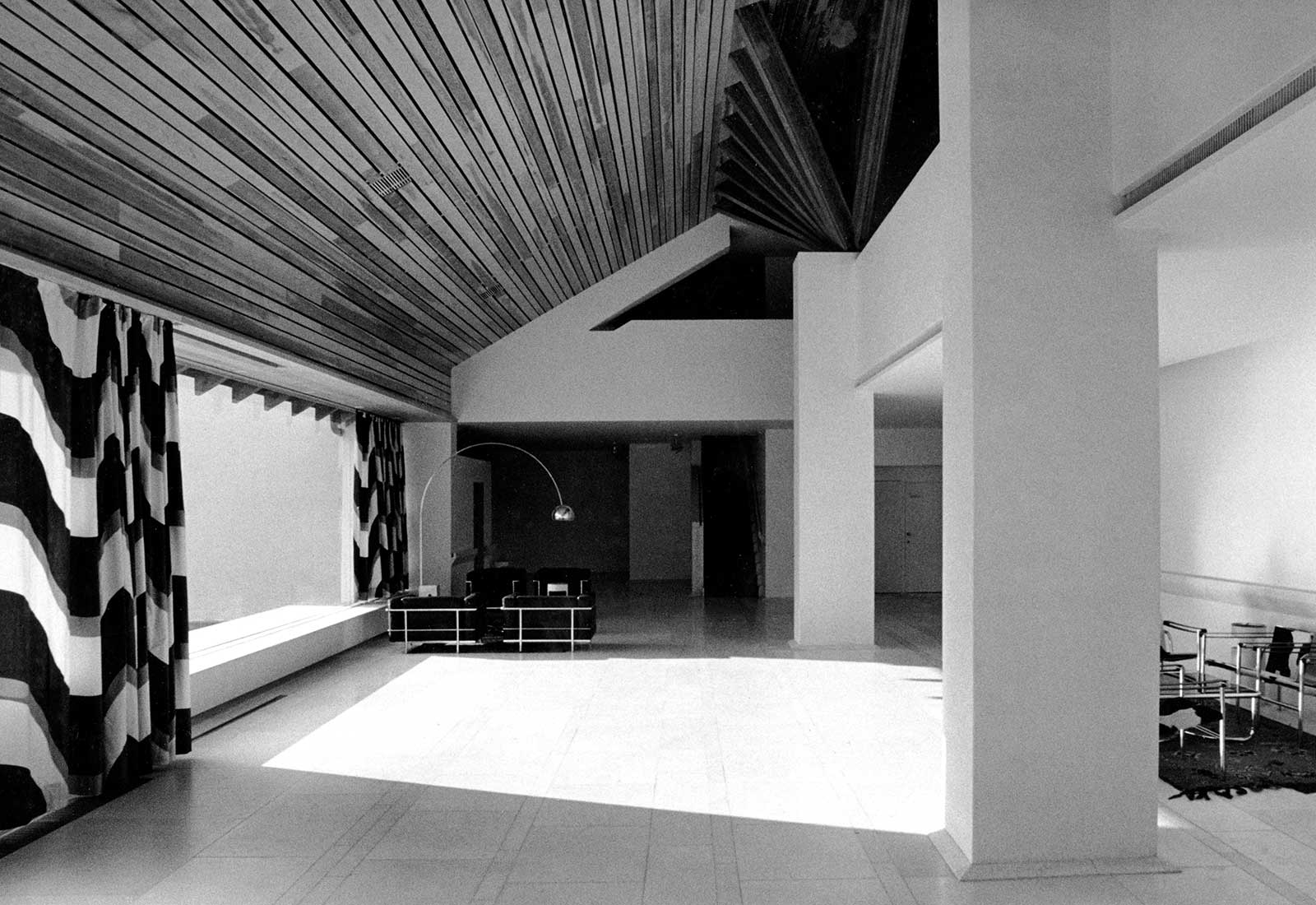
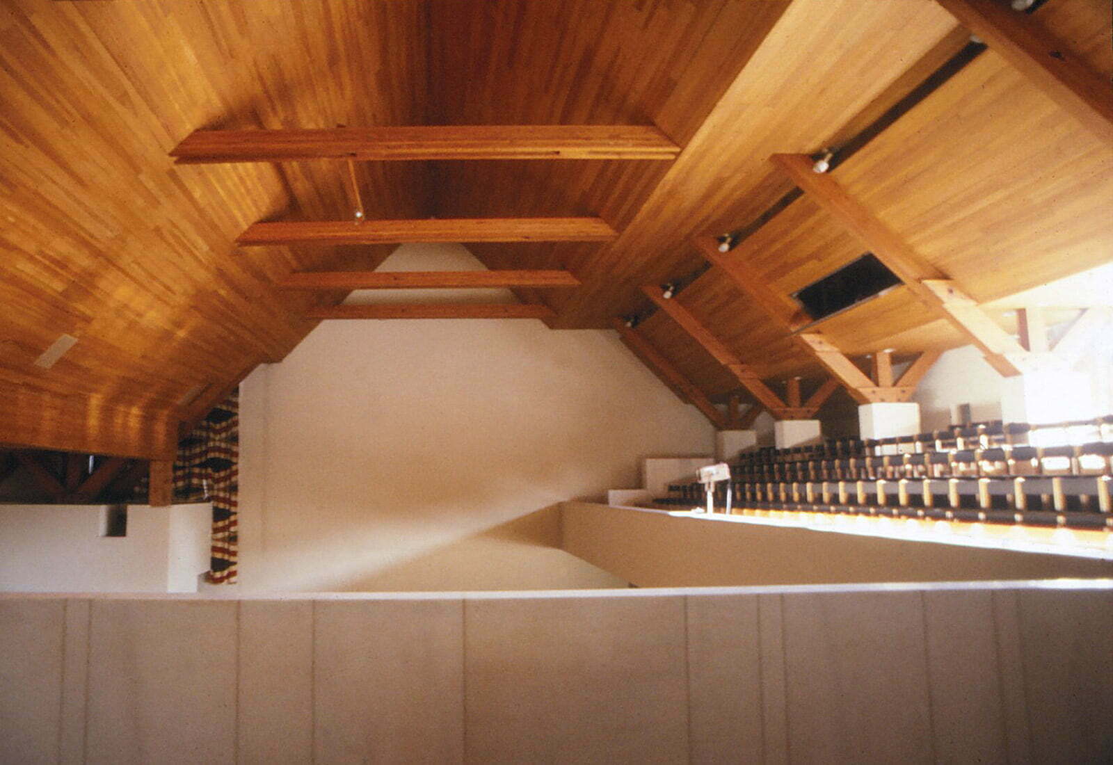
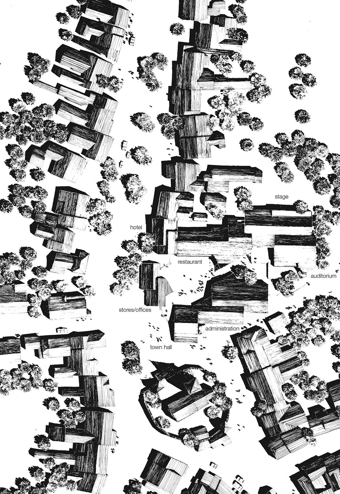
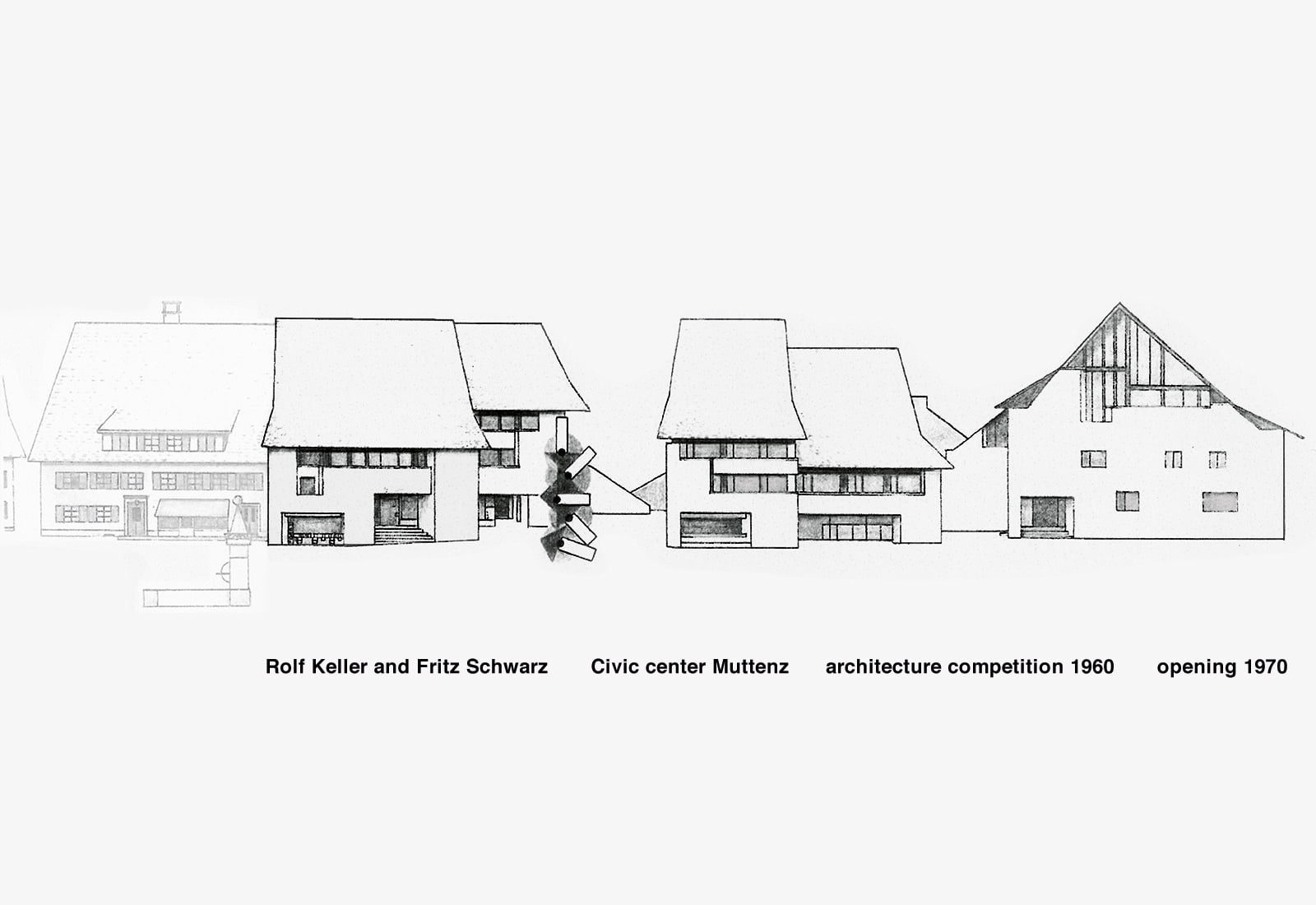
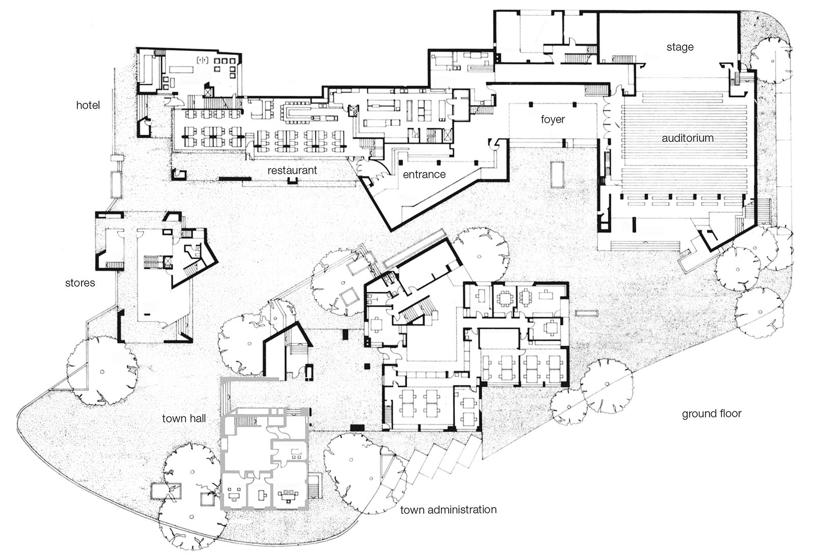
The project was selected in a national competition. The complex lies in the center of a medieval village core opposite the church with its fortified ring wall that gave shelter to the inhabitants during war. The existing town hall had to be integrated into the complex. The buildings are grouped around a foreward urbanesque court-yard with cobblestones and a sculptural fountain as well as a rear, green courtyard that links the center with the open landscape. The architecture adopts the elements of the surrounding farm houses (white sculptural volumes covered with steep closed roofs) and tries to interpret them anew. In a spatially intriguing manner, the visitor is led from the main street through the front courtyard to the auditorium tract in the back. The complex contains a town hall and community administration building, a hotel with 40 beds, restaurant and conference space, a bowling alley and a club. In addition, there is an auditorium wing with foyer containing a large auditorium with 700 seats and a small one with 150 seats as well as the necessary infrastructure.
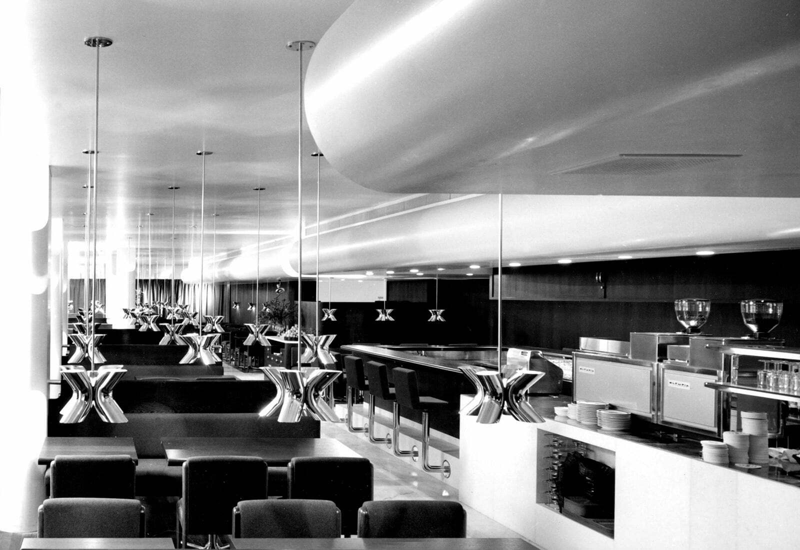
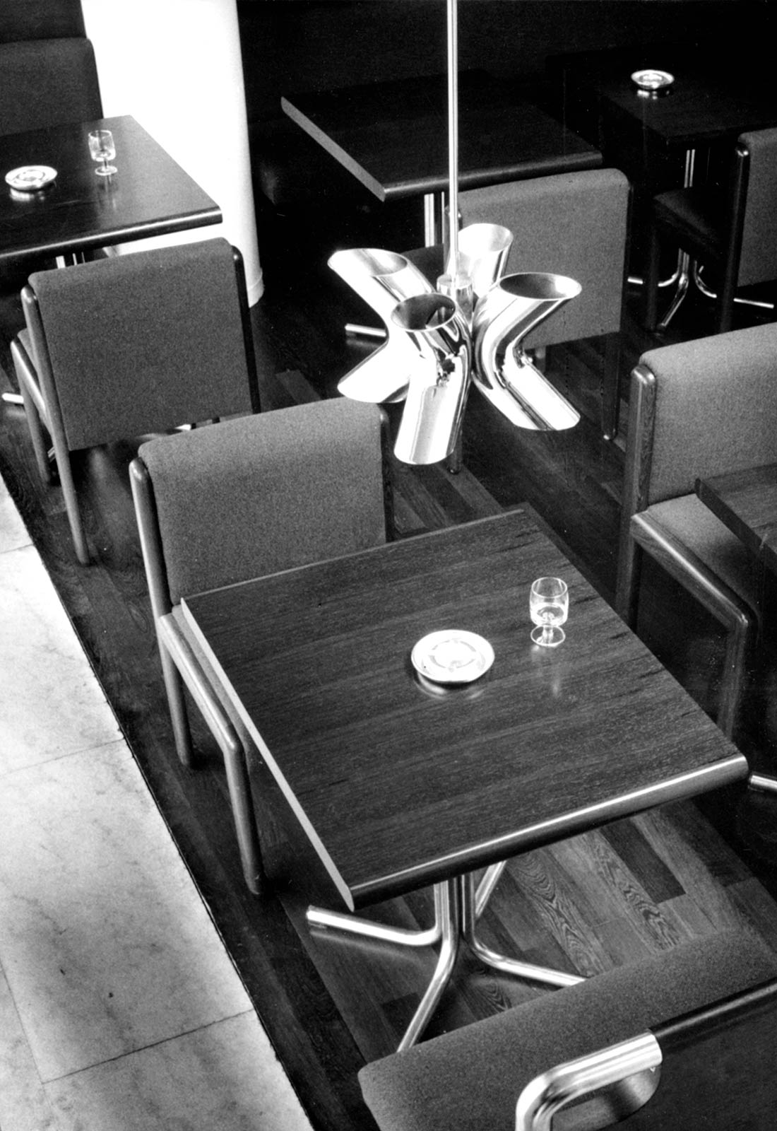
The austerely designed restaurant (white walls and ceiling, floors in wenge wood and marble, furniture in wenge wood and red-brown fabric, hardware and lamps in chrome) was declared to be outdated after 31 years of use and was replaced with a contemporary design.
The project was controversial in architectural circles and was labeled by purists as falsel integrative based upon imitating historic elements. It is very popular among the public, however, and is used intensively.
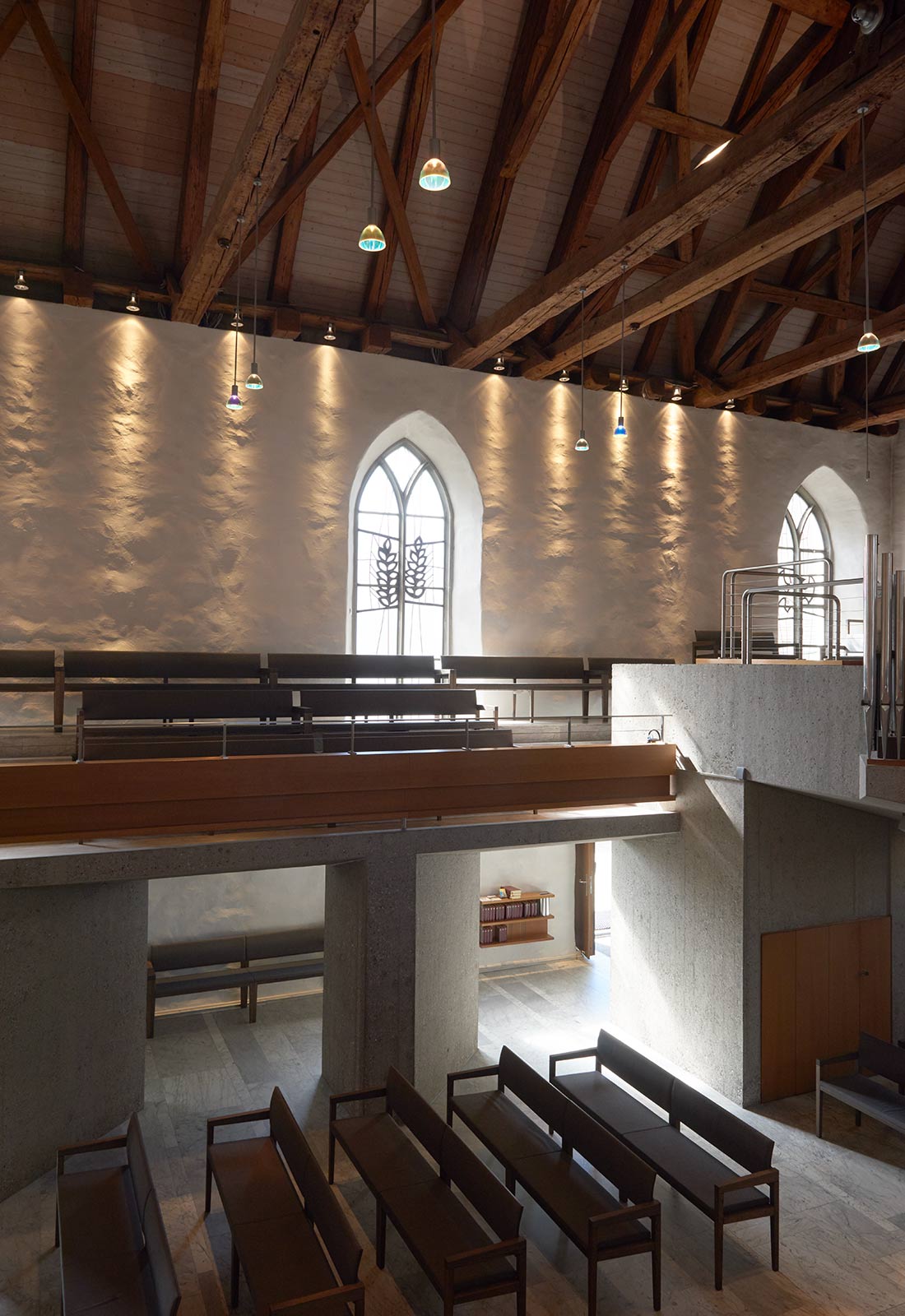
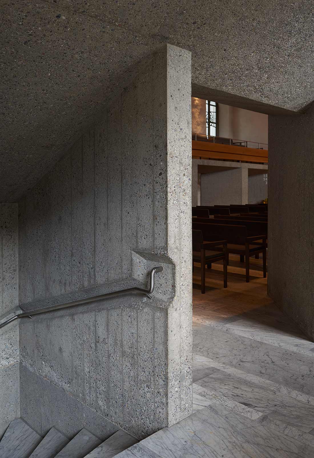
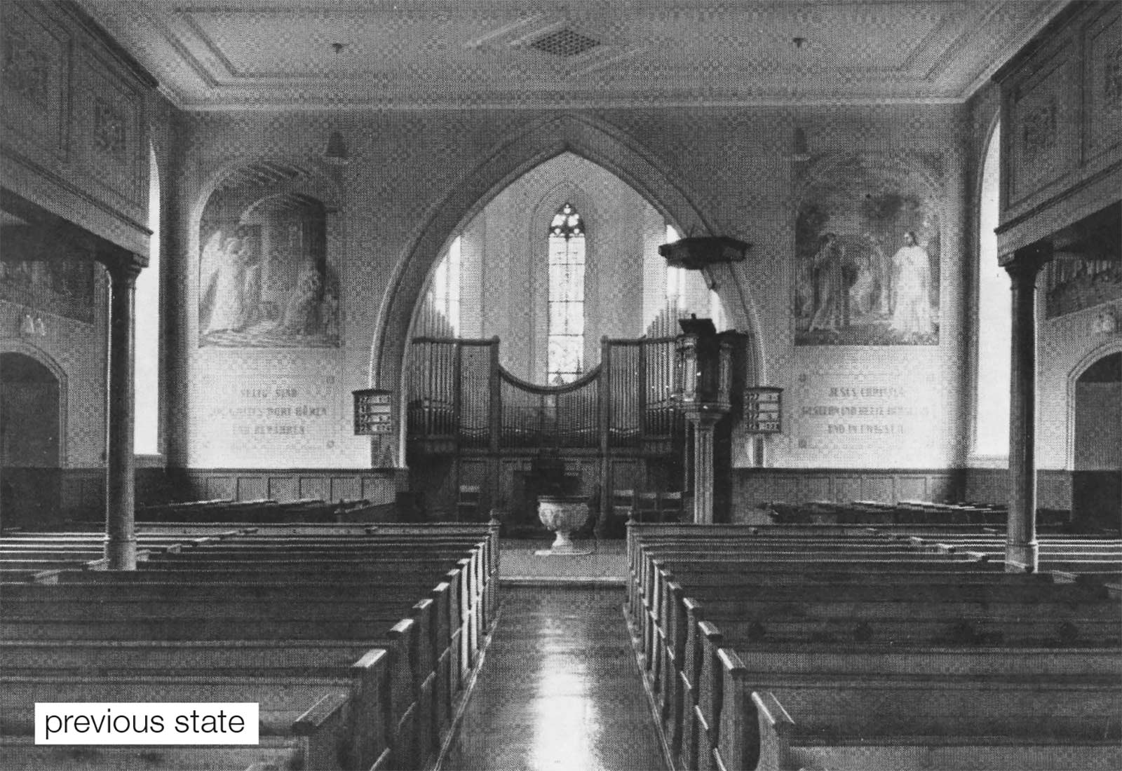
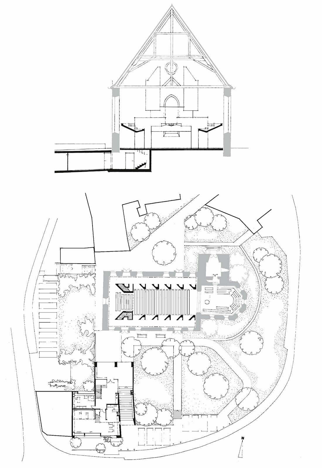
Restructuring of Church, 1963–1970
Bülach (Zurich)
The Renovation of Bülach Church (1970) can be characterised by the use of these two elements. Removing the heavy plaster ceiling from the 19th century I made the carpentry of the roof structure visible, a masterful combination of medieval craftmanship and natural tree trunks. The free standing gallery with the organ is made out of roughly treated concrete. Forest and rock seem to be heathen symbols. But Christ’s cross was made of raw wood and the rock is symbol of Saint Peter, the founder of the Christian church. The local church assembly resisted the veto of the authorities from the office of preservation.
